Discord PFP: Aesthetic, Anime, Red, Default, Gaming, Cool
Your Discord PFP is the smallest piece of real estate you own online, and it works harder than almost anything else in your profile. Discord renders it at just 128×128 pixels in chat next to your username, status dot, and role color which means it has to communicate personality in a space smaller than a postage stamp. Unlike a static forum avatar, a Discord PFP lives inside a system built around servers, roles, and constant scrolling chat, so the same image can read completely differently depending on which community it’s sitting in.
That’s the real reason “Discord PFP” is its own search category instead of just falling under “anime PFP” or “aesthetic PFP.” The platform’s visual context dark mode, tiny circular crops, role-colored usernames, server icons stacked in a sidebar changes what actually works. This guide breaks down the styles, platforms, and profile mechanics that matter specifically for a Discord PFP, not a generic profile picture that happens to also work there.
Anime Discord PFP
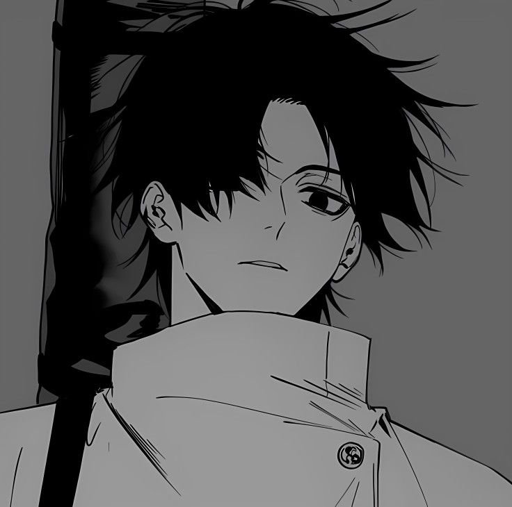
Anime is the single most searched Discord PFP category, and it’s not close. Expressive eyes, clean linework, and saturated color palettes are built to survive Discord’s brutal downscaling in a way photography usually isn’t. A close-cropped face shot with strong contrast between hair color and background reads clearly even shrunk to a chat-sized circle, while full-body shots tend to lose all detail.
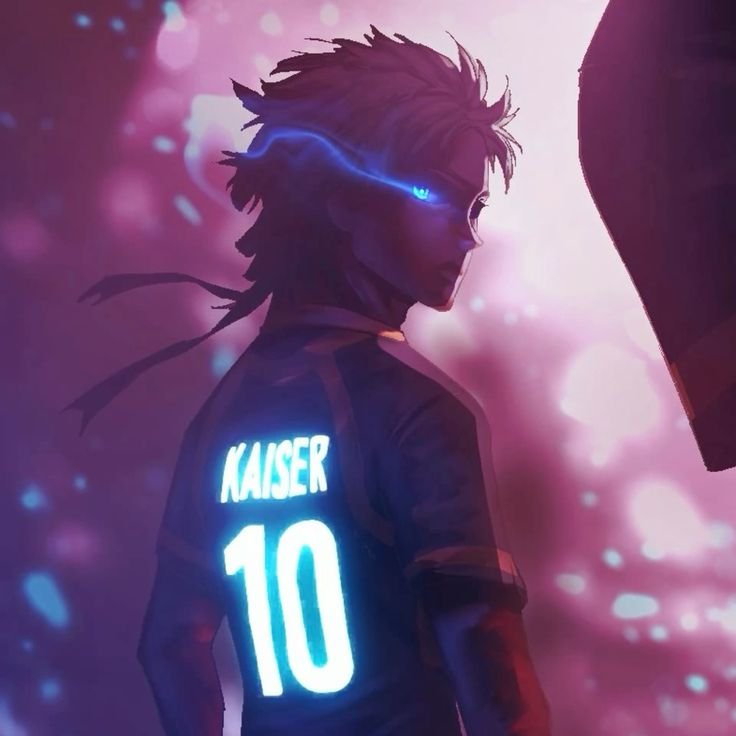
Seasonal spikes matter here more than in most categories when a season airs or a manga arc goes viral, searches for that specific character’s PFP jump within days, and generic “anime PFP” roundups rarely update fast enough to catch it. Popular picks skew toward characters with a single unmistakable visual hook: a mask, a signature eye color, a distinctive hairstyle silhouette that’s still legible at 128 pixels.
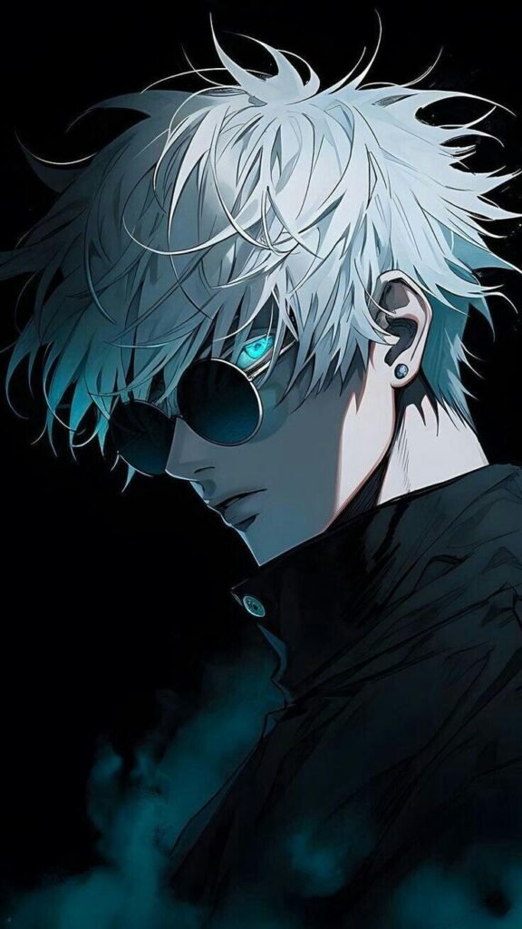
Dark academia and shoujo-style soft-focus edits are trending alongside harder-edged shonen action shots, so the category isn’t just one aesthetic. The split tends to follow server type: gaming and competitive servers lean toward action-pose anime PFPs with bold outlines, while art, writing, and hangout servers lean toward gentler, more painterly anime portraits.
“For specific examples of this style, our Satoru Gojo PFP and Ryomen Sukuna PFP collections both lean into the sharp, high-contrast look that survives Discord’s crop.”
Aesthetic Discord PFP
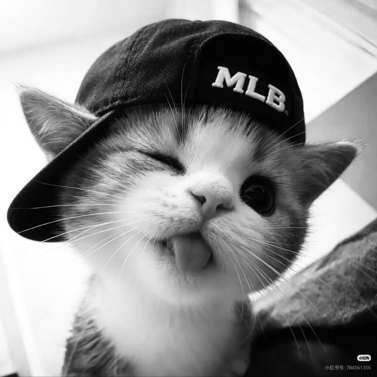
An aesthetic Discord PFP is less about subject matter and more about restraint muted palettes, consistent grain or film-style overlays, and a deliberate absence of visual noise. Pastel gradients, warm film tones, and soft vignettes dominate this style because they photograph well as a tiny circle without needing a sharp focal point to read.
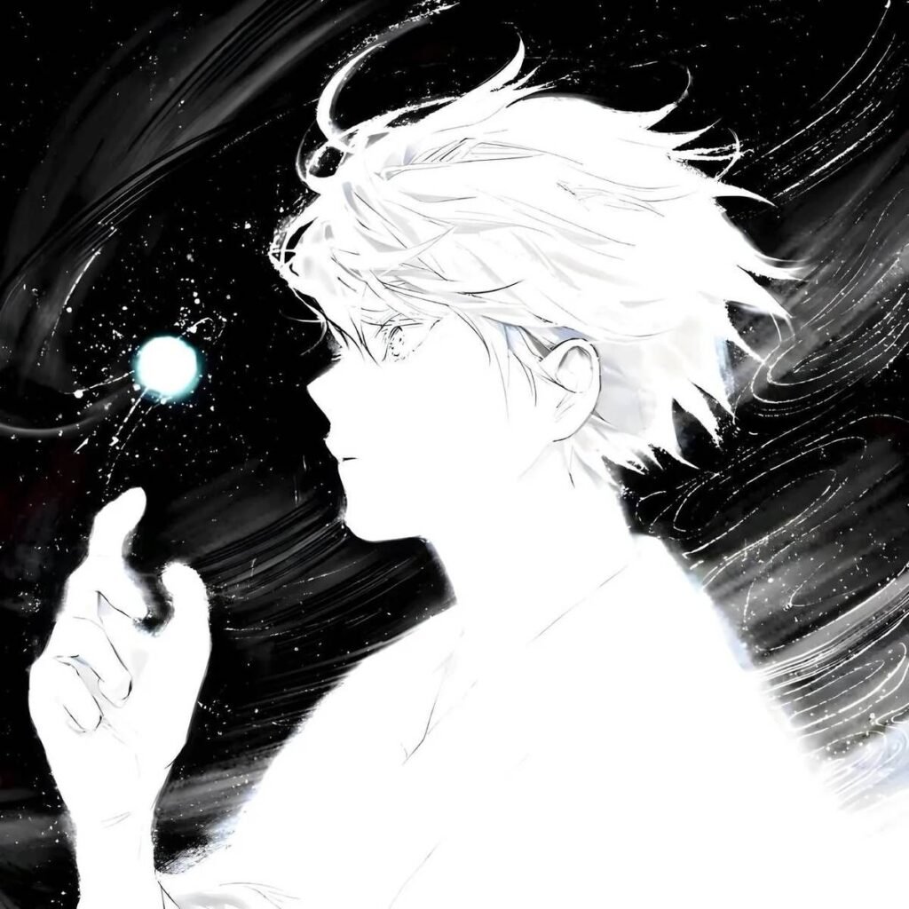
The tell for a genuinely aesthetic PFP versus a generic cute one is color discipline: two or three tones carried through the whole image, not a rainbow of competing hues. Sepia and dusty-rose edits, moody golden-hour shots, and minimalist line-art all fall under this umbrella, and they tend to pair with equally muted Discord banners rather than bold ones.
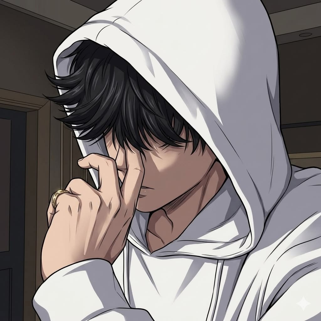
This category signals curation more than emotion. Someone running an aesthetic PFP is usually telling a server “I put thought into how my profile looks as a whole,” which is why it pairs so naturally with matching banner art, a coordinated “About Me” bio, and consistent color choices across pinned messages and server roles.
“Our Aesthetic Red PFP collection is built entirely around this kind of deliberate, color-disciplined style.”
Gaming Discord PFP
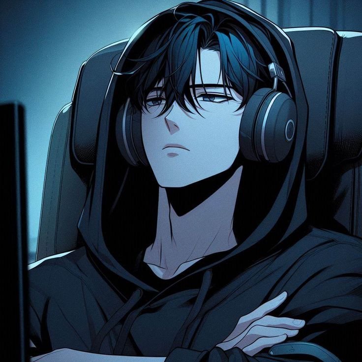
Given that Discord started as a voice-chat tool built for gamers, gaming PFPs remain one of its most functional categories the image itself communicates what you play before you type a word. Game-specific key art, character skins, and franchise emblems cut through server noise instantly, especially in servers organized around a single title where dozens of members are scrolling past identical usernames.
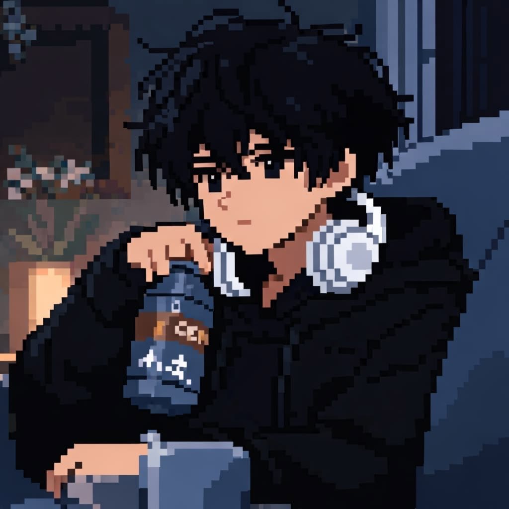
Bold, high-saturation key art tends to outperform screenshots here, since actual in-game screenshots are usually too cluttered or low-contrast to survive the crop to a small circle. Franchise logos and class or role icons (a specific weapon, a class symbol, a rank badge) work well precisely because they’re instantly recognizable within that game’s community, even to people who’ve never seen your face.
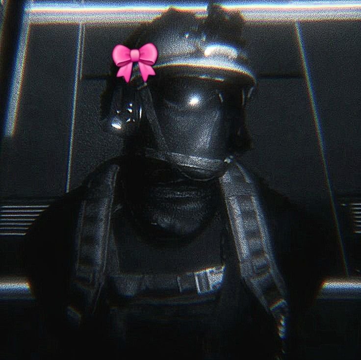
Competitive and ranked-focused servers lean toward minimal, single-color emblem styles that match rank or role badges, while casual gaming communities lean toward character art with more personality and expression. Either direction works, but mixing genres a fantasy RPG character in an FPS-focused server, for instance tends to read as mismatched rather than distinctive.
“Our Kamen Rider PFP and Leon Kennedy PFP collections are great examples of bold, instantly recognizable gaming key art that holds up at chat size.”
Cool Discord PFP
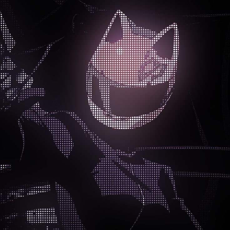
“Cool” is one of the vaguest-sounding categories on the list, but it has real, consistent search demand of its own, separate from anime or gaming variants people search it as a standalone modifier because they want something that reads as effortless rather than cute or aesthetic. The common thread across cool PFPs is restraint paired with confidence: strong silhouettes, a single dramatic light source, and enough negative space that the subject doesn’t need extra detail to hold attention.
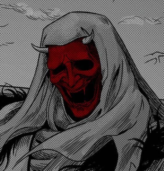
Hooded figures, single glowing eyes, fog and mist effects, and characters shown from behind or in silhouette dominate this category because mystery reads as “cool” faster than a clear, friendly face does. Monochrome or near-monochrome color grading shows up constantly here too, since it removes visual noise and lets shape and contrast carry the image.
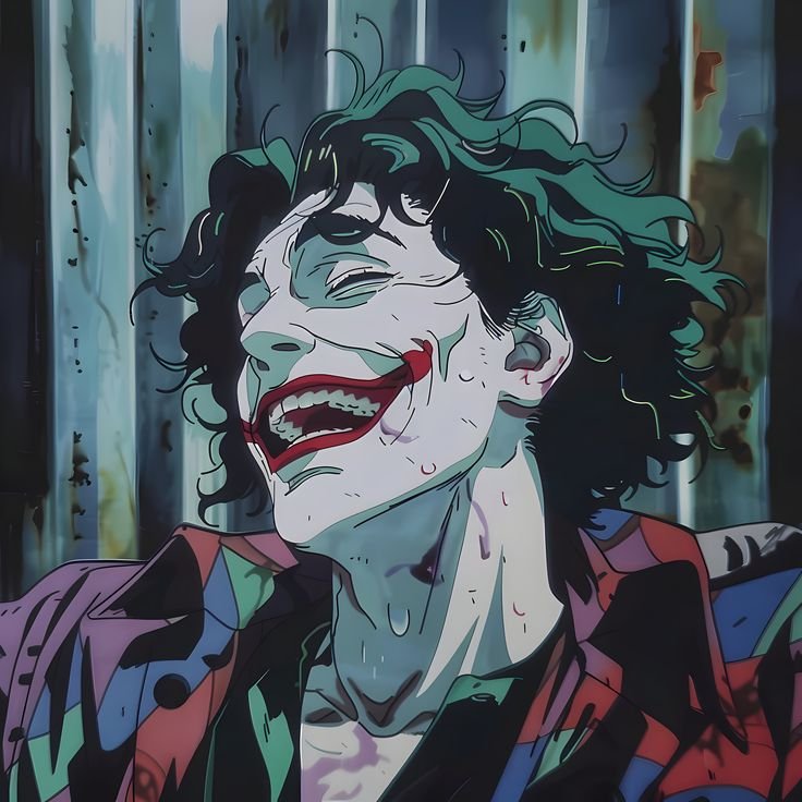
Cool PFPs tend to skew toward shorter usernames and sparser bios the whole profile leans minimal rather than expressive, which is part of why this style pairs so well with a plain black or single-accent-color Discord banner instead of a busy one.
“Characters like Dante and Silver Surfer fit this style well strong silhouettes, dramatic lighting, and enough restraint to read as effortless rather than busy.”
Cute Discord PFP
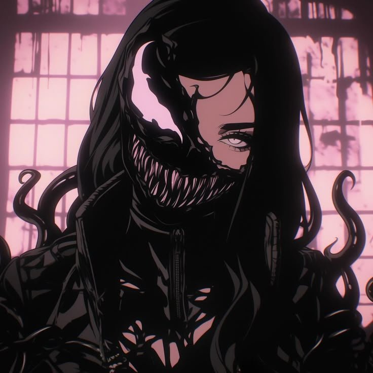
Cute PFPs work because they lower the social temperature of a text-only space. A soft expression, rounded shapes, and warm color accents signal approachability before you’ve said anything in chat, which matters in servers where new members are deciding whether to jump into conversation. Small animals, chibi-style characters, and soft pastel anime faces dominate the category for exactly that reason.
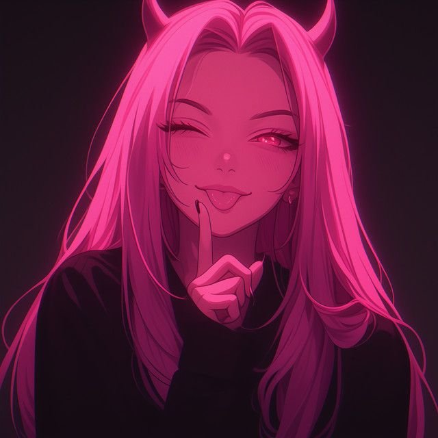
Blush, gentle highlights, and rounded framing do the actual emotional work here a cute PFP with harsh lighting or sharp angles reads as inconsistent, so the technique matters as much as the subject. Cats in illustrated or cartoon styles remain a perennial favorite because they combine that softness with instant recognizability, even smaller than 128 pixels.
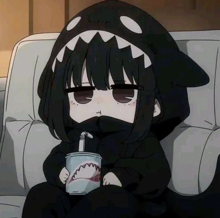
There’s also a “dark cute” subvariant worth naming specifically: shy expressions and rounded shapes kept inside a darker color palette, popular in alt and gothic-adjacent communities that still want approachability without switching to a fully pastel aesthetic. It’s a genuinely distinct look, not just a cute PFP with the brightness turned down.
“If this softer style fits your vibe, our Pokemon PFP and Doraemon PFP collections offer plenty of approachable, rounded-shape options.”
Dark and Gothic Discord PFP
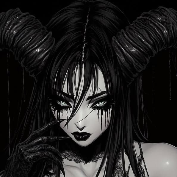
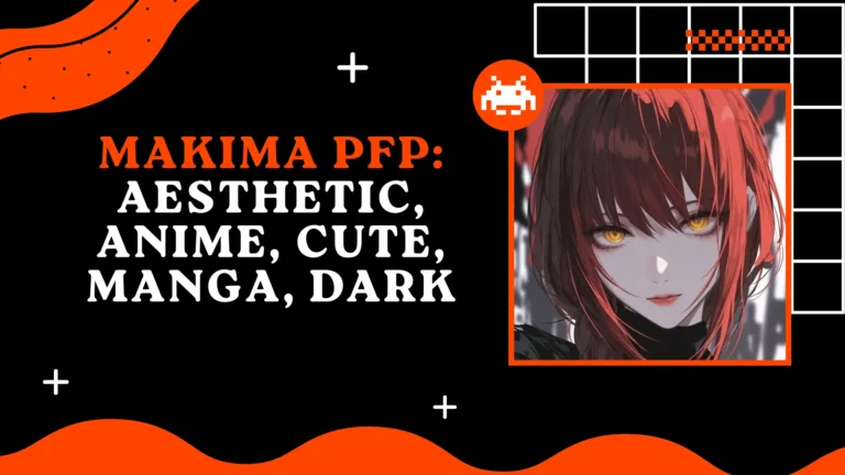
Dark Discord PFPs lean into moody lighting, black-dominant palettes, and shadowed portraits rather than bright saturation and within Discord’s own dark-mode interface, they blend into the UI in a way that reads as intentional rather than accidental. Gothic anime girls, red-and-black color pairings, and single-source lighting that leaves most of the frame in shadow are the recurring visual signatures.
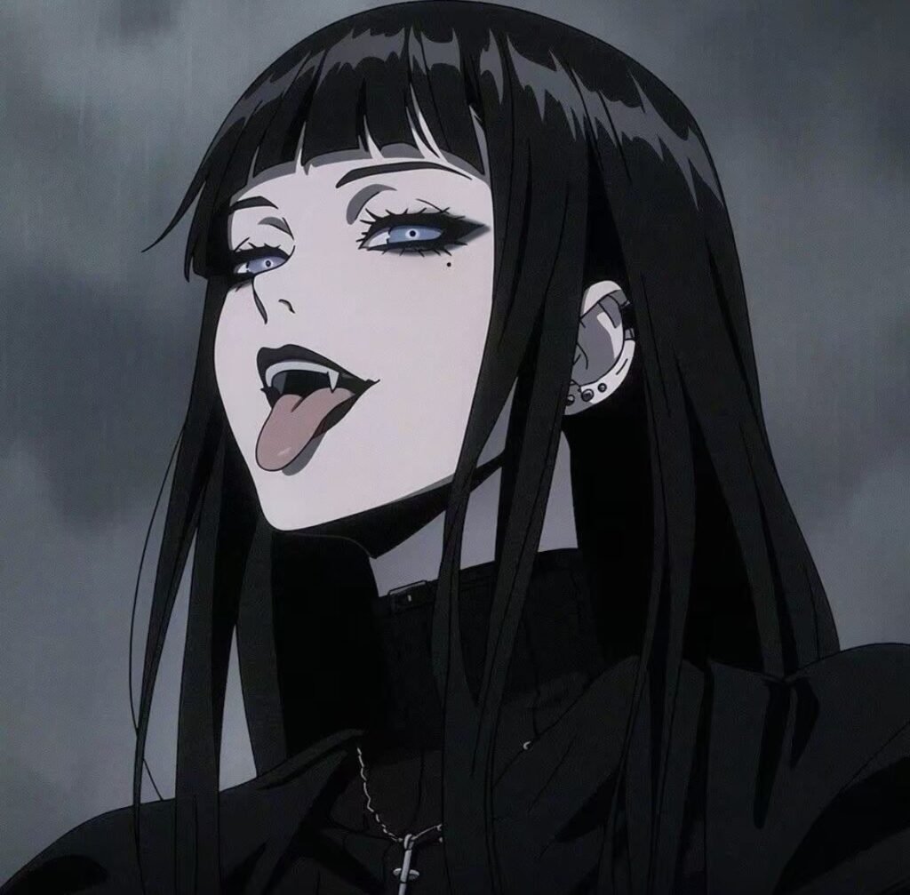
Neon edge glow and cyberpunk color grading have become the defining edit style for this category recently a dark base image with a single saturated highlight color (electric blue, magenta, acid green) traced along an edge or silhouette. It photographs distinctly from older “grunge” dark aesthetics, which relied more on texture and grain than glow.
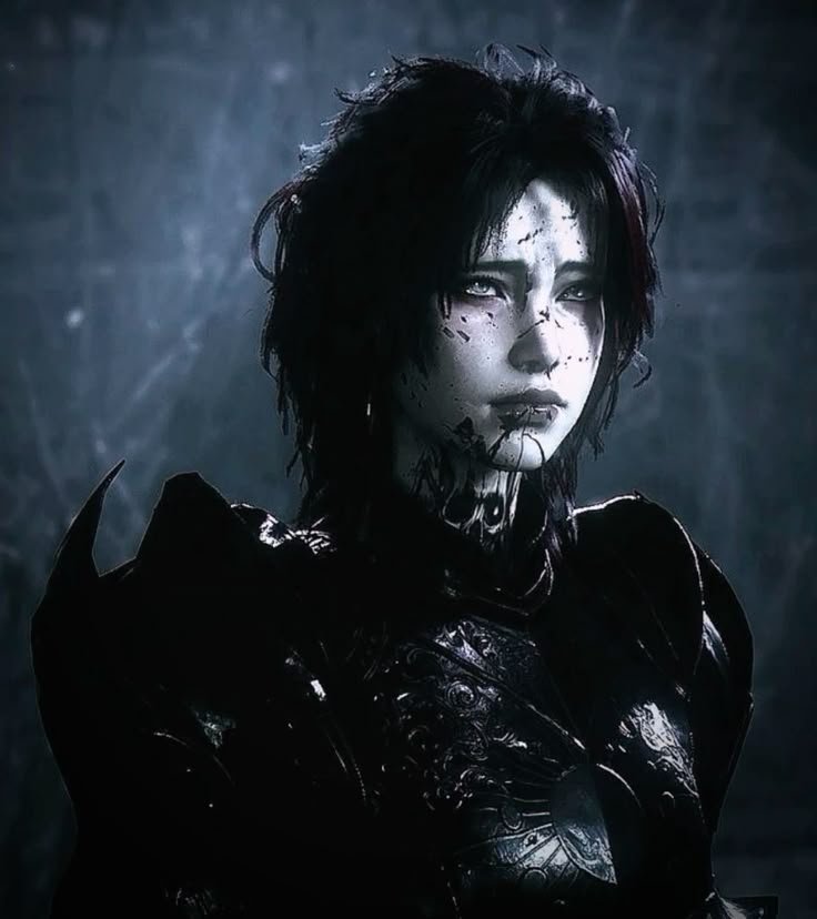
This category tends to signal confidence and detachment rather than approachability, which is why it pairs naturally with role-colored usernames in red or purple servers and with banner art that continues the same shadow-and-highlight treatment rather than switching to a lighter tone.
Funny and Meme Discord PFP
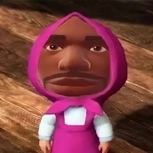
Meme PFPs exist to do one job: make someone smile mid-scroll. Reaction-image crops, exaggerated expressions, and recognizable meme templates work here specifically because Discord chat moves fast a funny avatar gets noticed in the split second someone’s eyes pass over the message list, which a subtle or moody image can’t compete with.
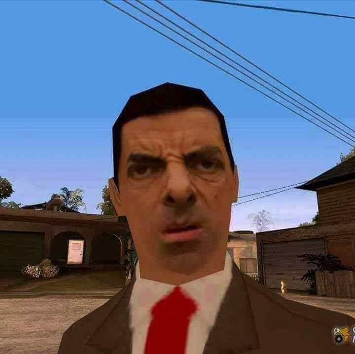
Goofy character poses from niche fandoms perform surprisingly well in this category, not despite being niche but because of it a silly, exaggerated pose from a smaller fandom signals “I don’t take this too seriously” in a way an overused mainstream meme format no longer does. The humor lands because it’s slightly unexpected rather than instantly recognized by everyone.
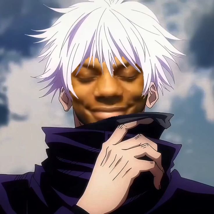
This is also the one category where low image quality is sometimes a feature rather than a flaw deliberately compressed, low-res, or deep-fried meme edits read as intentional irony rather than a mistake, which is the opposite of every other section in this guide.
“For a pop-culture spin on this category, our Michael Jackson PFP collection has plenty of personality-driven picks.”
Matching Discord PFP
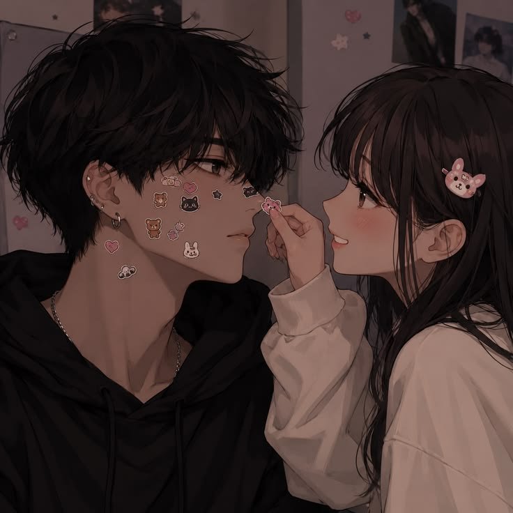
Matching PFPs split-image sets designed to pair with a friend, partner, or group’s avatars are one of the more social-specific categories on Discord, since the appeal only works if both people are visible in the same server or friends list. Split-character duos, mirrored poses, and complementary color palettes (one warm-toned, one cool-toned from the same scene) are the dominant format.
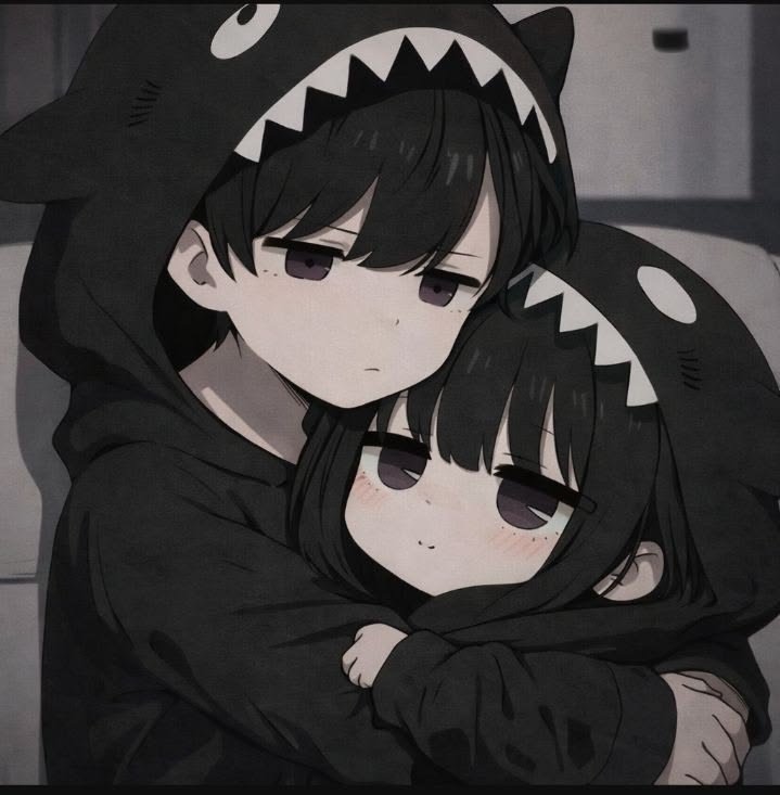
Couple sets built from a single source image split into two crops are especially popular because they guarantee visual consistency without either person needing separate art. Friend-group sets extend the same idea to three or four people, usually built from characters in a shared anime, game, or franchise so the connection reads immediately to anyone who recognizes the source.
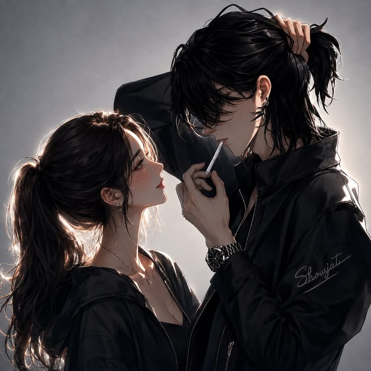
The format only works well if both halves stay recognizable independently a matching set that only makes sense side-by-side loses its point the moment one person changes servers or the other updates their PFP first.
For Boys Discord PFP
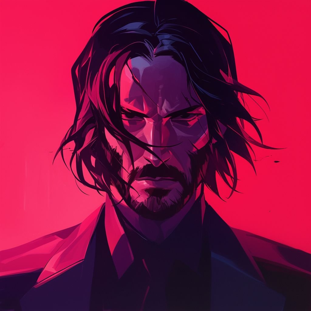
There’s a genuine, searchable gendered lean in this category, distinct from the “cool” and “gaming” umbrellas it sometimes overlaps with. Boy-tagged Discord PFPs skew toward bolder outlines, darker or more saturated palettes, and characters shown in more dynamic or action-oriented poses rather than quiet portrait crops.
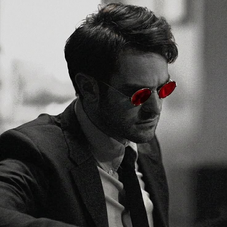
Attitude-forward looks hooded figures, streetwear-coded characters, and bape or hype-brand-influenced edits show up consistently in this search pattern, often carried over from broader messaging-app avatar trends rather than being unique to Discord. The throughline is confidence conveyed through pose and styling rather than expression alone.
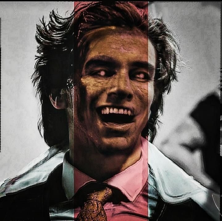
This category overlaps heavily with gaming and cool PFPs but isn’t identical to either the defining trait is a slightly harder visual edge (sharper linework, less pastel, more contrast) rather than a specific subject matter.
For Girls Discord PFP
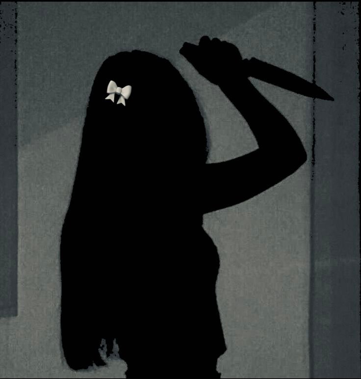
The girl-tagged side of this search pattern skews toward softer color work and more expressive close-up framing, but “soft” doesn’t mean low-effort detailed hair rendering, layered lighting, and carefully chosen accent colors (a single lip color, a hair ribbon, painted nails) do a lot of the visual work in a small crop.
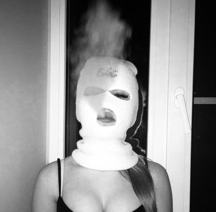
Y2K-influenced editing has become a defining thread here: glossy highlights, chrome or holographic accents, and slightly oversaturated pinks and blues pulled from early-2000s digital photography aesthetics rather than traditional pastel softness. It reads as more assertive than classic “cute” PFPs while staying warm rather than harsh.
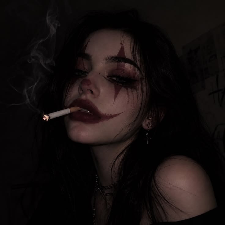
As with the boys’ category, this isn’t a rigid rulebook plenty of girl-tagged PFPs lean dark, gothic, or minimal instead. The consistent thread in search behavior is close, expressive framing rather than any single color story.
Discord PFP for Your Discord Profile
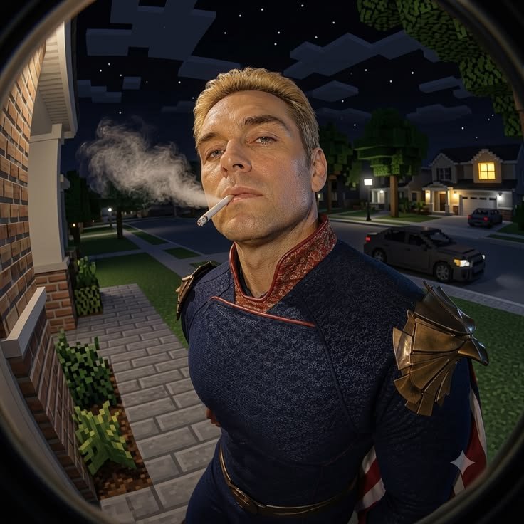
Most Discord PFP roundups stop at “pick an image,” but Discord’s own profile system now does more than just crop your avatar into a circle and almost none of the top-ranking guides for this topic actually cover it. Avatar decorations (frames that sit around your PFP, available through Discord Nitro or select promotions) change how your avatar reads even before anyone opens your profile card, so a busy decoration frame can clash badly with a detailed PFP underneath it.
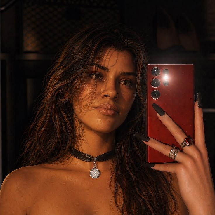
Per-server avatars are the bigger overlooked feature: Discord lets you set a different profile picture for individual servers, separate from your global avatar. That means your “gaming server PFP” and your “study server PFP” don’t have to be the same image, and picking styles from different sections of this guide for different servers is a completely normal way to use the feature rather than a compromise.
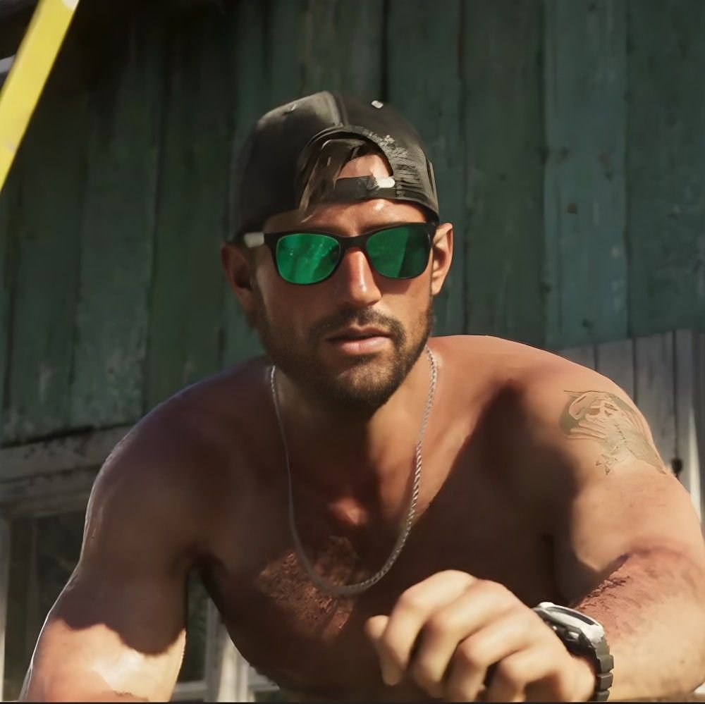
Your PFP also sits directly beside your status indicator the small colored dot showing online, idle, do not disturb, or offline and inside a colored ring if you’re in a voice channel. High-contrast PFPs stay legible against all four status colors; a PFP that’s mostly green, red, or gray specifically can visually blend into its own status dot at small sizes, which is worth checking before you commit to an avatar.
Pinterest Discord PFP
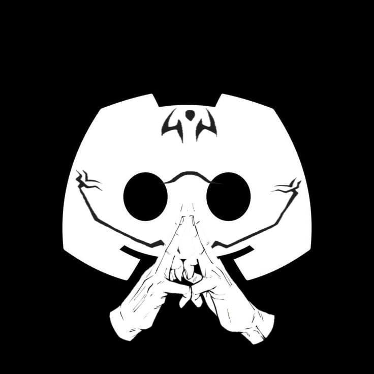
Pinterest functions as the discovery engine for this entire category rather than a platform you post a finished PFP to people build boards of dozens of candidate images before ever changing their Discord avatar. That board-based browsing habit is why Pinterest-sourced Discord PFP collections tend to include full, uncropped images rather than pre-cropped circles: pinners want to see the whole composition before deciding how it’ll crop.
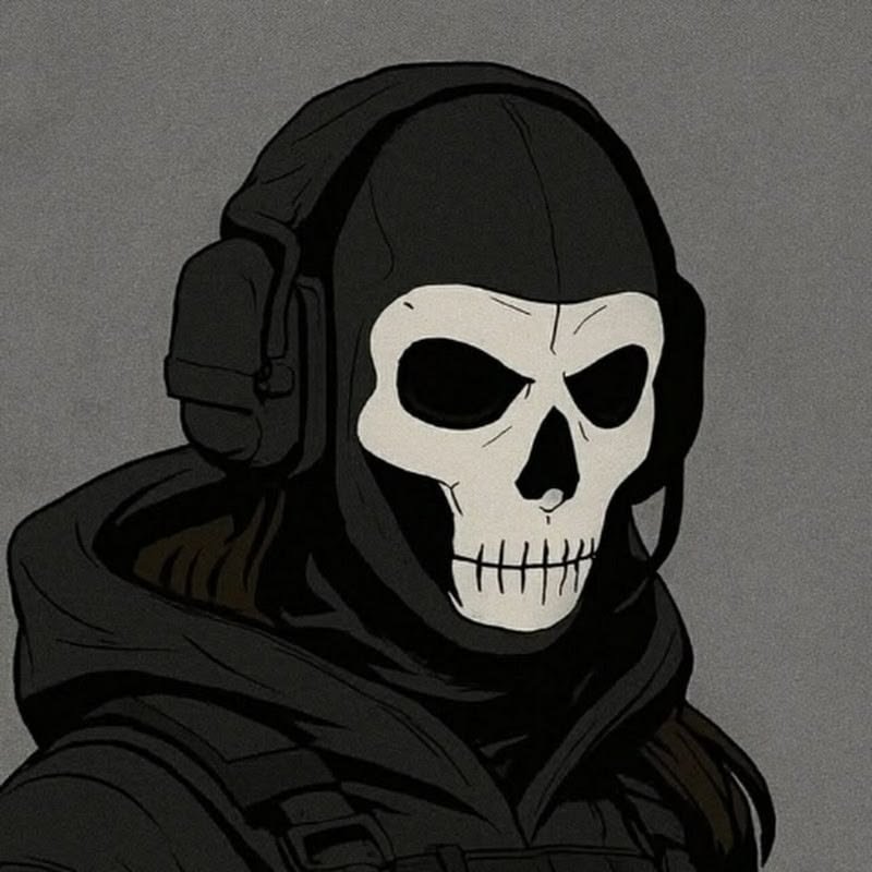
Wallpaper-style images ones with generous background space around the subject perform disproportionately well on Pinterest specifically because they double as phone wallpapers, letting someone match their lock screen to their new Discord avatar without needing two separate images. That dual-purpose framing barely matters on other platforms but is a defining feature of Pinterest search behavior for this topic.
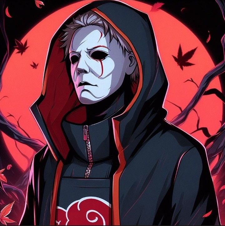
Because Pinterest results skew toward “moodboard” style, the platform is also where matching and couple PFP sets get discovered most often a single pin showing both halves of a split image tends to outperform posting either half individually.
Instagram Discord PFP
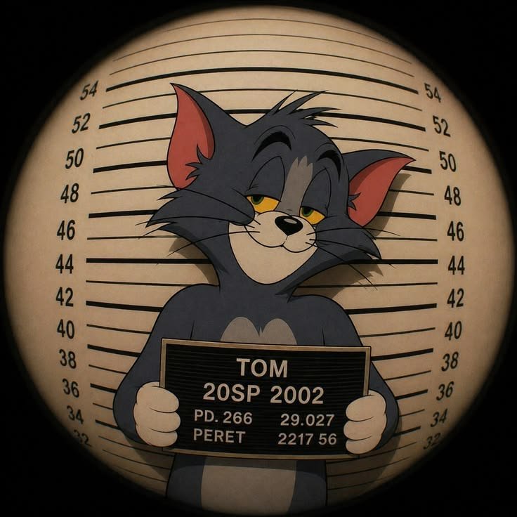
Instagram’s role in this category is almost entirely about coordination rather than discovery. People search “Discord PFP for Instagram” when they want one image, or a matching set, that works across both platforms without looking out of place in either which means the image needs to survive both Discord’s circular crop and Instagram’s story ring and grid thumbnail.
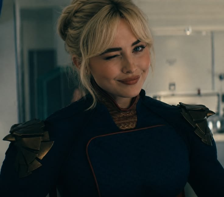
The story ring specifically crops tighter and more aggressively than Discord’s chat avatar does, so a PFP with detail near the edges (a wide hairstyle, a two-character composition) that reads fine on Discord can lose its most important element in an Instagram story preview. Centering the subject with extra margin solves this for both platforms at once.
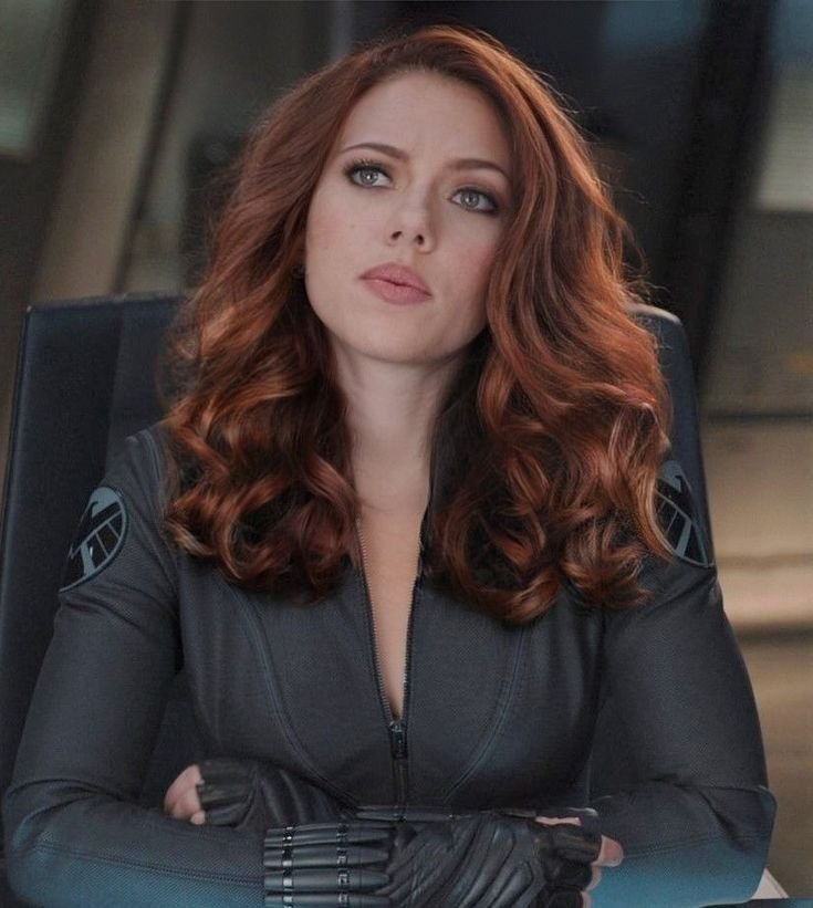
Grid coordination is the other Instagram-specific factor: because a profile picture sits above a whole feed, people choosing a Discord PFP that will also represent them on Instagram tend to pick colors that won’t clash with their existing grid, which isn’t a consideration on Discord at all.
HD/4K Discord PFP
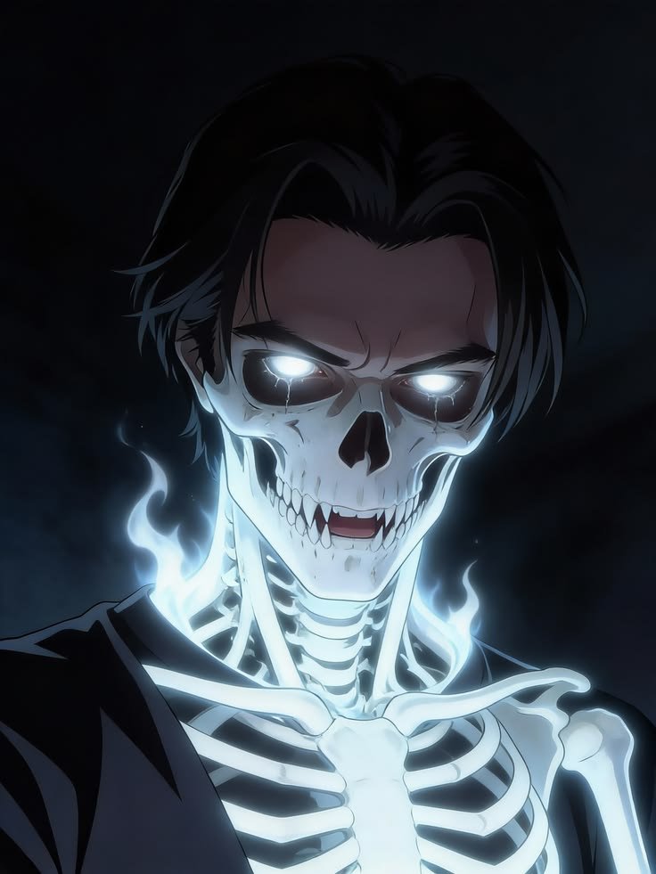
High-resolution source images matter more for Discord than the platform’s tiny 128×128 display size would suggest, because Discord actually stores avatars up to 1024×1024 and will use that larger file anywhere the UI shows an expanded profile card, not just the chat-sized circle. A low-resolution source image looks fine shrunk down but turns visibly soft the moment someone clicks your username to view your full profile.
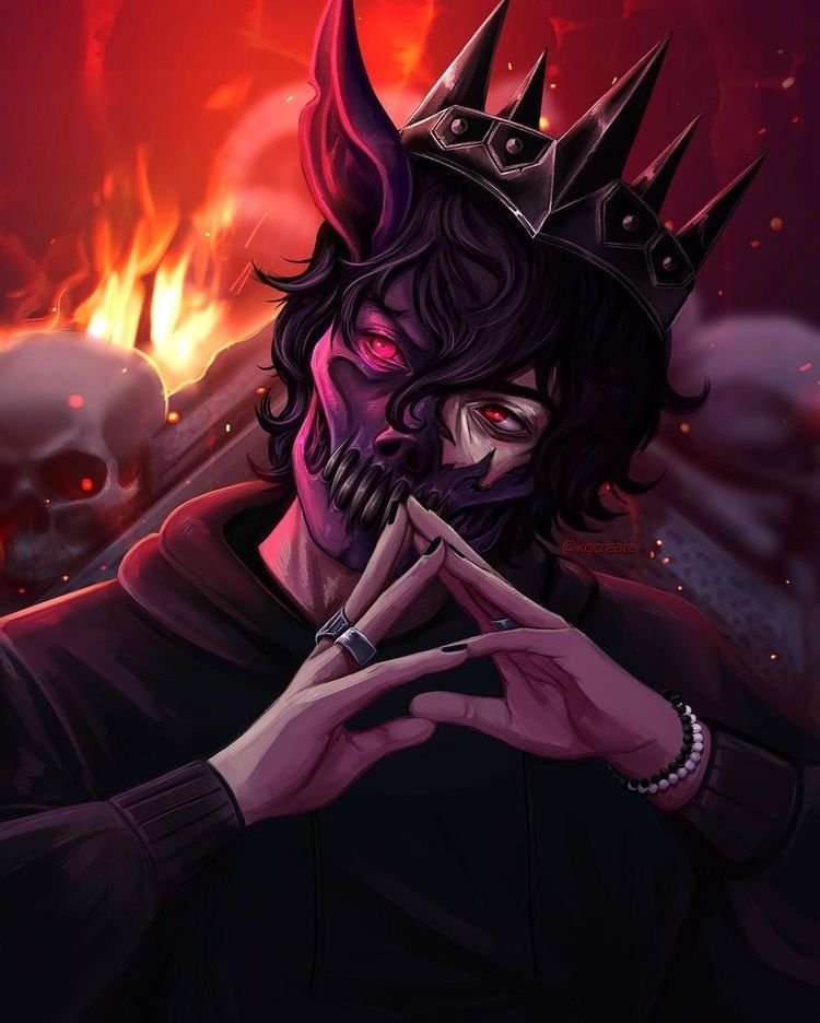
HD sourcing also matters for people who reuse the same PFP as a banner element or in server art an upscaled or genuinely high-resolution file holds up under that reuse in a way a screenshot-quality image doesn’t. Clean edges and true color depth (rather than compression artifacts) are the two most common failure points when people grab an image straight from a small thumbnail instead of the original source.
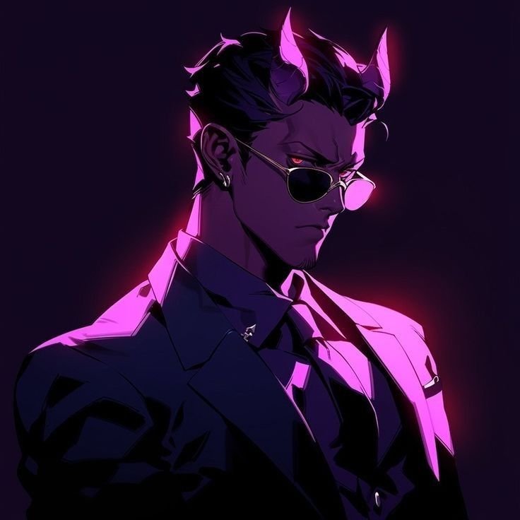
For anime and illustrated PFPs specifically, 4K sourcing often comes from official key art or high-resolution episode frames rather than fan edits, which also tends to avoid the compression banding that shows up in re-shared, re-compressed images that have circulated online for years.
“For high-resolution, cinematic key art in this style, see our Grand Theft Auto VI PFP collection.”
Wallpaper Discord PFP
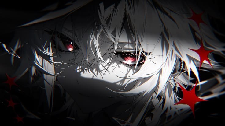
The “wallpaper” search pattern for Discord PFPs is distinct from HD/4K in what it’s actually solving: people aren’t just looking for a sharp image, they’re looking for a coordinated pair one crop for the small circular avatar and a wider version of the same artwork for a phone or desktop background. Full-scene compositions with the main subject positioned to one side work best for this, since that layout crops cleanly into a centered avatar while still working as a full-width wallpaper.
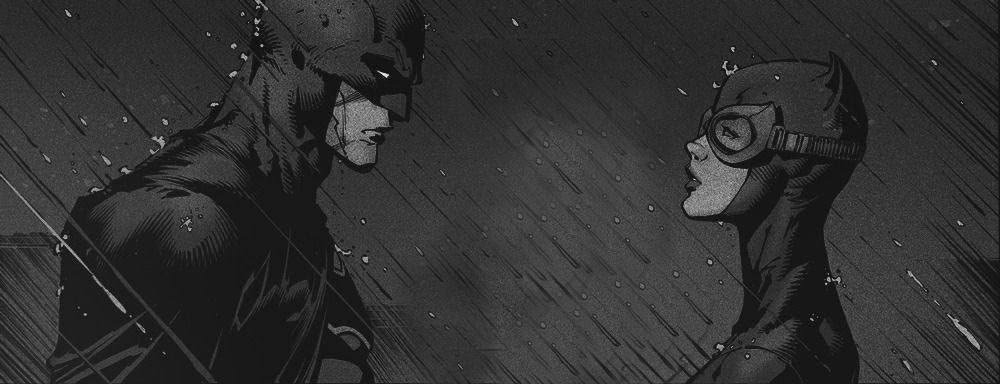
This is where background matters most out of every category in this guide. A PFP crop can get away with a plain or blurred background because it disappears at small size, but a wallpaper version of the same image needs a background that holds up at full screen size gradient skies, blurred bokeh lighting, and simple environmental scenes are the most common solutions.
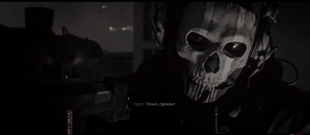
Matching PFP-and-wallpaper sets are especially popular around seasonal anime releases and game updates, when official promotional art is released in multiple aspect ratios specifically to support this use case.
How to Choose the Right Discord PFP
- Prioritize center-weighted composition. Discord crops to a circle on desktop and a square on mobile, so anything near the corners of a rectangular image gets cut off on one platform or the other.
- Check contrast against your status dot. Avoid PFPs that are dominated by green, red, or gray, since they can visually merge with the online/DND/offline indicator at chat size.
- Test it small before committing. Shrink the image to roughly 40 pixels wide on your screen — if the subject is unrecognizable, it’ll disappear in a busy chat.
- Match your banner and role color, not just your PFP. A cohesive profile (avatar, banner, and username color aligned) reads as more intentional than a striking avatar sitting next to a mismatched banner.
- Use per-server avatars instead of forcing one image everywhere. A gaming-server PFP doesn’t need to double as your study-group PFP.
- Source the highest resolution version you can find. Discord stores up to 1024×1024, and low-res images turn soft the moment someone opens your full profile.
- Keep animated PFPs simple if you’re using GIF avatars. Fast, busy motion is distracting at chat size in a way it isn’t in a larger video.
Read: Kamen Rider PFP
Read: Pokemon PFP
Read: Dante PFP
Read: Doraemon PFP
Read: Silver Surfer PFP
Frequently Asked Questions
Conclusion
A Discord PFP isn’t just a smaller version of a general profile picture it’s shaped by a very specific visual environment: dark mode, circular crops, role-colored usernames, and status dots that a generic “profile picture” guide never accounts for. Whether the pull is toward expressive anime portraits, restrained aesthetic minimalism, bold gaming key art, or a coordinated matching set with a friend, the styles that actually work share the same underlying discipline strong silhouettes, deliberate color choices, and compositions that survive being shrunk to the size of a fingertip.
The category keeps evolving alongside Discord’s own features, from per-server avatars to decoration frames, which means the “right” PFP is less about finding one perfect image and more about matching the right style to the right server, and being willing to change it as your communities do. Get that fit right, and your avatar does real work for you making you recognizable, setting a tone, and giving your online identity a shape before you’ve typed a single word.

One Comment