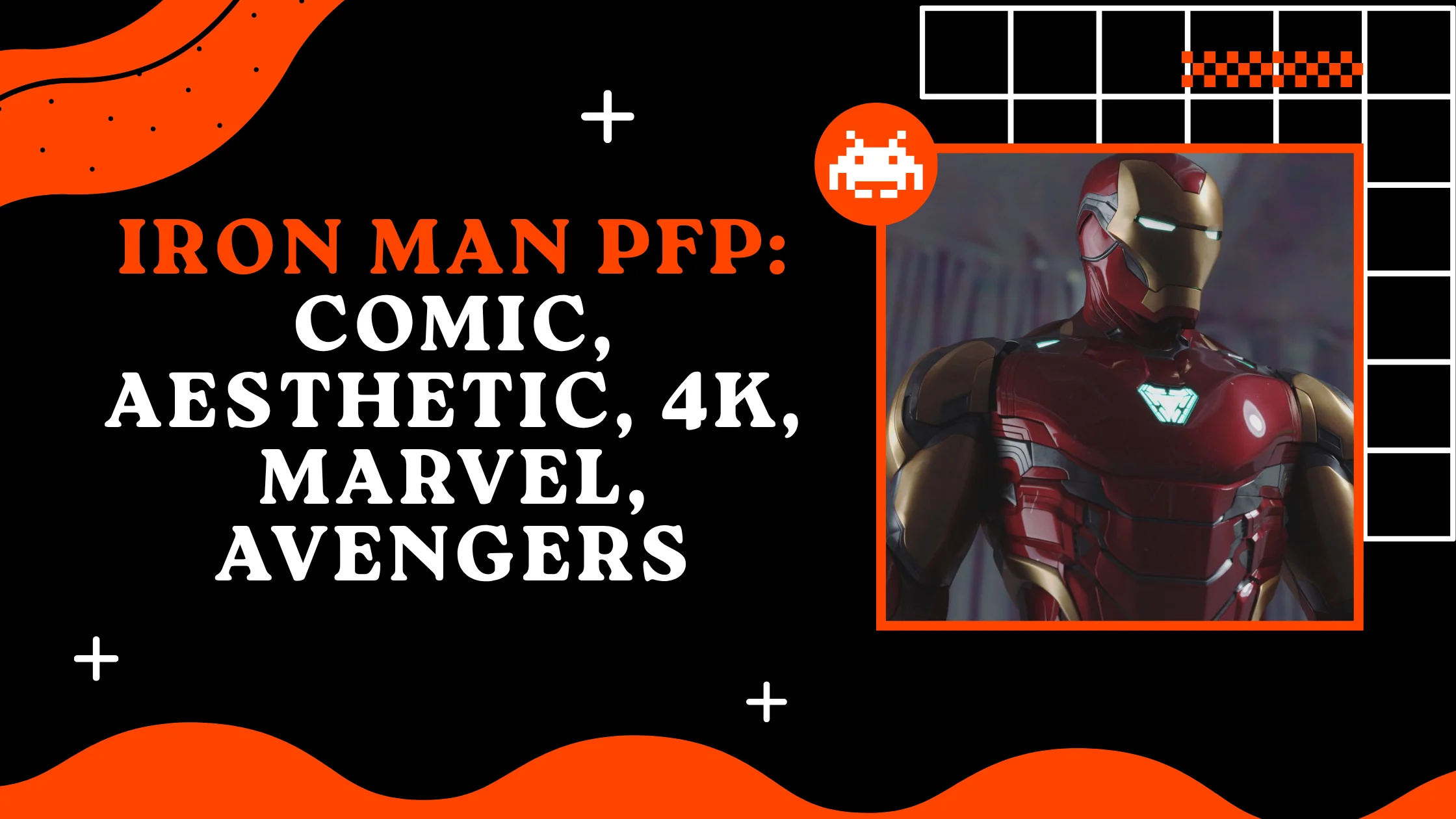
300+ Iron Man PFP: Comic, Aesthetic, 4k, Marvel, Avengers
Iron Man PFPs work because Tony Stark’s armor has always been a mask that says more about identity than it hides. Since debuting in Tales of Suspense #39 in 1963, courtesy of Stan Lee, Larry Lieber, Don Heck, and Jack Kirby, the character has embodied a very online idea decades before the internet existed: you build the version of yourself you want the world to see. A glowing arc reactor, a red-and-gold shell, a face with no expression to give away that’s not just superhero iconography, it’s the exact language profile pictures speak.
What makes Iron Man specifically strong as a PFP, rather than just “a popular superhero,” is that his design is instantly legible even in a 40-pixel circle. The faceplate’s angular, almost robotic features read clearly at avatar size in a way busier costumes don’t, and the character’s decades of redesigns mean there’s a version classic, stealth, brutal, sleek for pretty much any tone someone wants their account to project. This guide breaks down the major armors worth using, where each one performs best, and how to actually pick the right crop.
Classic Red-Gold Armor PFPs
The red-and-gold color scheme, codified through the Mark III-style armor popularized by artists like Bob Layton in the early 1980s, is the version most people picture when they hear “Iron Man.” It’s built around a two-tone palette: a deep candy-apple red as the base with gold detailing along the chest, forearms, and boots. As a PFP, this contrast does a lot of visual work red and gold sit far enough apart on the color wheel that the armor pops against nearly any background without extra editing.

The expression, or lack of one, is part of the appeal. The faceplate’s narrow triangular eye slits give off calm authority rather than aggression, which is why this version tends to read as “confident” more than “intimidating.” Lighting tends to favor a single source hitting the chest-mounted arc reactor, letting that circular glow act as a natural focal point that draws the eye immediately, even in a tiny frame.
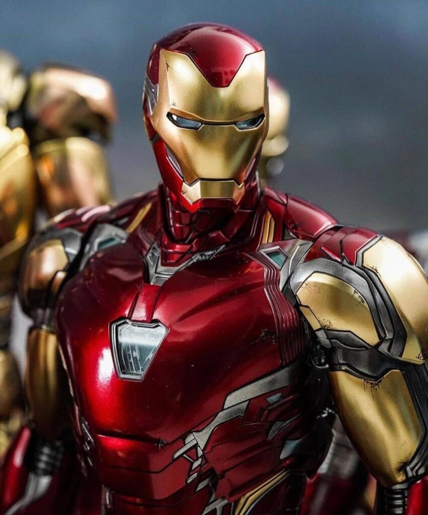
This is the safest starting point for most users because it’s unmistakably Iron Man without requiring context. A blurred cityscape or comic-panel background works fine, but many fans prefer solid dark backgrounds so the red-gold contrast isn’t competing with anything else. It’s the version most compatible with the widest range of platforms and audiences.
Hulkbuster Armor PFPs
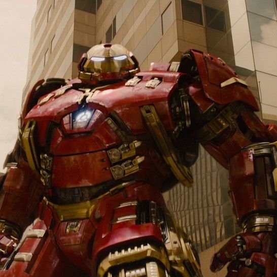
The Hulkbuster massive, boxy, built specifically to physically overpower the Hulk is the version fans reach for when they want scale rather than sleekness. Where the classic armor is streamlined, the Hulkbuster is deliberately oversized: thick plated forearms, a wider stance, and a chest unit that dwarfs the rest of the design. As a PFP it reads as raw power rather than elegance, which appeals to a different crowd than the standard suit does.
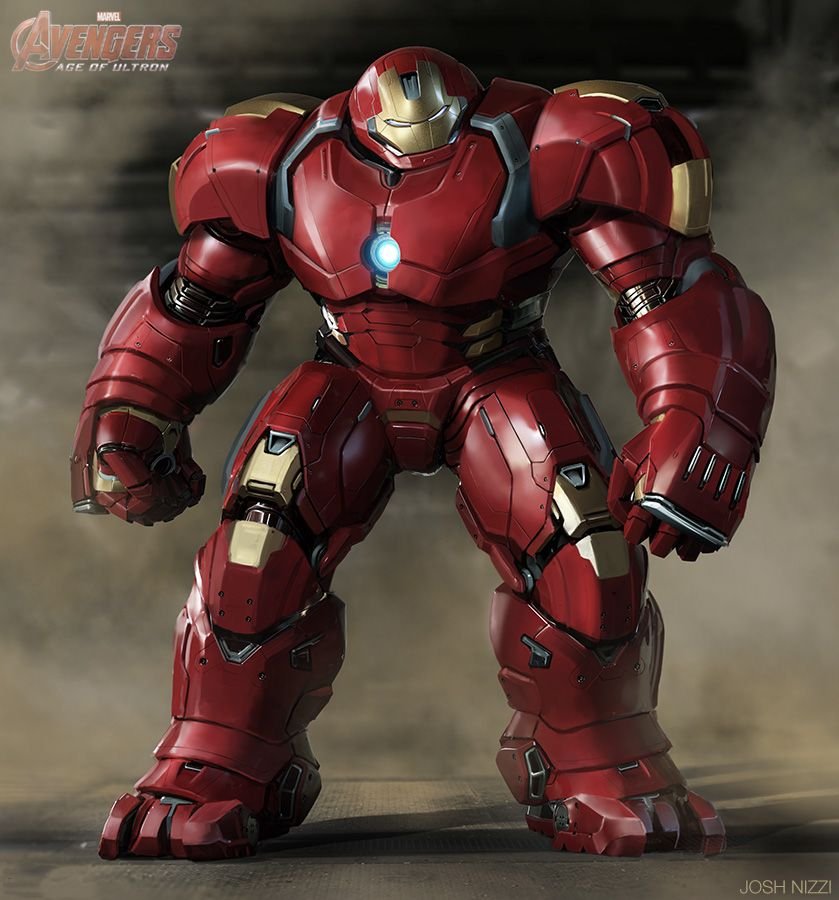
Color palette leans industrial: muted reds and grays instead of glossy red-gold, with more visible mechanical seams and rivets. That grittier finish photographs well under harsher, more directional lighting, since the added texture and shadow depth actually enhance the sense of bulk rather than flattening it the way soft lighting would. Cropping in tight on the head and shoulders is usually necessary, since the full Hulkbuster silhouette is too wide to read clearly at small sizes.
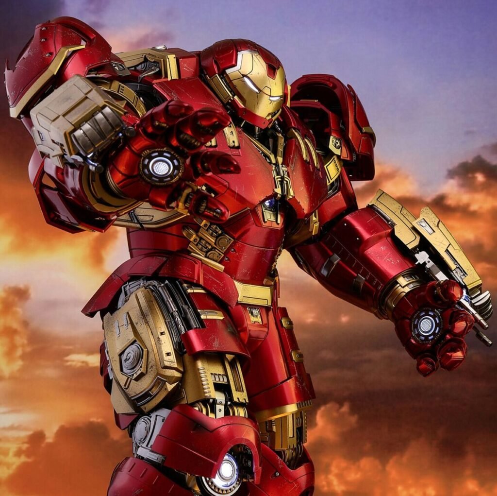
Emotionally, this armor communicates “built for a specific fight,” which resonates with fans drawn to Iron Man’s engineering-first characterization rather than his charisma. It fits accounts centered on gaming, mecha content, or general tech-and-machinery aesthetics just as comfortably as superhero fandom spaces.
Stealth Armor PFPs
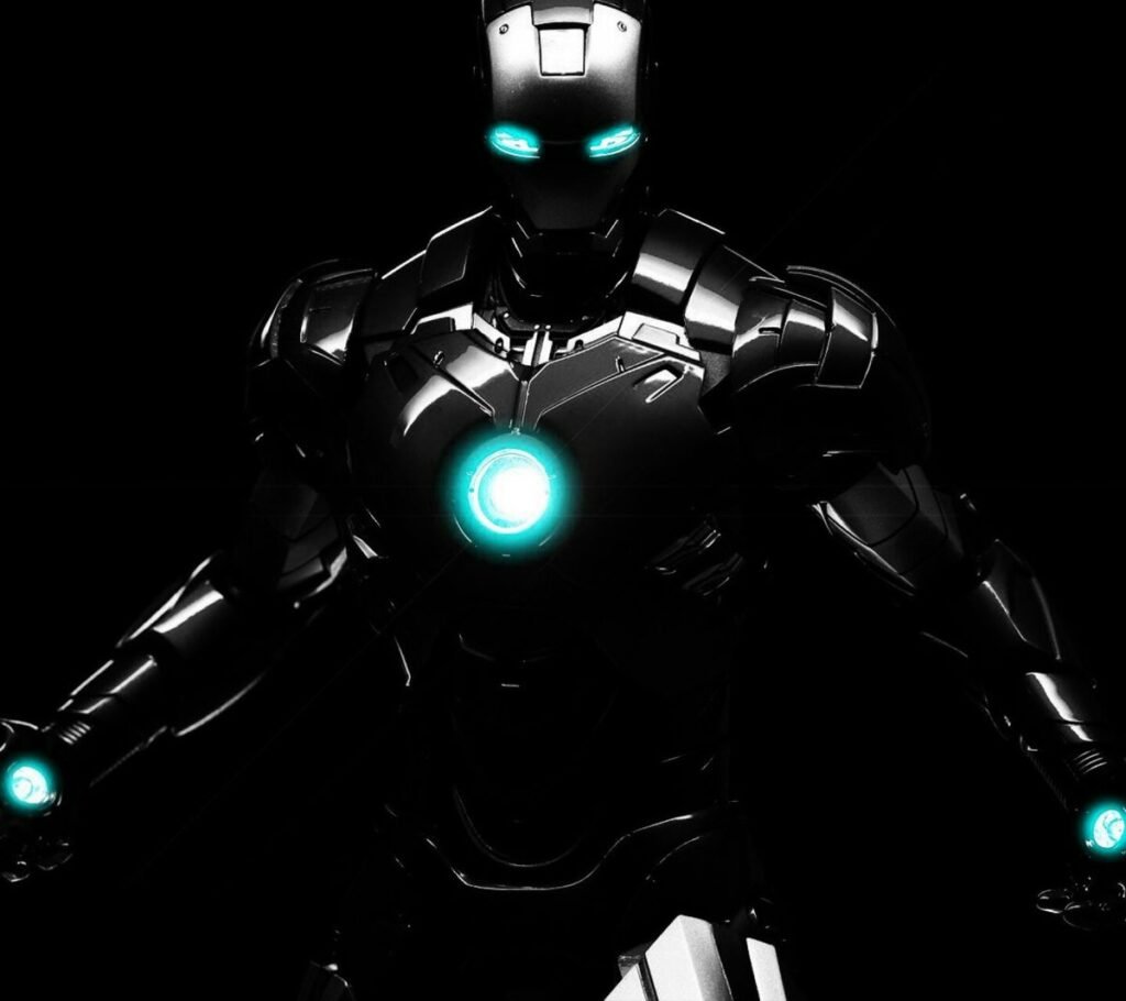
The matte-black stealth armor variant strips away the loud red-gold entirely in favor of a low-visibility palette: charcoal black with faint violet or dark-red underlighting along the same panel lines the classic suit uses. It’s a deliberate design choice within the comics an armor meant to blend in rather than announce itself and that concept translates directly into a PFP that reads as understated rather than showy.
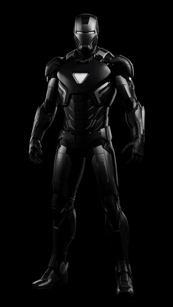
Because the palette is so dark, lighting becomes the entire story visually. A single rim light or the arc reactor’s glow against near-total blackness creates strong contrast without needing bright colors, which is exactly why this version performs well for users who want their account to feel moody or minimal rather than bold. Backgrounds should stay dark too a black or near-black backdrop lets the faint reactor glow become the only real point of visual interest.
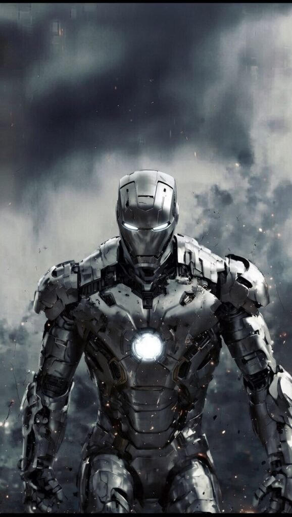
This is the version fans pick when the classic red-gold feels too “mainstream superhero” for their account’s tone. It’s a favorite in aesthetic and dark-mode-leaning PFP communities that prioritize restraint over recognizability.
Superior Iron Man PFPs
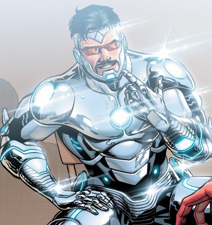
Introduced during the Superior Iron Man storyline, this white-and-gold redesign swaps the traditional red base entirely, giving Tony Stark’s armor a sleeker, almost predatory silhouette with an exposed, more angular jawline than prior suits. The story behind it Stark operating under a morally compromised version of himself gives the design an edge that fans who know the arc read into the PFP itself: it looks like Iron Man, but colder.
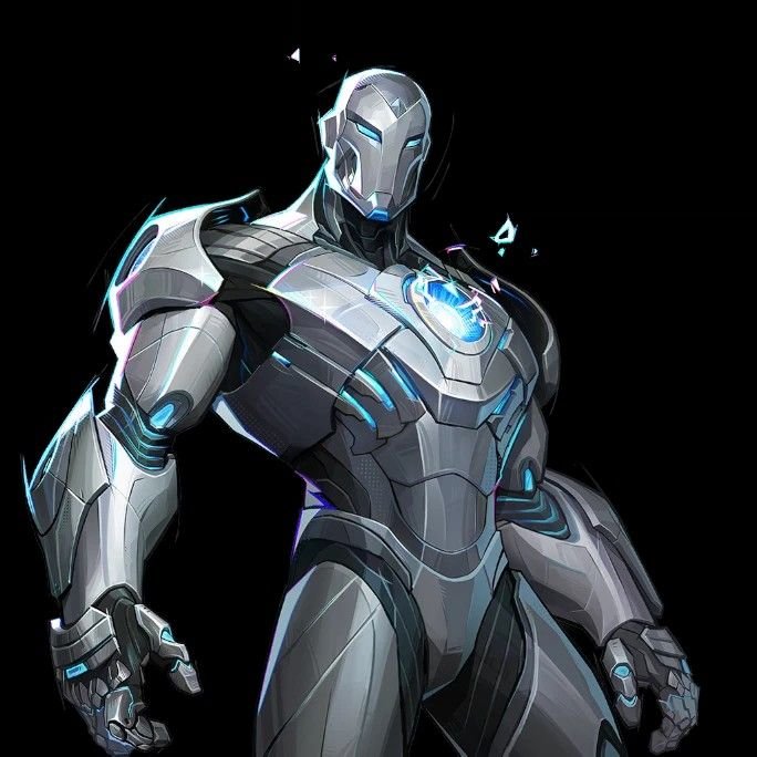
Visually, the white base means this armor behaves very differently under lighting than any red-gold version. Instead of relying on contrast between the suit and background, the white plating reflects ambient light, so soft, even lighting produces the cleanest results, while harsh single-source lighting can blow out the highlights and lose detail in the panel lines. Gold trim stays as the accent, functioning the same focal-point role the arc reactor plays elsewhere.
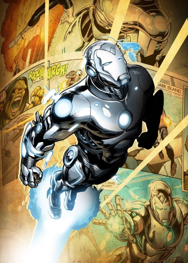
Fans of morally gray or antihero framing gravitate toward this version specifically because of its story context, making it one of the few Iron Man PFPs where the source material meaningfully shapes why someone picked it, not just how it looks.
Anime-Style Iron Man PFPs
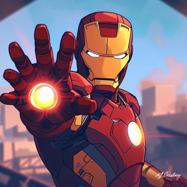
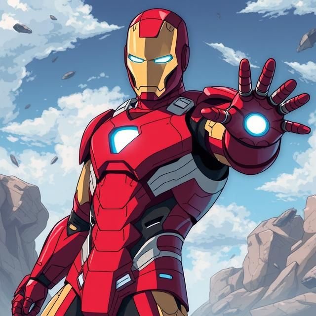
Fan-rendered anime and manga-style interpretations of Iron Man have become a steady presence in fan-art communities, translating the armor’s hard mechanical edges into cel-shaded linework and exaggerated proportions more common to shonen-style art. These pieces tend to simplify the chest and helmet geometry while emphasizing the eyes and reactor glow, since anime art styles rely heavily on expressive linework to carry emotion that Western comic art gets from shading.
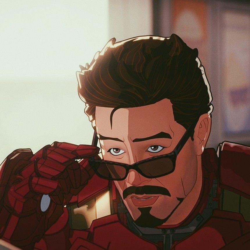
Color palettes in these pieces often push more saturated, almost neon reds and golds compared to comic-accurate versions, since anime aesthetics generally favor higher contrast and more vibrant tones. Backgrounds frequently include speed lines, energy bursts, or gradient skies rather than realistic settings, reinforcing the stylistic shift away from live-action or comic-panel realism.
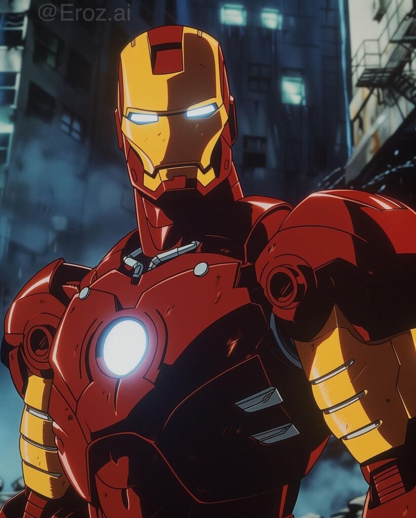
This category appeals heavily to crossover fans people active in both anime and superhero fan spaces who want an avatar that signals both fandoms at once without needing two separate accounts to do it.
Cool Iron Man PFPs
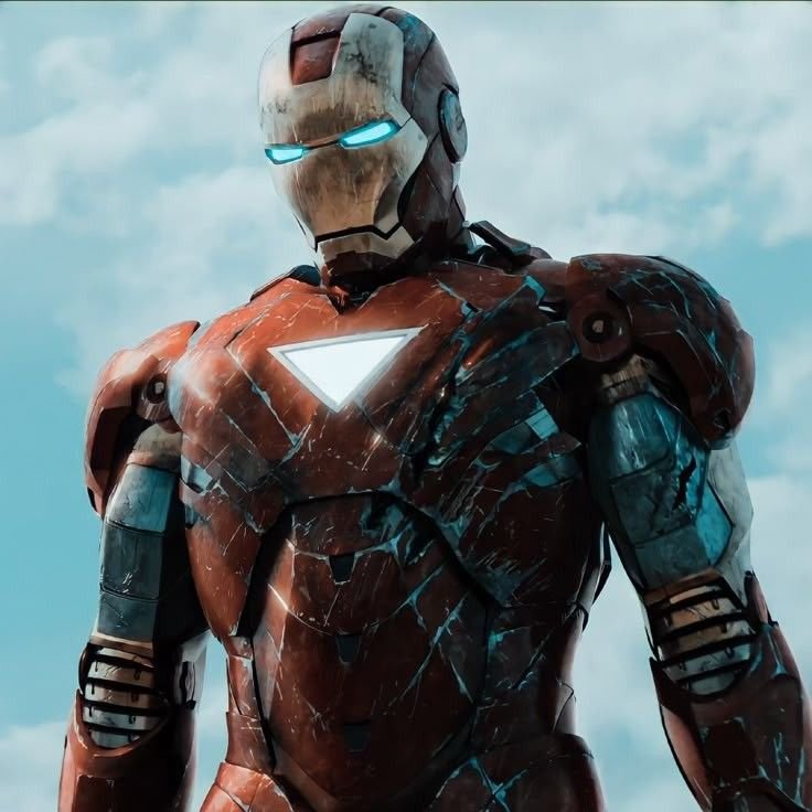
“Cool” Iron Man PFPs typically center on dynamic action poses repulsor blasts mid-fire, a three-quarter turn with the faceplate half-lit, or a low-angle shot that emphasizes the suit’s height and presence. The goal is impact rather than a calm portrait shot, so these images lean on motion blur, particle effects, and dramatic shadow play across the armor’s panel lines.
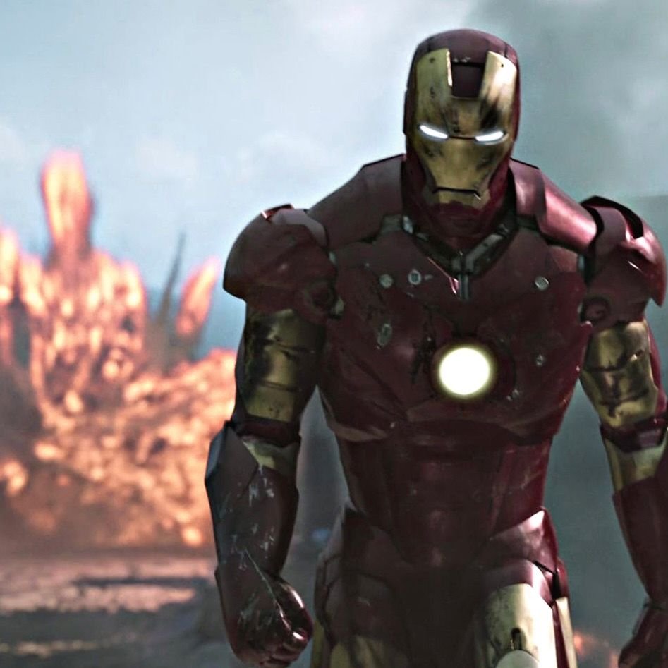
Lighting in this category is almost always high-contrast, with strong rim lighting separating the figure from a dark or blurred background. This isn’t subtle mood lighting like the stealth-armor category it’s meant to grab attention immediately, which matters more on platforms where avatars appear small and need to stand out fast. Expression, where visible, tends toward intensity rather than the classic version’s calm authority.
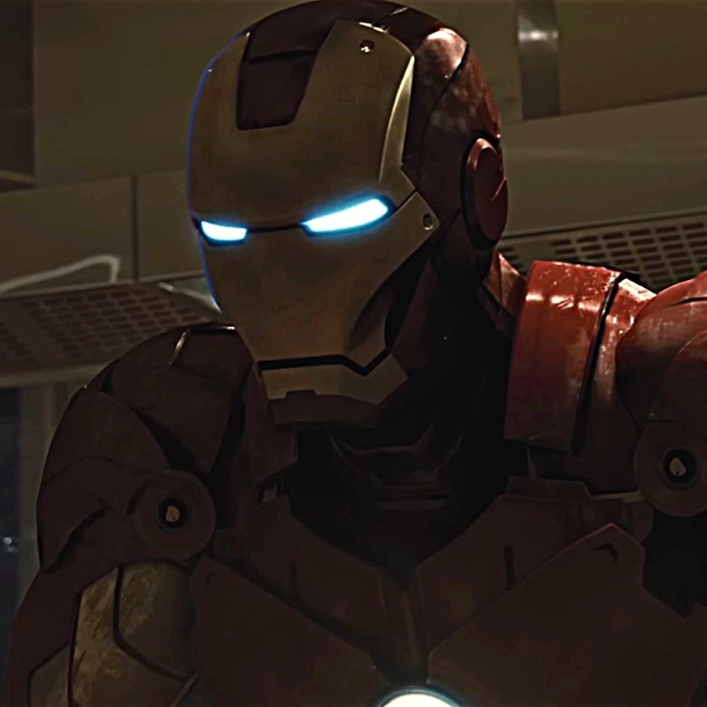
This style suits gaming profiles, esports handles, and accounts built around a more aggressive or high-energy online persona.
“Fans of commanding Marvel villains may also enjoy our Doctor Doom PFP collection.”
Cute Iron Man PFPs
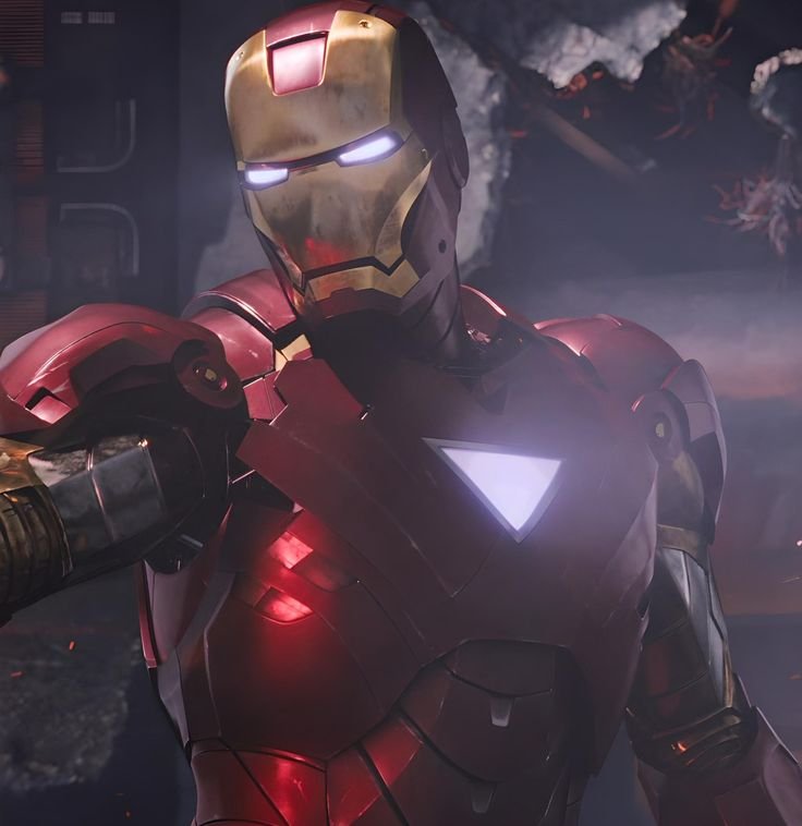
Chibi and simplified cartoon renderings of Iron Man swap the armor’s sharp angles for rounded proportions, oversized helmets, and softer color gradients. The arc reactor often becomes a bigger, more prominent design element in these pieces, since it’s an easy focal point that reads as friendly rather than technical when enlarged and softened.
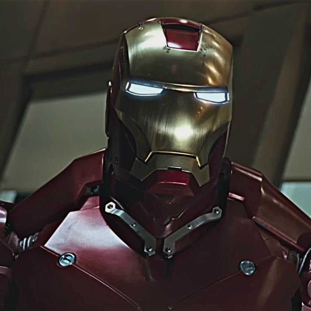
Pastel-leaning palettes are common here softer reds paired with warmer, muted golds instead of the high-shine metallic tones classic versions use. Backgrounds tend toward simple flat colors or minimal patterns rather than detailed scenes, keeping the focus entirely on the character’s simplified, approachable proportions.
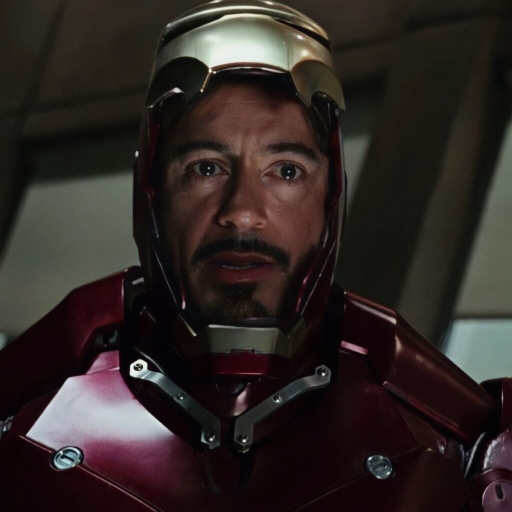
This version works well for fans who love the character but want their PFP to feel lighthearted rather than heroic or intense, and it’s a strong option for accounts that mix fandom content with more casual, everyday posting.
Funny-Meme Iron Man PFPs
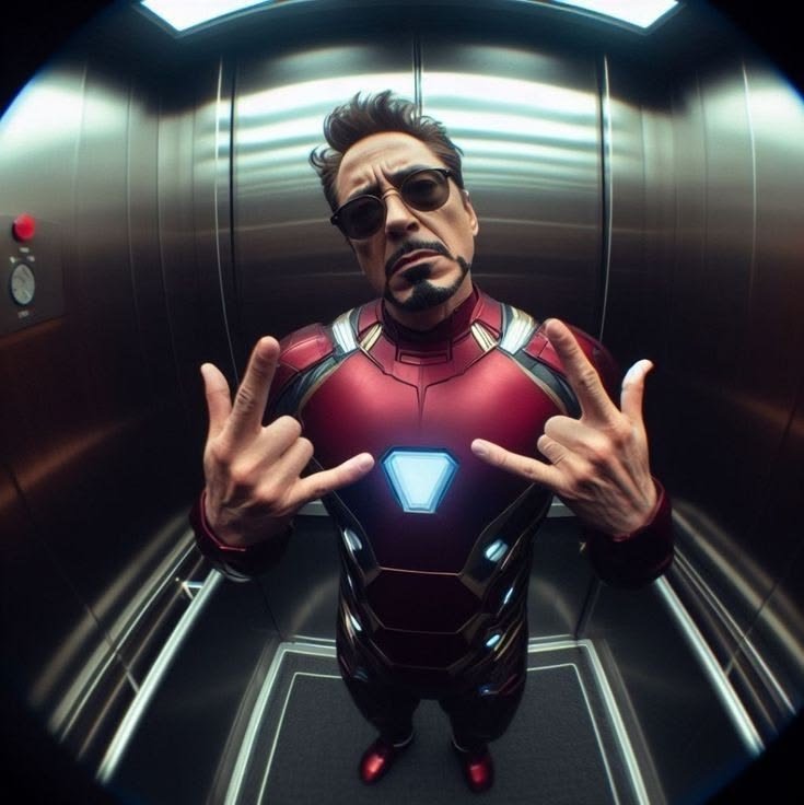
Meme-format Iron Man PFPs usually pull specific, recognizable expressions or moments often exaggerated reaction faces edited onto the armor, or stills paired with bold meme-style text overlays. Unlike the other categories, visual consistency with “accurate” armor detail matters less here than instant recognizability of the joke or reference itself.
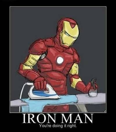
These images often use flatter, more saturated colors and heavier outline work so the image reads clearly even when compressed by platform algorithms, since memes get shared and re-uploaded repeatedly, losing quality each time. Cropping is usually tighter on the face than any other category, since the joke typically depends on a specific expression being visible.
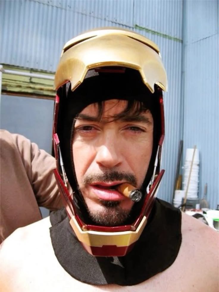
This category thrives in Discord servers and group chats where a shared sense of humor matters more than a polished aesthetic, making it one of the more community-specific PFP styles rather than a general fandom choice.
HD & 4K Iron Man PFPs
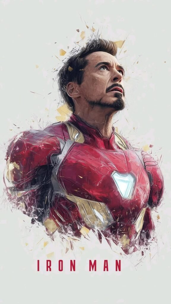
High-resolution renders whether sourced from official promotional art, high-quality fan renders, or upscaled comic art matter specifically because avatars get scaled down aggressively by most platforms, and low-resolution source images turn muddy or pixelated once compressed. Starting from a genuinely high-resolution file preserves fine detail like panel line etching and reactor glow gradients that a compressed image would flatten into a blur.
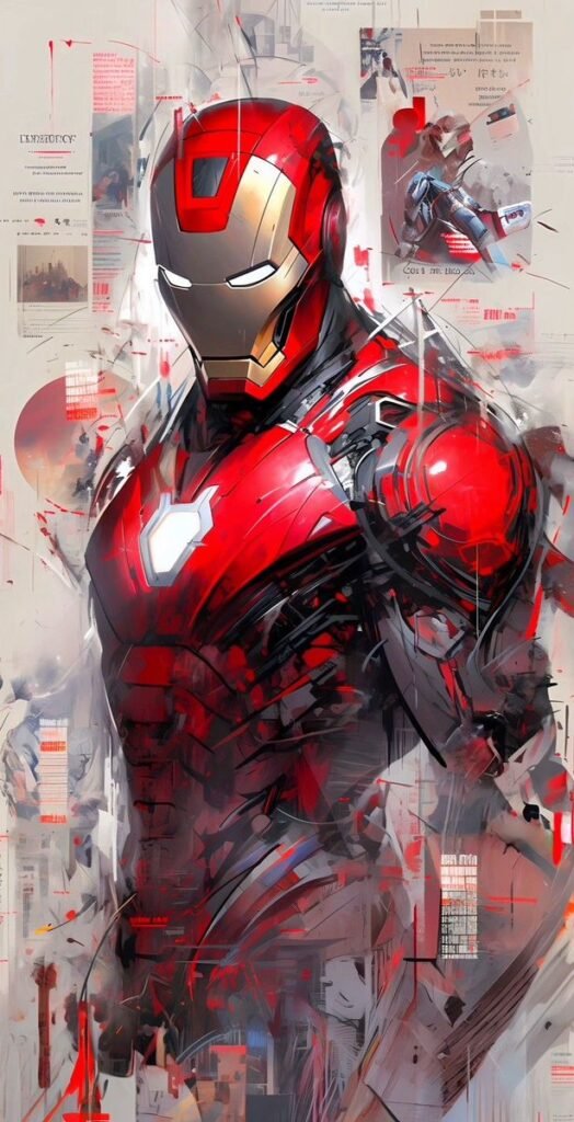
Color accuracy tends to be stronger in these versions too, since high-res sources typically come from official art with properly calibrated color grading rather than screenshots or heavily compressed fan uploads. Backgrounds in HD renders can afford more detail and depth without becoming visually muddy, since the resolution supports it.
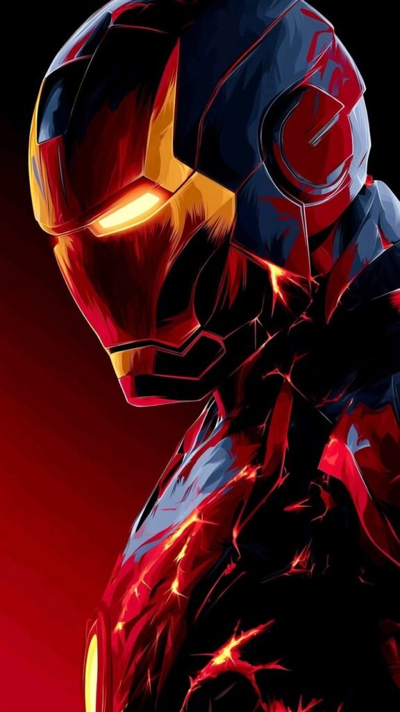
This category isn’t really its own “look” so much as a quality tier that applies across every other style listed here, and it’s worth prioritizing regardless of which specific armor or art style someone picks.
“For more armored, tech-driven avatars, browse our Batman PFP collection.”
Discord Iron Man PFPs
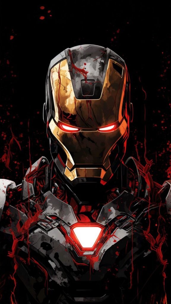
Discord’s small circular avatar crop, positioned right next to a colored status indicator and often a role-color username, changes what actually reads well compared to a square or rectangular image. Because the crop clips the corners of any square source image, centering the reactor glow or faceplate dead-center in the frame matters more here than on flatter platforms, since anything pushed toward the edges risks getting cut off entirely.
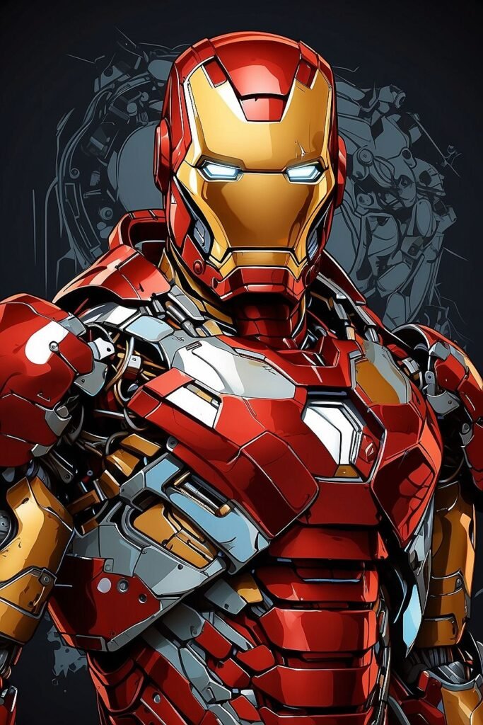
Server banner pairing is also a real consideration for Discord specifically many fan servers use matching Iron Man banners or theme colors, so a red-gold classic-armor avatar tends to blend more cohesively into a Marvel-themed server’s visual identity than a mismatched palette would. Stealth or Superior Iron Man versions can clash visually against a bright red-gold server banner if the two aren’t chosen with each other in mind.
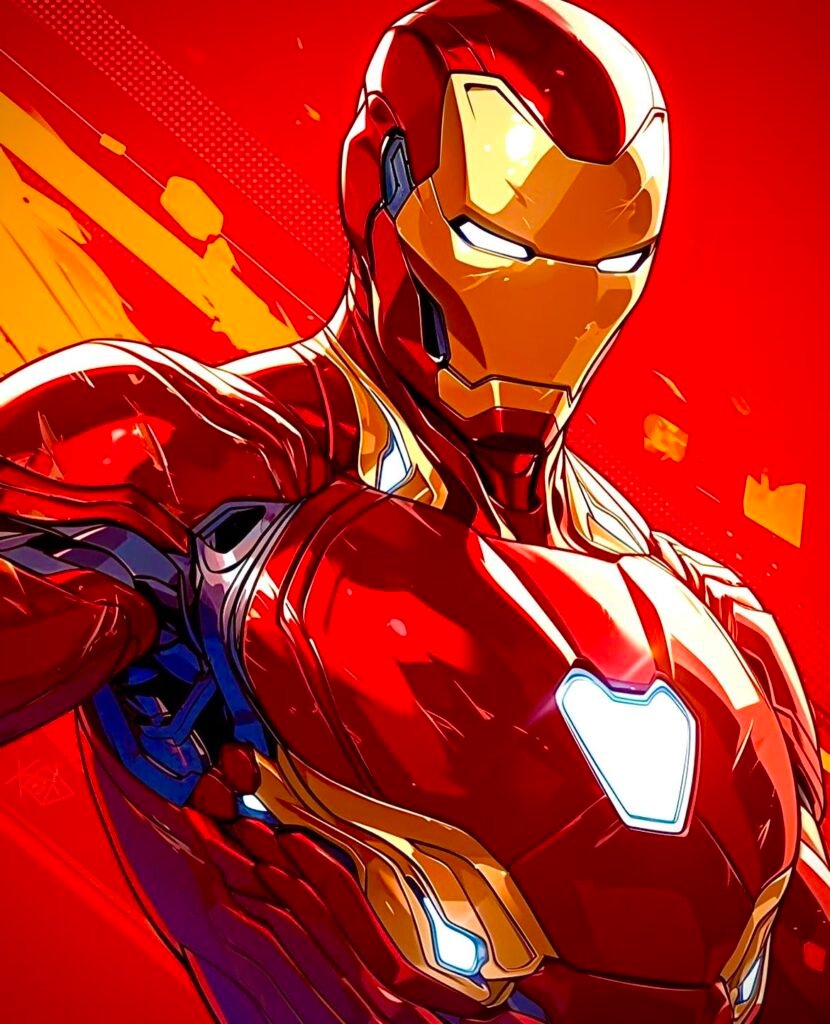
Given how small the circular crop renders next to chat messages, high-contrast versions classic red-gold or cool/action-pose renders tend to hold up better than subtler stealth-armor images, which can lose their moody lighting effect entirely at that size.
TikTok Iron Man PFPs
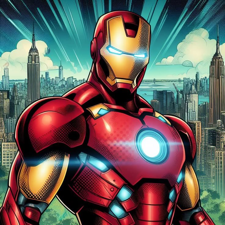
TikTok avatars sit in a uniquely cluttered visual environment small circular thumbnails next to usernames, positioned above fast-scrolling comment sections and duet or stitch previews where dozens of other avatars appear in a grid simultaneously. Standing out in that grid matters more here than almost anywhere else, which pushes high-contrast, high-saturation versions like the anime-style or cool/action renders ahead of subtler options.
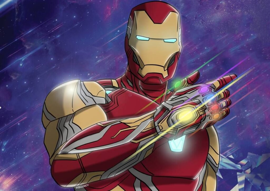
Because TikTok users scroll extremely fast, an avatar needs to register in a fraction of a second rather than reward a longer look. Simpler silhouettes a clean faceplate shot rather than a busy action scene tend to perform better here specifically because complexity gets lost at scroll speed, not because it looks worse up close.
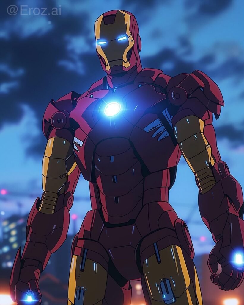
This is one of the few platforms where the “cute” or chibi-style Iron Man renders genuinely compete with the more dramatic options, since their bold, simplified shapes are also built for fast recognition.
Instagram Iron Man PFPs
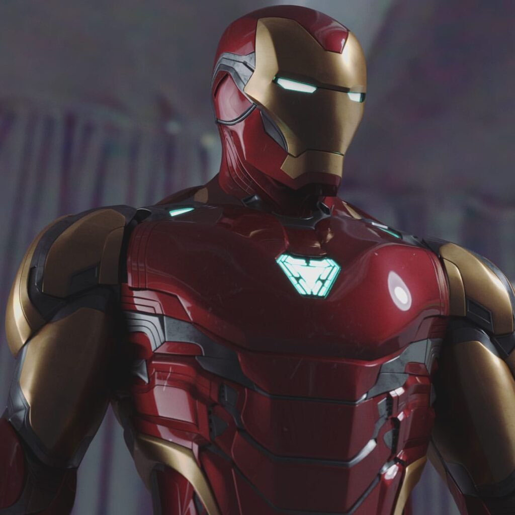
Instagram wraps every avatar in a colored story ring whenever the user has an active story, which interacts directly with the armor’s own color palette. A classic red-gold Iron Man avatar sits comfortably inside Instagram’s typical gradient story ring, while a stealth-black or white Superior Iron Man version creates a starker, more deliberate contrast against it something worth choosing intentionally rather than by accident.
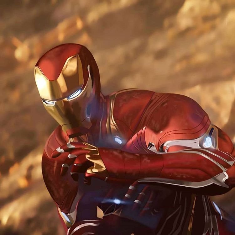
Grid and feed color coordination matters more on Instagram than almost any other platform, since the avatar appears repeatedly beside a curated grid of photos. Users running Marvel-fan or cosplay-adjacent accounts often pick an Iron Man variant whose dominant color echoes their overall feed palette, making the profile picture feel like an extension of the grid rather than a separate element competing with it.
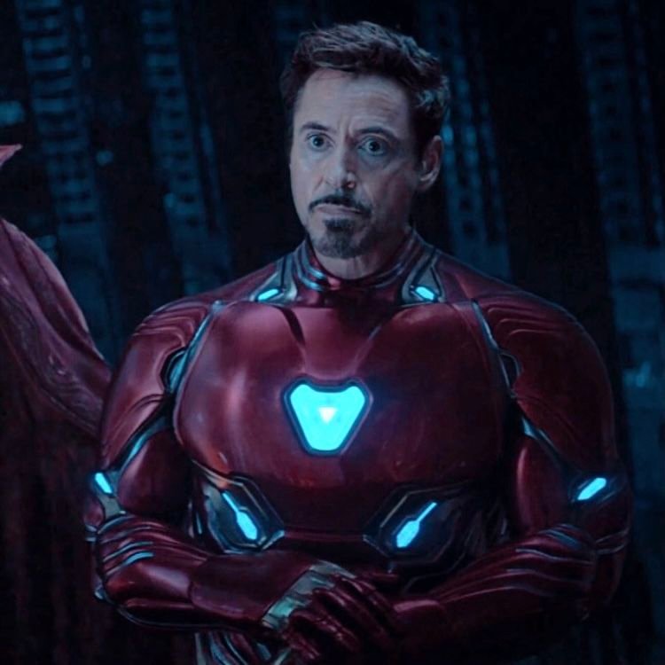
Because Instagram avatars display slightly larger than Discord’s, more detailed renders — including HD comic art or anime-style pieces — hold up better here than they would in Discord’s smaller frame.
Pinterest Iron Man PFPs
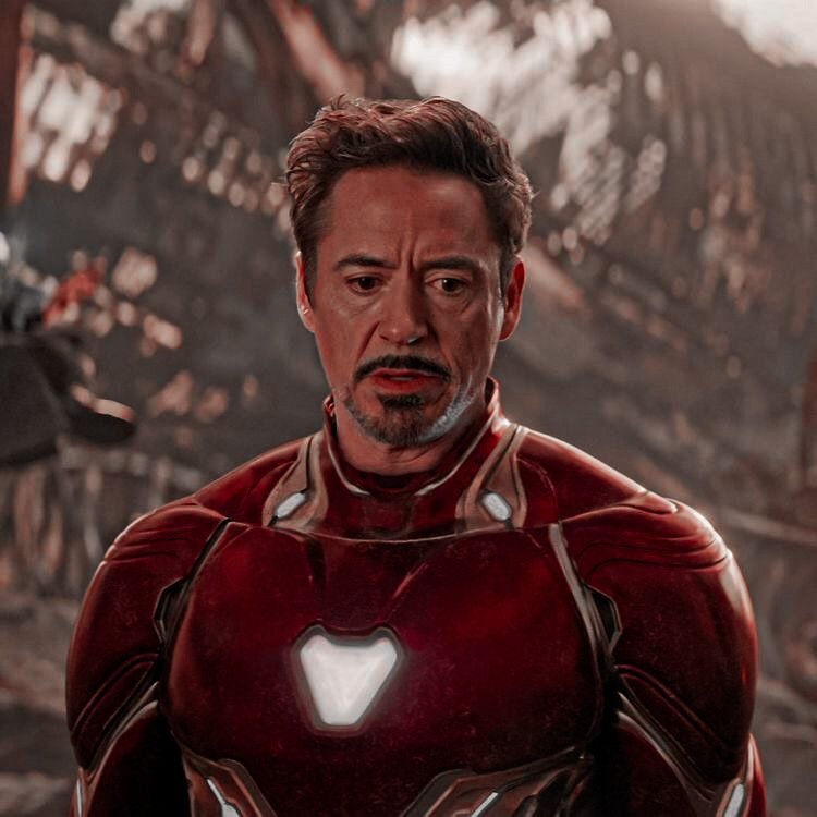
Pinterest functions differently from every other platform on this list because discovery happens through boards, not a social feed built around the avatar itself. That shifts what “works” as a PFP: rather than needing instant recognizability at tiny scroll speed, Pinterest users curating Iron Man boards often favor full, uncropped wallpaper-style images as their profile picture, since the platform’s culture leans toward treating the avatar as another piece of collected art rather than a purely functional identifier.
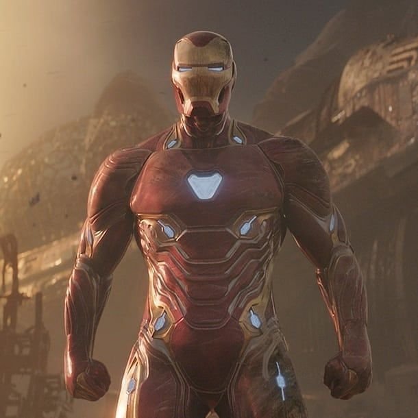
Because of this, detailed HD renders, full-body armor shots, and even multi-armor group images tend to perform better here than the tightly cropped, face-focused versions that dominate faster-scrolling platforms. Color palette matters less for instant contrast and more for how well the image fits thematically alongside whatever other Iron Man or Marvel content the user is pinning and organizing.
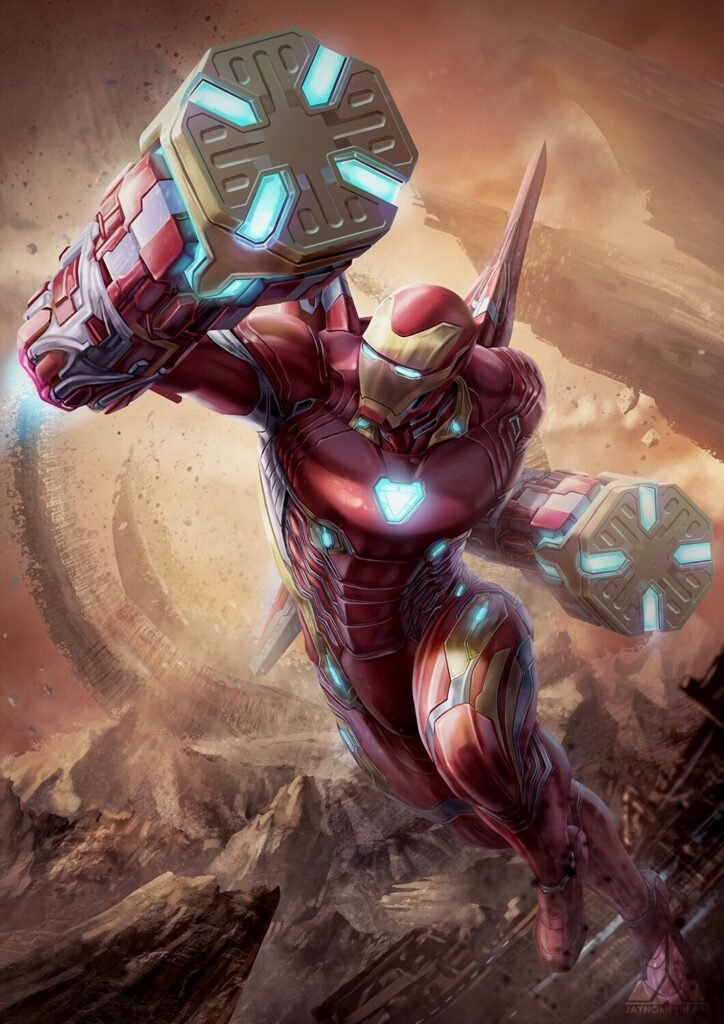
This makes Pinterest one of the more flexible platforms for PFP choice, since the avatar functions more like a mood-board anchor than a functional identity marker.
Twitter/X Iron Man PFPs
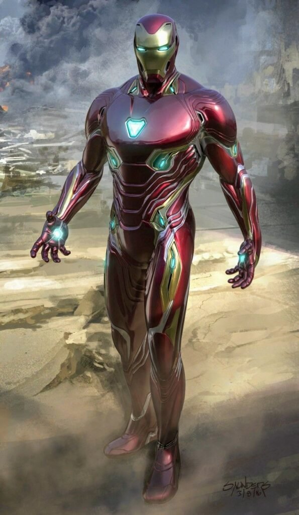
On Twitter/X, avatars sit beside dense walls of text in every reply chain, which means the image needs to remain recognizable at a glance even when it’s competing with paragraphs of surrounding content rather than other images. Reply-chain recognition — being able to identify a user’s avatar instantly while scrolling through a fast-moving thread — favors high-contrast, simple silhouettes over busy or subtly lit compositions.
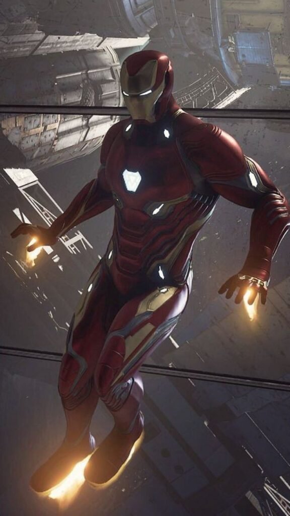
This is part of why the classic red-gold armor tends to be the most common Iron Man choice on the platform specifically: it maintains legibility surrounded by text in a way that a moody stealth-armor render, which depends on darker ambient lighting to read properly, doesn’t always manage at the platform’s smaller avatar size.
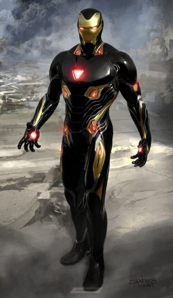
Fandom and comics-discussion accounts in particular lean toward this platform-specific legibility requirement, since a recognizable avatar helps other users track a specific poster across long, fast-moving reply threads.
Matching Couple Iron Man PFPs
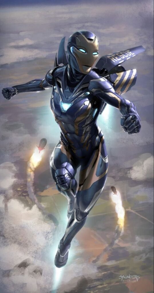
Iron Man pairs most commonly with Pepper Potts in her Rescue armor for matching-PFP sets, since Rescue’s design deliberately echoes Iron Man’s own red-gold palette and panel styling while remaining visually distinct enough that the two avatars read as a clear set rather than duplicates. Some fans also pair a classic Iron Man render with a War Machine-style gray-and-black armor for a “team” rather than “romantic” matching set.
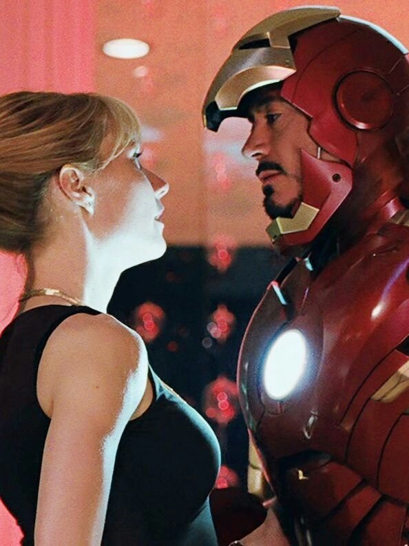
Color coordination is the main technical concern in this category both images typically need matching lighting direction and a similar background treatment (both dark, both bright, both cropped the same way) for the pairing to read as intentional side-by-side rather than coincidental. Mismatched crop styles are the most common reason matching sets look unpolished.
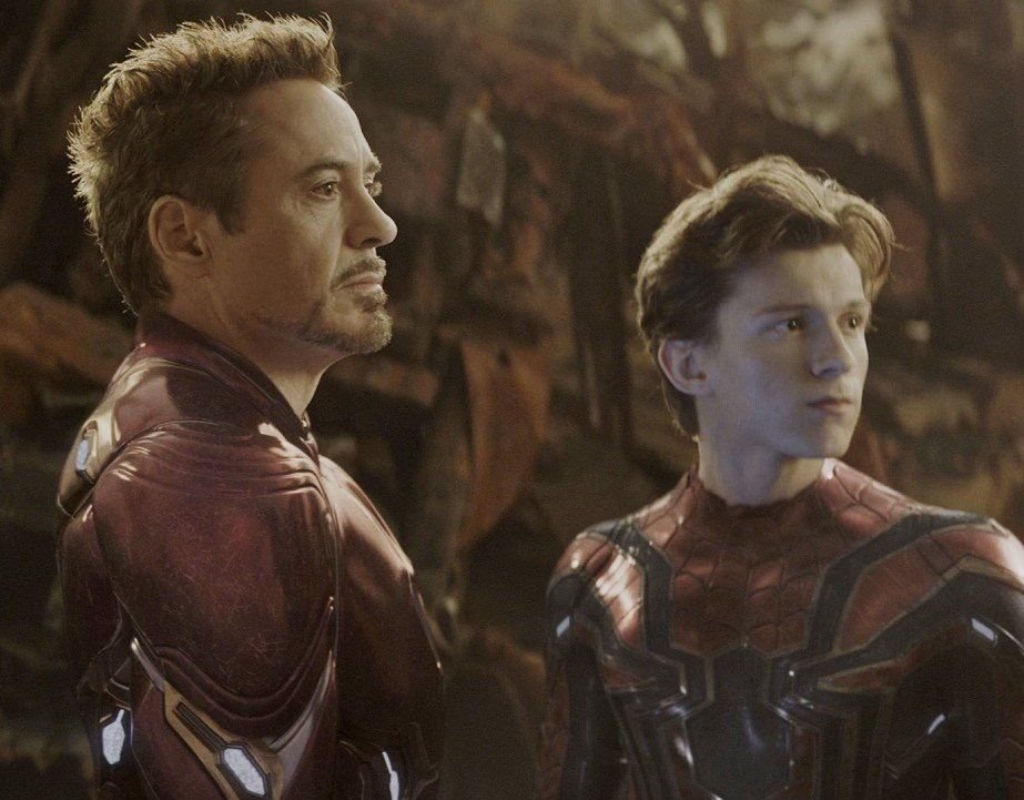
This category is popular specifically within couple or best-friend Discord and Instagram pairings where displaying a coordinated set signals the relationship visually without needing captions to explain it.
Black and White Iron Man PFPs
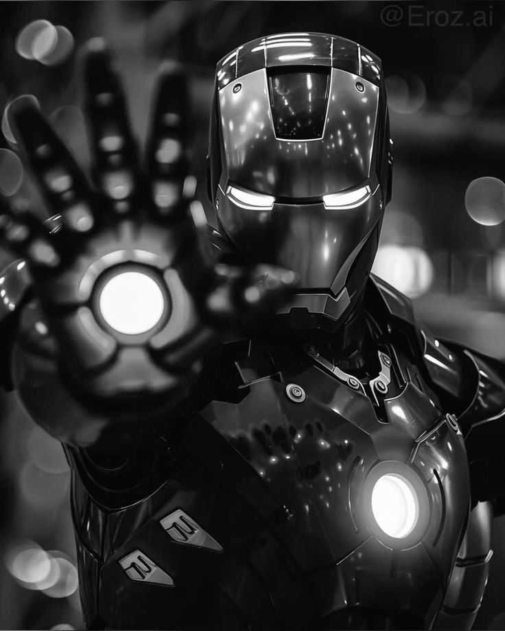
Stripping Iron Man’s signature red-gold palette down to grayscale removes the color contrast the design normally leans on, which shifts all the visual weight onto lighting and line detail instead. Panel etching, the faceplate’s geometric shadows, and the arc reactor’s glow rendered here as a bright white-hot circle rather than a colored light become the entire visual anchor points once color is gone.
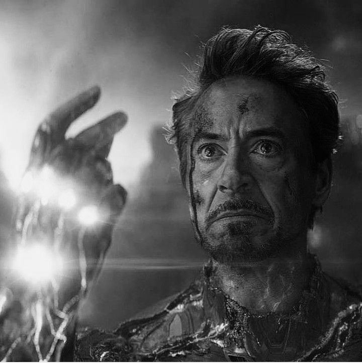
High-contrast black-and-white edits, where the armor reads as near-black against a stark white or light-gray background, tend to perform best, since low-contrast grayscale conversions can make the armor’s silhouette blur into indistinct gray-on-gray shapes. This treatment is popular among fans who want a more minimalist, editorial aesthetic for their overall profile rather than a bright comic-accurate look.
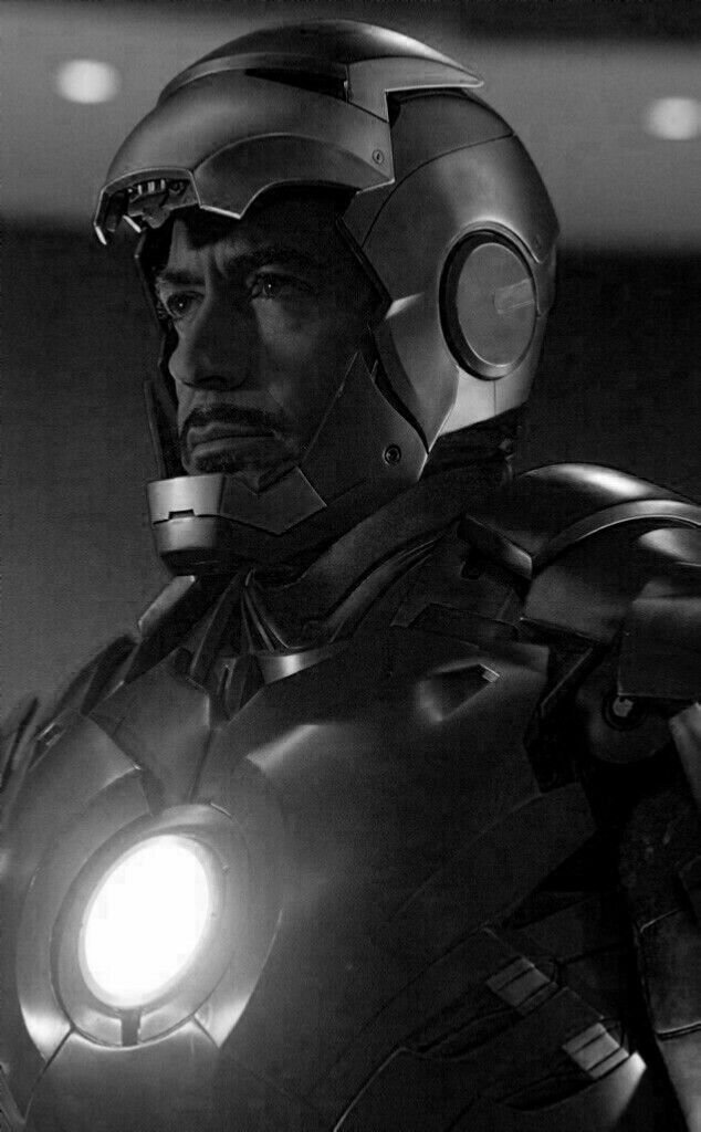
This version pairs particularly well with the stealth-armor design specifically, since that suit was already built around a limited, low-visibility palette that translates naturally into monochrome.
“For a different kind of raw power, see our Kratos PFP picks.”
Wallpaper-Style Iron Man PFPs
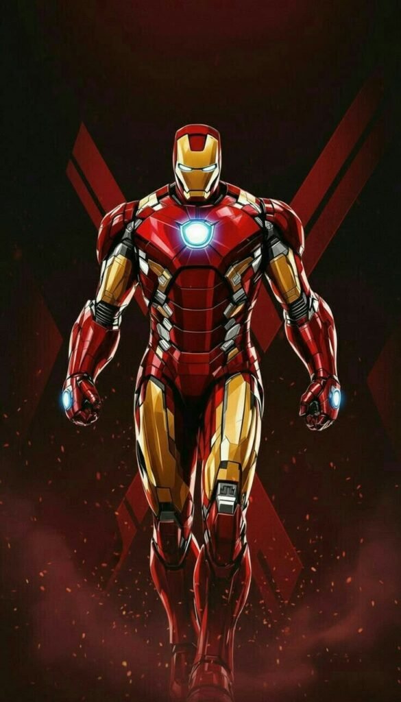
Full, uncropped wallpaper compositions wide shots showing the entire suit, a detailed background environment, or multiple armor variants displayed together serve a different purpose than tightly cropped avatar shots. These work best on platforms that don’t force a circular or heavily cropped avatar frame, or as source images fans crop down themselves for a specific platform’s needs.
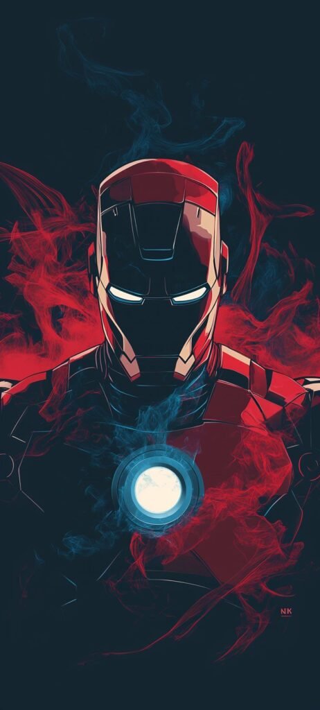
Because these images aren’t optimized for small-scale legibility the way platform-specific PFPs are, detail density matters more than contrast: intricate background elements, multiple lighting sources, and full environmental context all read fine at wallpaper scale in a way they wouldn’t in a 40-pixel Discord circle.
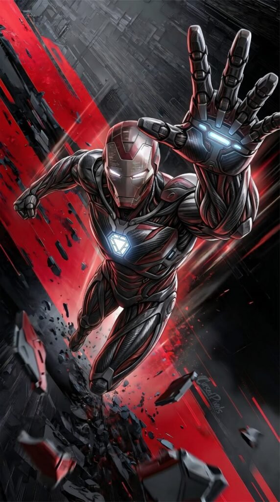
Fans often keep a wallpaper-style Iron Man image as a phone or desktop background while running a separately cropped version as their actual social PFP, treating the two as complementary rather than interchangeable.
How to Choose the Right Iron Man PFP
- Prioritize visibility first pick a version with enough contrast to read clearly at the smallest size your platform displays.
- Center the arc reactor or faceplate in the frame so nothing critical gets clipped by circular crops.
- Match the armor’s color palette to your platform’s UI elements, like Instagram’s story ring or a Discord server’s role colors.
- Choose classic red-gold for maximum cross-platform recognizability if you only want one version.
- Pick stealth or black-and-white treatments for a more minimalist, understated profile aesthetic.
- Coordinate crop style and lighting direction with any banner image for visual consistency.
- Use HD or upscaled source files whenever possible, since heavy compression flattens fine armor detail fastest.
- For matching sets, pair Iron Man with a visually distinct but palette-coordinated character like Rescue.
- Consider your account’s overall tone action-heavy renders suit gaming or esports profiles, while softer chibi versions suit casual or lifestyle accounts.
Read: Doctor Doom PFP
Read: Spider Man PFP
Read: Captain America PFP
Read: Satoru Gojo PFP
Read: Kratos PFP
Frequently Asked Questions
Conclusion
Iron Man’s appeal as a PFP comes down to range: few characters offer this many genuinely distinct, well-recognized looks, from the classic red-gold suit to the stark white of Superior Iron Man to the deliberately muted stealth armor. That range means the choice isn’t just about picking “an Iron Man image” it’s about picking the specific version that matches the tone an account is actually going for, whether that’s bold and heroic, minimal and moody, or soft and approachable.

3 Comments