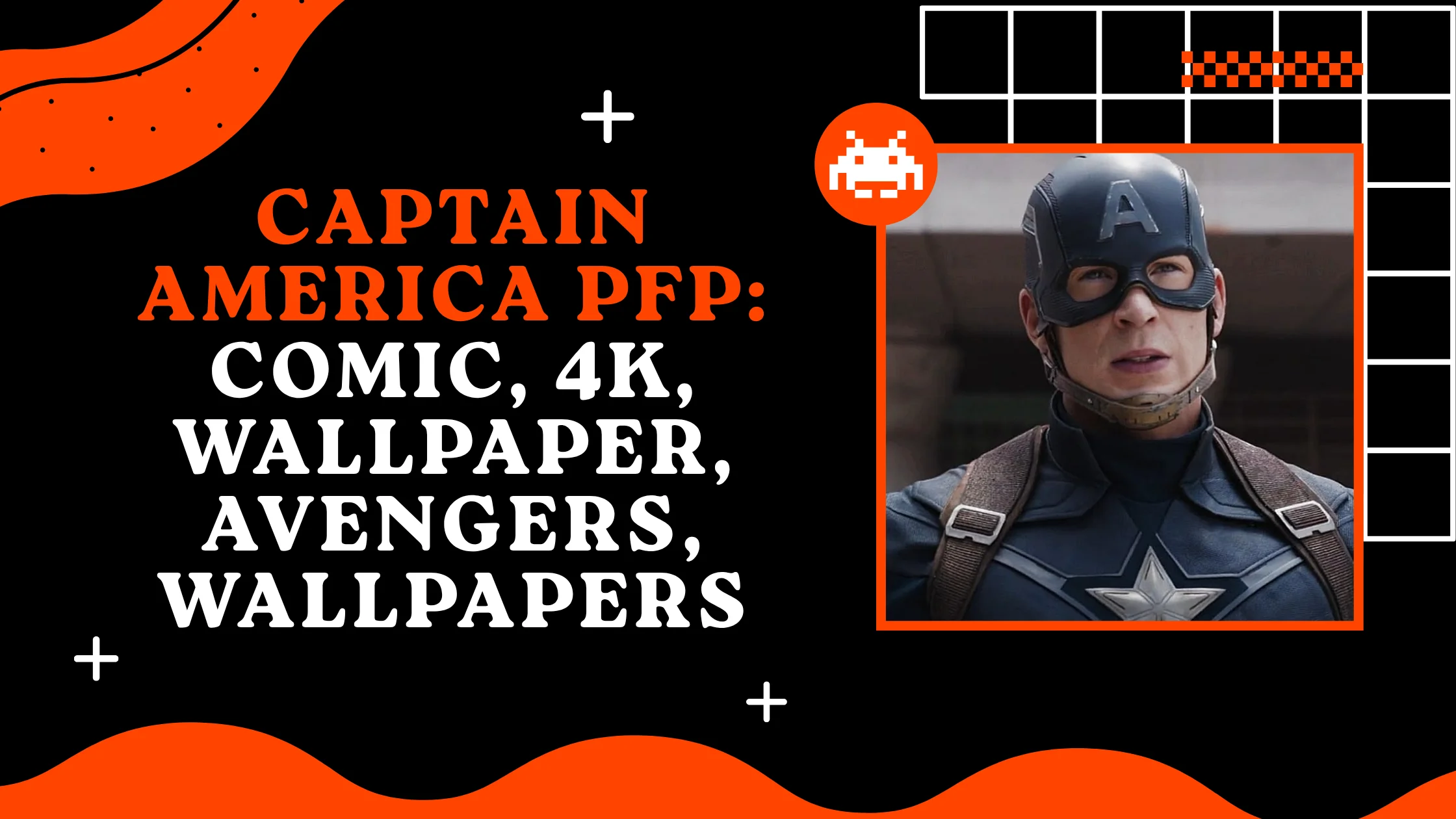
265+ Captain America PFP: Comic, 4k, Wallpaper, Avengers, Wallpapers
Captain America PFPs carry a specific kind of visual authority that comes straight from the character’s origin Joe Simon and Jack Kirby created him in 1941, and his very first cover showed Steve Rogers punching Adolf Hitler square in the jaw, a full year before America even entered World War II. That’s not a subtle debut, and it set the tone for everything the character has represented ever since: a design built to stand for something, not just look impressive.
Online identity works the same way a comic cover does you get one image to make an instant statement, and few Marvel characters communicate as clearly as Captain America. The star-spangled suit and the round, indestructible vibranium shield aren’t just costume details; they’re symbols people recognize even at a glance, which makes this character an unusually direct PFP choice for anyone who wants their avatar to project confidence, discipline, or old-fashioned heroism without needing any extra context.
Aesthetic Captain America PFPs
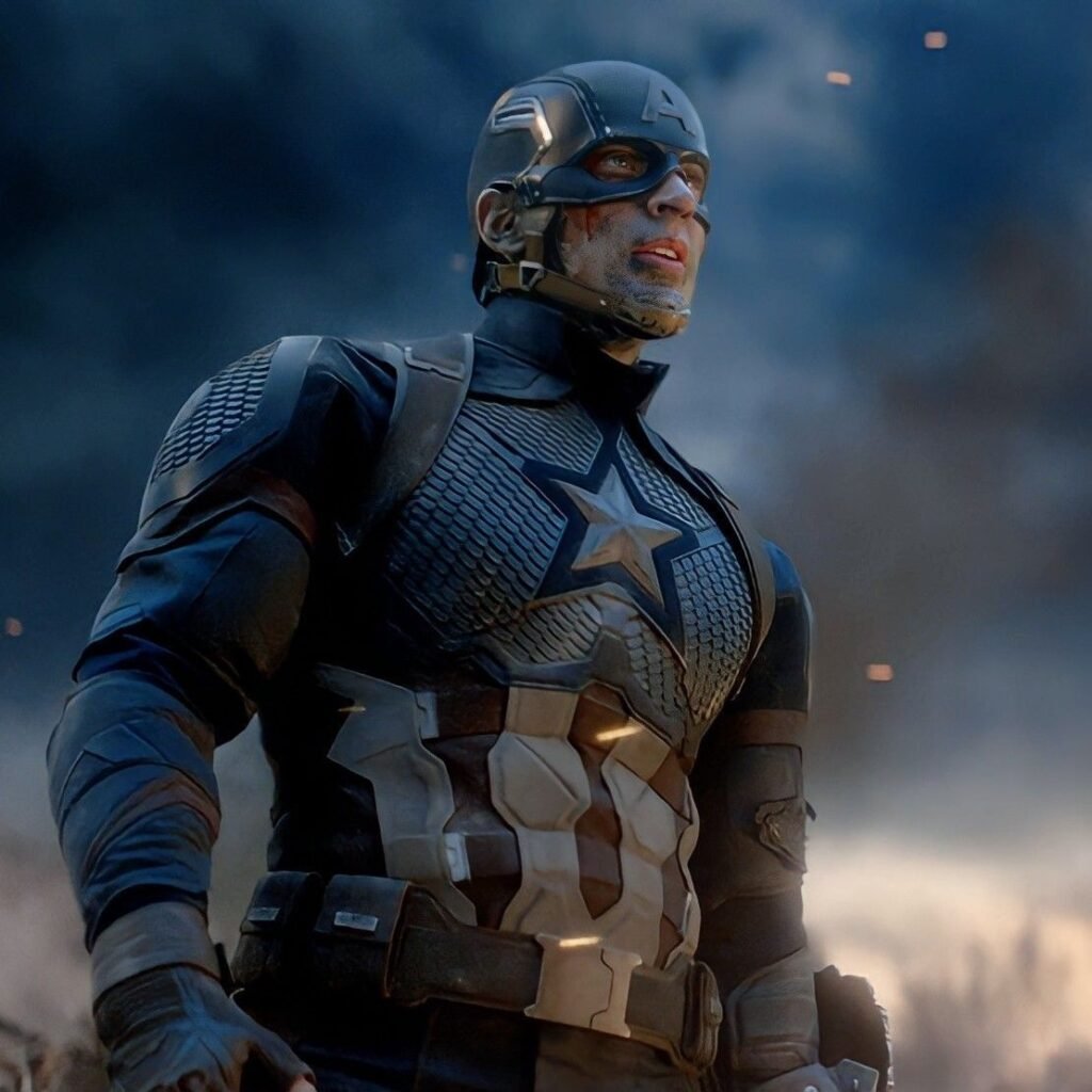
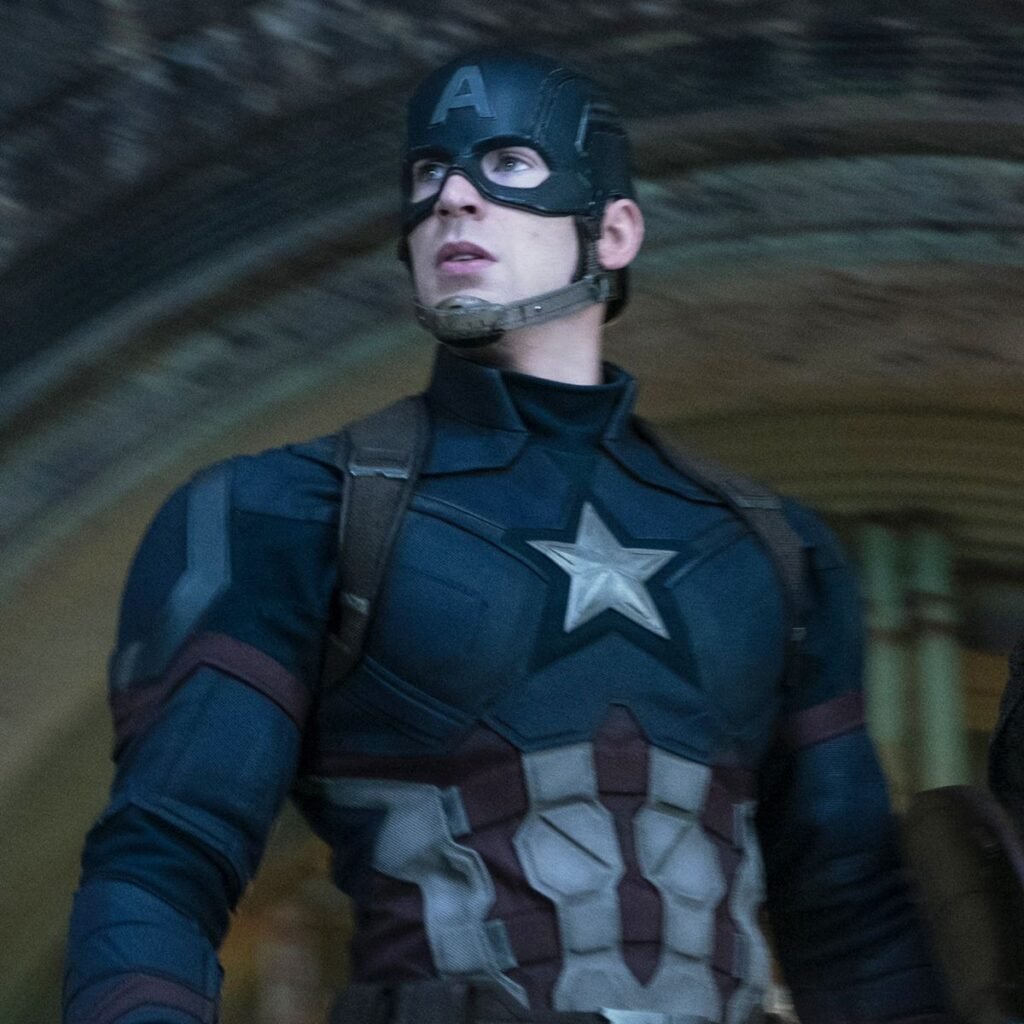
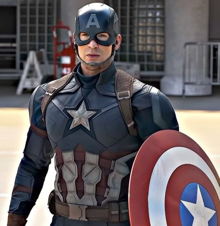
Aesthetic Cap edits tend to slow the character down from action-hero energy into something more contemplative a quiet shot of the shield resting against a wall, or Steve Rogers in profile with the star catching soft light. The costume’s structured lines lend themselves well to this calmer treatment, since the design was never meant to look chaotic even mid-battle.
Color grading in this category often mutes the classic primary red, white, and blue into something closer to a vintage newsreel palette desaturated blues, faded reds evoking the character’s 1940s origins rather than his modern comic-accurate brightness. That slight fade gives the image a sense of history rather than pure spectacle.
Backgrounds stay minimal by design: brick walls, dim interiors, occasional wartime-era textures like propaganda-poster typography faded into the frame. Nothing competes with the shield’s circular silhouette, which remains the single most recognizable shape in the entire image.
“For more classic Avengers avatars, check out our Iron Man PFP collection.”
Cool Captain America PFPs
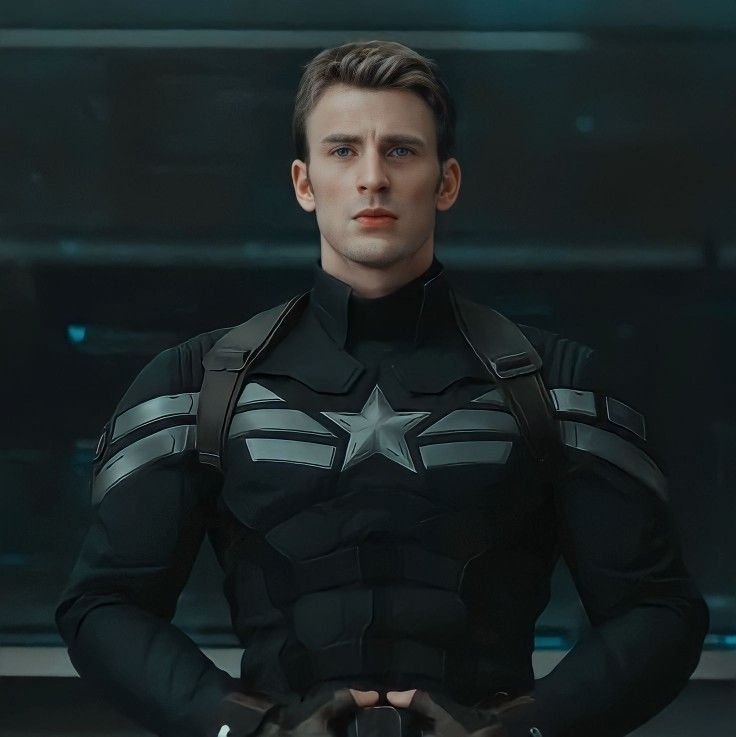
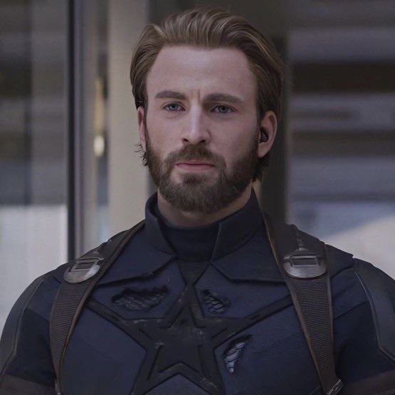
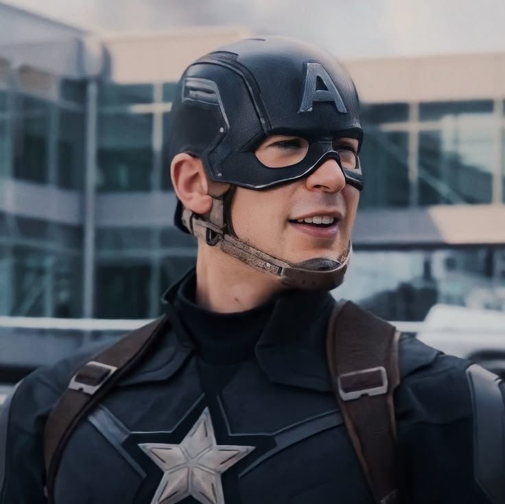
“Cool” Captain America PFPs lean into motion and impact the shield mid-throw, caught at the exact moment it deflects an attack, or Cap in a low crouch bracing for the next hit. The design supports this naturally, since the shield’s function as both weapon and defense gives artists a dynamic focal point other heroes’ gear simply doesn’t offer.
Lighting tends toward high-contrast, comic-panel-style shading: hard highlights across the star emblem, deep shadow along the suit’s blue segments. Some of this visual language traces directly back to Ed Brubaker and artist Steve Epting’s Winter Soldier run beginning in 2005, which pushed Captain America’s visuals toward a grittier, more grounded espionage tone than his earlier, brighter Silver Age appearances.
Emotional tone here skips playful entirely and goes straight to resolve jaw set, shield raised, no hesitation. It’s Cap as a soldier first, which is a specific angle that separates this category from lighter, more casual hero-PFP trends.
HD & 4K Captain America PFPs
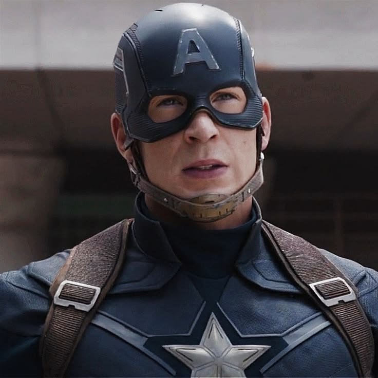
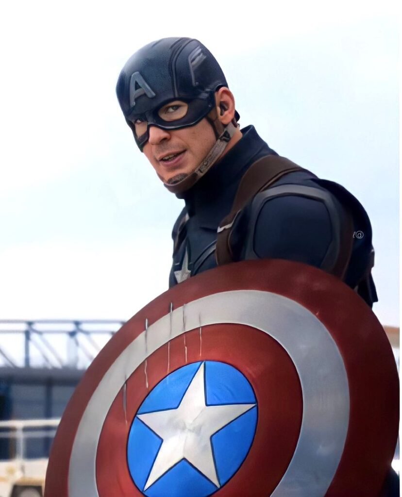
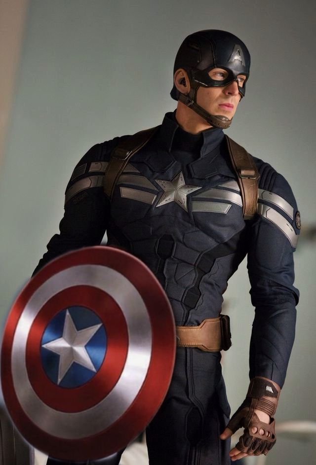
High-resolution Captain America images matter because the shield’s design depends on crisp geometry — the concentric red-and-white rings and central star lose their clarity fast under compression, turning a precise emblem into a blurred smear. Fans hunting HD or 4K sources are usually after clean digital art or sharp comic scans where every ring stays perfectly defined.
At full resolution, costume stitching and the suit’s segmented panel lines become the real payoff, giving the design a more tactical, armored feel rather than a flat spandex look. That detail level matters especially for fans drawn to Cap’s more militarized modern redesigns.
Because the palette here relies on just three bold colors, sharpness does more work than added visual complexity ever could. A crisp, clean shield reads as far more striking at 4K than a busier, over-detailed image would at the same size.
Wallpaper-Style Captain America PFPs
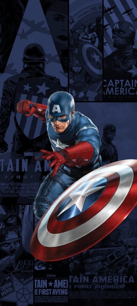
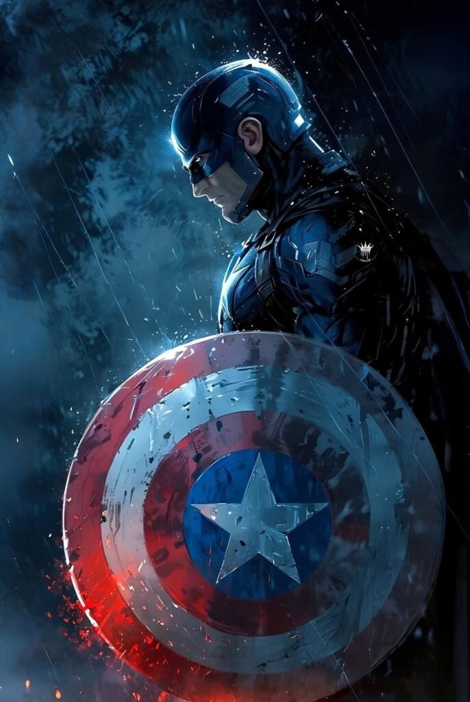
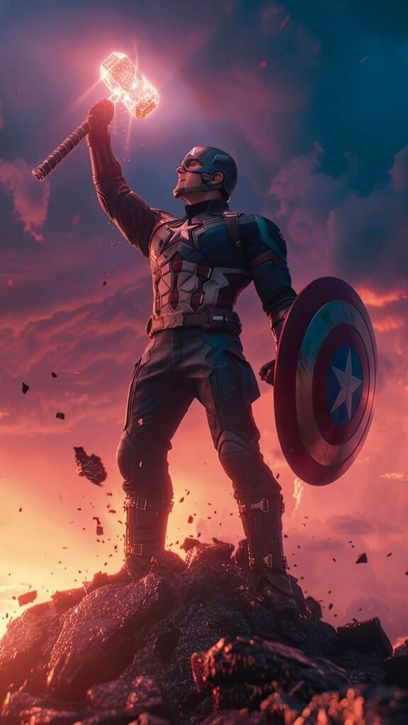
Wallpaper-oriented Cap art tends to widen the frame significantly, placing the character against a full battlefield or city skyline rather than isolating the shield. Smoke, rubble, or a distant American flag catching wind in the background all give these compositions a scale that a tight avatar crop simply can’t achieve.
These pieces often lean into the character’s wartime roots more directly than any other category, drawing visual cues from his 1940s comic origins — worn boots, dust-covered uniform, a sense of having just come out of active combat rather than posed for a clean hero shot.
Fans frequently pair a wallpaper with a cropped shield-focused detail pulled from the same source image as their actual PFP, creating a matched desktop-and-avatar combo instead of two visually unrelated pictures of the character.
Discord Captain America PFPs
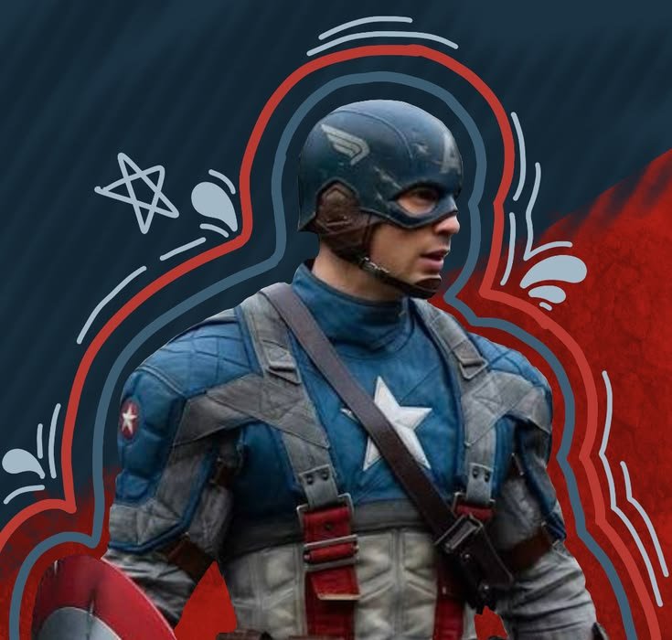
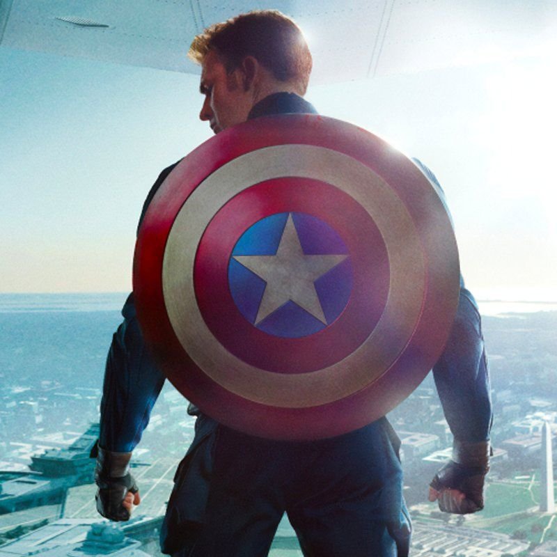
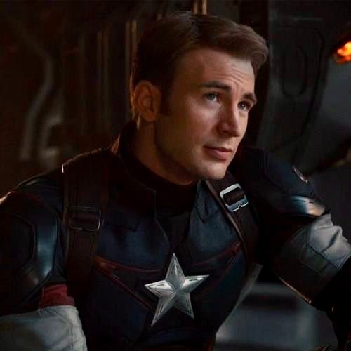
Discord shrinks every avatar into a small circle sitting right beside your status dot and role color, and the shield’s bold, high-contrast rings hold up remarkably well under that constraint since the design was already built around instant visual recognition from a distance in-panel.
Server banner pairing plays a bigger role here than most people expect. Because Discord displays a banner above your username in the member list, fans running military-themed, strategy, or classic-Marvel servers often pick Cap art that echoes the banner’s red-white-blue palette, so the whole profile card reads as one deliberate design rather than mismatched pieces.
Role colors interact cleanly with this palette too blue role tags blend naturally with the suit, while red tags create a bolder, flag-like pairing, giving fans two distinct visual directions depending on the server’s overall tone.
“Fans wanting a grittier take on Marvel heroes may also like our Punisher PFP collection.”
TikTok Captain America PFPs
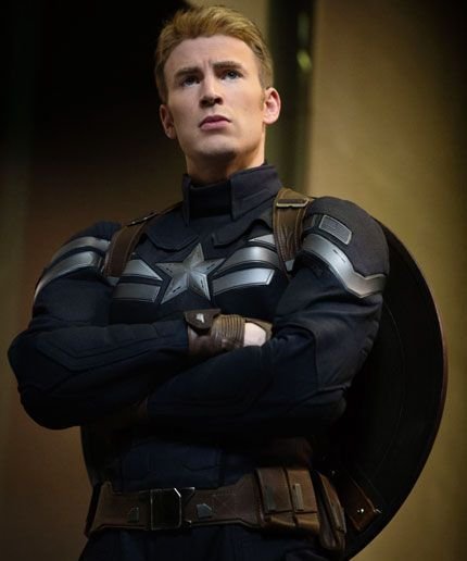
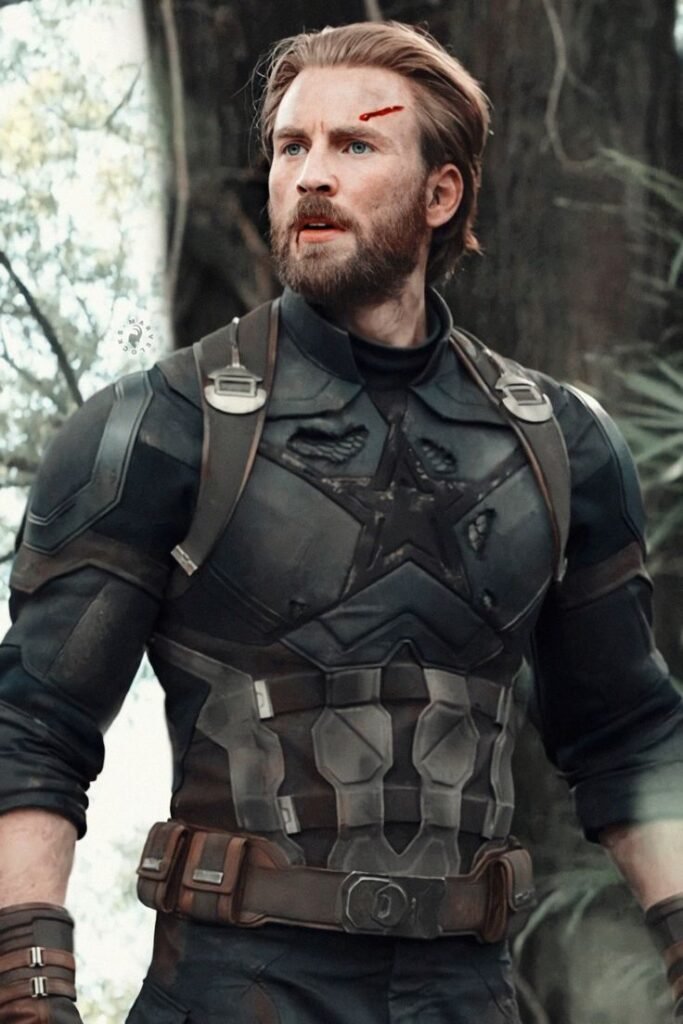
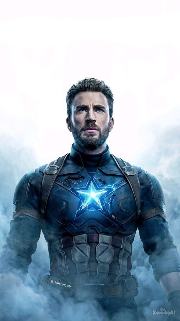
TikTok compresses every avatar into a tiny circle competing against a fast-scrolling wall of comments and a duet grid full of other creators, and the shield’s simple circular shape actually performs well under those conditions since its geometry reads instantly even at a drastically reduced size.
Edits built for this platform tend to go bold and poster-style — shield filling most of the frame, background stripped down to almost nothing — because finer costume detail disappears the moment someone’s mid-scroll. Clips referencing the shield-throw motion, one of the character’s most consistently animated actions across decades of adaptations, have become a popular source for short looping PFP-adjacent edits here.
Because patriotic and superhero-nostalgia content tends to perform well with TikTok’s broader Marvel fan community, Captain America PFPs often circulate alongside classic comic-cover throwbacks rather than purely modern redesigns.
Instagram Captain America PFPs
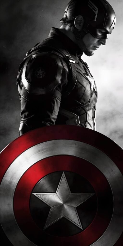
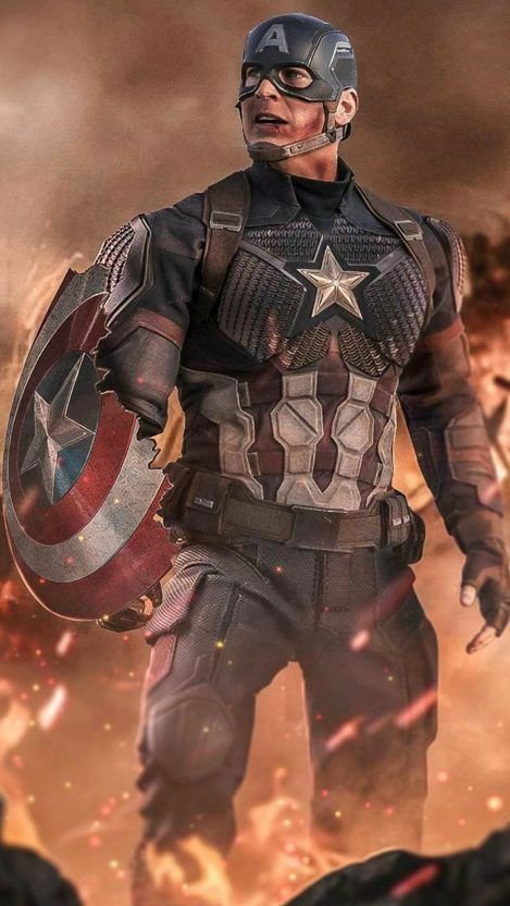
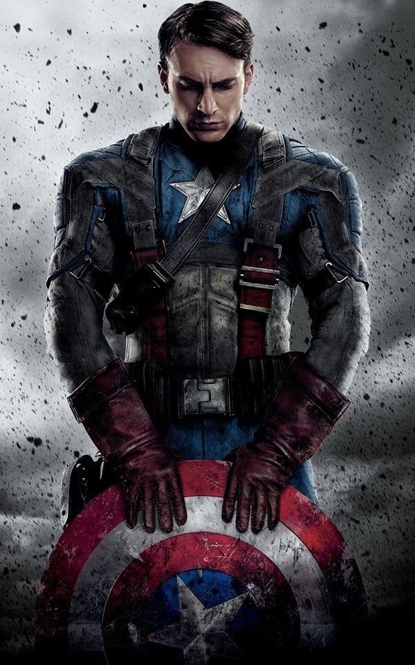
Instagram’s circular story-ring crop tends to clip the outer edges of wider compositions, so Cap PFPs built for this platform usually keep the star emblem and shoulders centered well inside that boundary, letting shield detail or background scenery near the frame’s edge fall outside the visible circle.
Grid coordination matters more here than on most platforms. Fans running Americana, vintage-poster, or classic-comic-themed feeds often pull the red-white-blue palette directly into their post grid, so the PFP feels like a natural extension of the whole profile rather than an unrelated avatar sitting above it.
The story ring’s bright gradient border also interacts differently with this character than with darker Marvel figures — the suit’s saturated primary colors tend to hold their own against a colorful ring rather than getting visually overwhelmed by it.
Pinterest Captain America PFPs
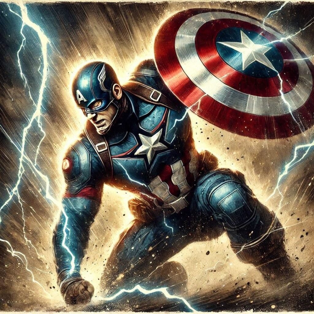
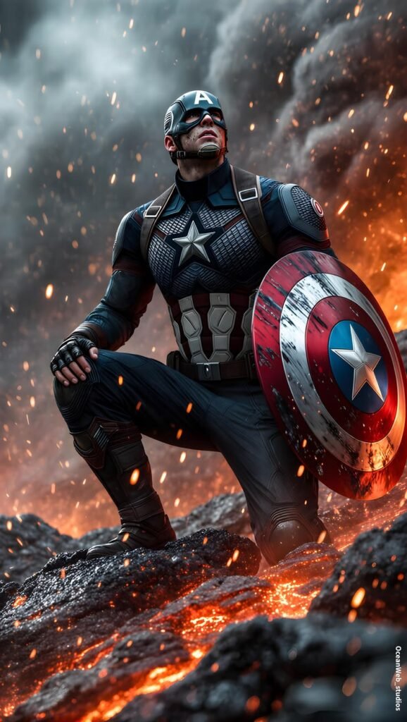
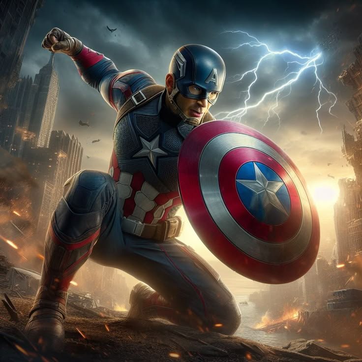
Pinterest runs on board-based discovery rather than a single profile image, and Captain America content performs well there because the character supports genuinely distinct board categories WWII-era comic covers, modern shield-design variants, tactical-suit concept art, and patriotic Americana imagery all draw from the same figure without repeating a single visual style.
Because Pinterest doesn’t force a tight crop, full-figure or wallpaper-style images tend to outperform close-up avatar crops here. People are collecting reference and inspiration boards, not hunting for a single profile picture, so battlefield scenery and full costume shots get more engagement than a shield-only close-up would.
This is also where fans frequently discover specific historical comic covers, including reprints of that original 1941 Hitler-punching debut issue, since Pinterest’s discovery algorithm tends to surface archival material alongside modern fan reinterpretations.
“For a more modern Marvel hero pick, see our Miles Morales PFP collection.”
Twitter/X Captain America PFPs
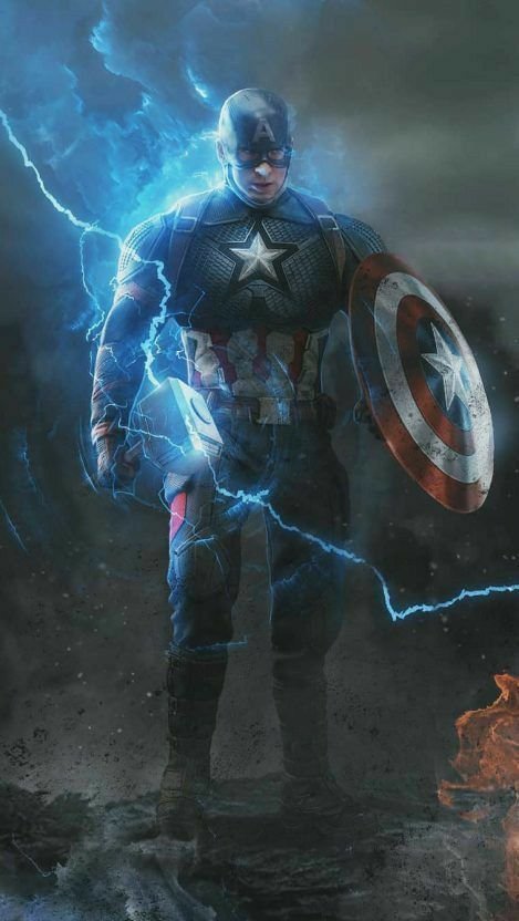
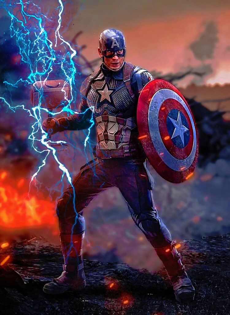
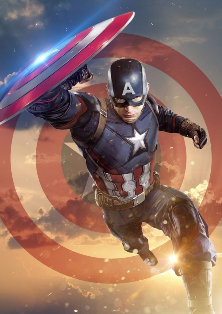
On X, avatars sit directly beside dense reply threads, so legibility at a genuinely small size matters more than fine costume detail. The shield’s concentric rings and central star read clearly even shrunk down next to dozens of other tiny avatars crowding the same thread, giving Cap a functional edge over more visually busy hero designs.
Because the character has long been used as political and cultural shorthand — sometimes sincerely, sometimes ironically — a Captain America PFP on X often carries more real-world context than it does on purely fandom-driven platforms, something worth considering before picking it for aesthetics alone.
Because X timelines are almost entirely text, PFPs with heavy battlefield backgrounds tend to disappear at a glance. The strongest choices crop tight to the star emblem or shield, letting the symbol carry the full weight of recognition without extra scenery competing for space.
Black and White Captain America PFPs
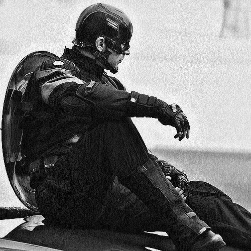
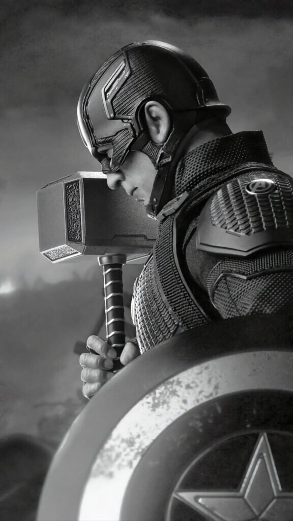
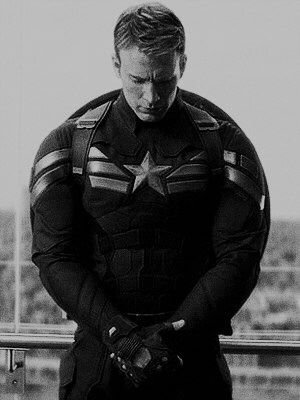
Stripped of color, Captain America’s design holds up better than most people expect, largely because his 1941 debut predates full-color comic printing standards and the character has deep visual roots in black-and-white newspaper strip aesthetics from that same wartime era.
Monochrome edits tend to lean into that history directly, using halftone dot patterns or rough inked linework reminiscent of vintage newsprint rather than a modern digital finish. The shield’s rings translate into pure contrast beautifully, staying legible even without a single trace of red or blue.
Emotional tone shifts here too without the flag-bright palette softening things, black-and-white Cap art often reads as more solemn and historical, closer to a WWII-era propaganda poster than a modern superhero panel.
WWII Captain America — Steve Rogers’ Original Look
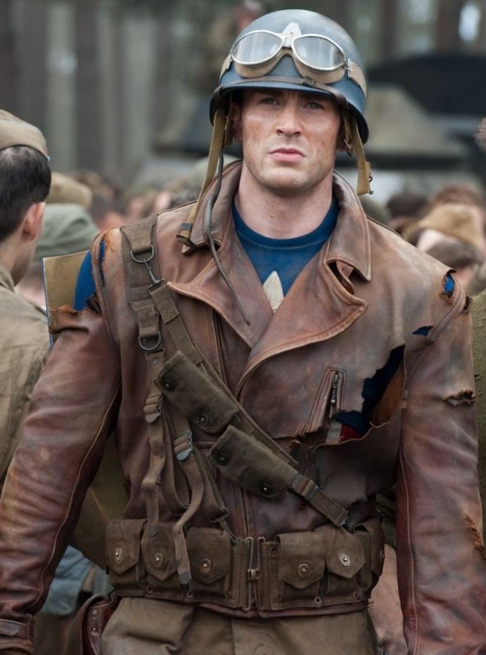
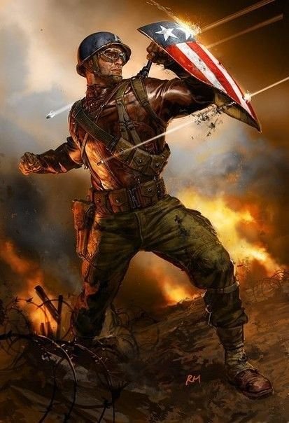
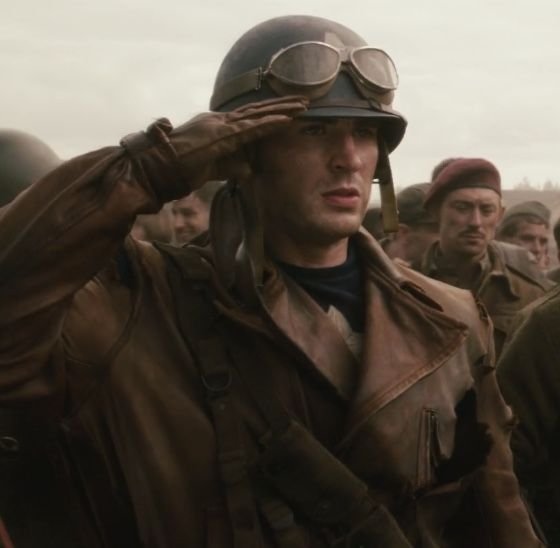
If one version of Steve Rogers himself defines “classic” Captain America searches, it’s the original 1941 wartime design from Captain America Comics #1 the simplest form the costume has ever taken, before decades of armor plating, tactical redesigns, and film-driven updates layered onto it. This is Rogers as he first appeared: chainmail-textured tunic, plain leather boots, and a shield that hadn’t yet settled into its now-famous perfect circle.
PFP artists return to this era because it strips the character back to his rawest premise a scrawny kid from Brooklyn given the Super-Soldier Serum and sent straight into a real war, with none of the polish later decades of comics would add. The palette here often skews slightly duller than modern renditions, closer to muted wartime posters than glossy comic-book brightness, and battle damage torn fabric, dust, ink-scratched grime — shows up far more often than in his cleaner modern look.
It’s a favorite among fans drawn to Rogers’ original context rather than his later Avengers-era polish, since this version predates the shield’s vibranium upgrade, the character’s post-war cultural status, and virtually every redesign that followed making it the closest thing to seeing Captain America exactly as Joe Simon and Jack Kirby first drew him.
Sam Wilson Captain America — The Iconic Alternate Version
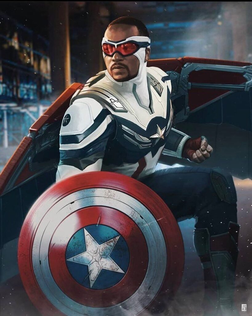
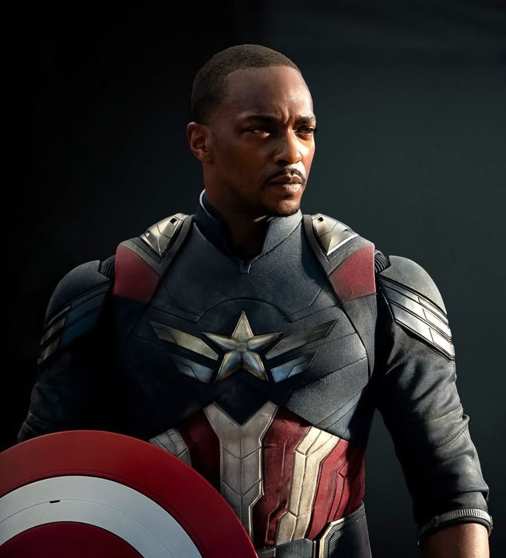
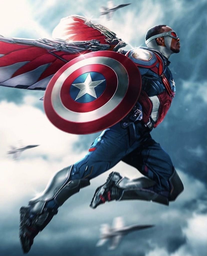
If one alternate version of Captain America dominates “iconic look” searches beyond the classic Steve Rogers suit, it’s Sam Wilson taking up the shield and mantle in Marvel’s 2015 Captain America relaunch, following his long-running history as the Falcon. The design keeps the same star-and-shield foundation but reworks the costume with a more streamlined, modern silhouette suited to Wilson’s own combat style.
PFP artists return to this version because it answers a specific question fans keep asking: what does the Captain America identity look like when it’s passed to someone new entirely? The palette stays close to the classic red-white-blue but often incorporates darker accents, and the shield itself sometimes takes on a more angular, technologically updated form compared to the original round design.
It’s a favorite among fans who follow the character’s legacy storylines closely rather than just the WWII origin, since Wilson’s tenure represented one of the most significant identity shifts the shield has undergone since Steve Rogers first picked it up in 1941.
How to Choose the Right Captain America PFP
- Keep the shield or star emblem fully visible — cropping through either undercuts the single most recognizable part of the design.
- Test contrast at thumbnail size before committing; Discord, X, and TikTok all shrink avatars down aggressively.
- Match the suit’s red-white-blue palette to your banner or grid if you’re building a coordinated profile.
- Choose tight, centered crops for text-heavy platforms like Discord and X, and fuller battlefield compositions for Pinterest.
- Pick a genuinely high-resolution source; the shield’s concentric rings blur into noise under heavy compression.
- Decide between the classic Steve Rogers suit and the Sam Wilson redesign based on which era of the character you want to represent.
- Avoid overly cluttered wartime backgrounds if you’re using a tight crop; save the busier scenes for wallpaper-style images.
- Stay consistent with your existing profile’s color scheme rather than picking an image in isolation.
Read: Spider Man PFP
Read: Loki PFP
Read: Doctor Doom PFP
Read: Captain America vs Soldier Boy
Read: Batman vs Captain America
Frequently Asked Questions
Conclusion
Captain America endures as a PFP choice because his design was built around symbolism from the very first cover a shield, a star, and a color scheme that communicated exactly what the character stood for before readers even opened the comic. Whether it’s the classic Steve Rogers suit, a black-and-white edit rooted in his wartime origins, or the modern redesign worn by Sam Wilson, every version stays anchored to that same instantly readable identity.
That clarity is what makes him work across such different platforms. A PFP has to hold up in a tiny Discord circle, a clipped Instagram ring, and a crowded X reply thread all at once, and Captain America’s bold, high-contrast shield was practically built for that kind of visibility test. For fans who want an avatar that projects conviction without needing extra context, few characters communicate it as directly as Marvel’s first Avenger.

5 Comments