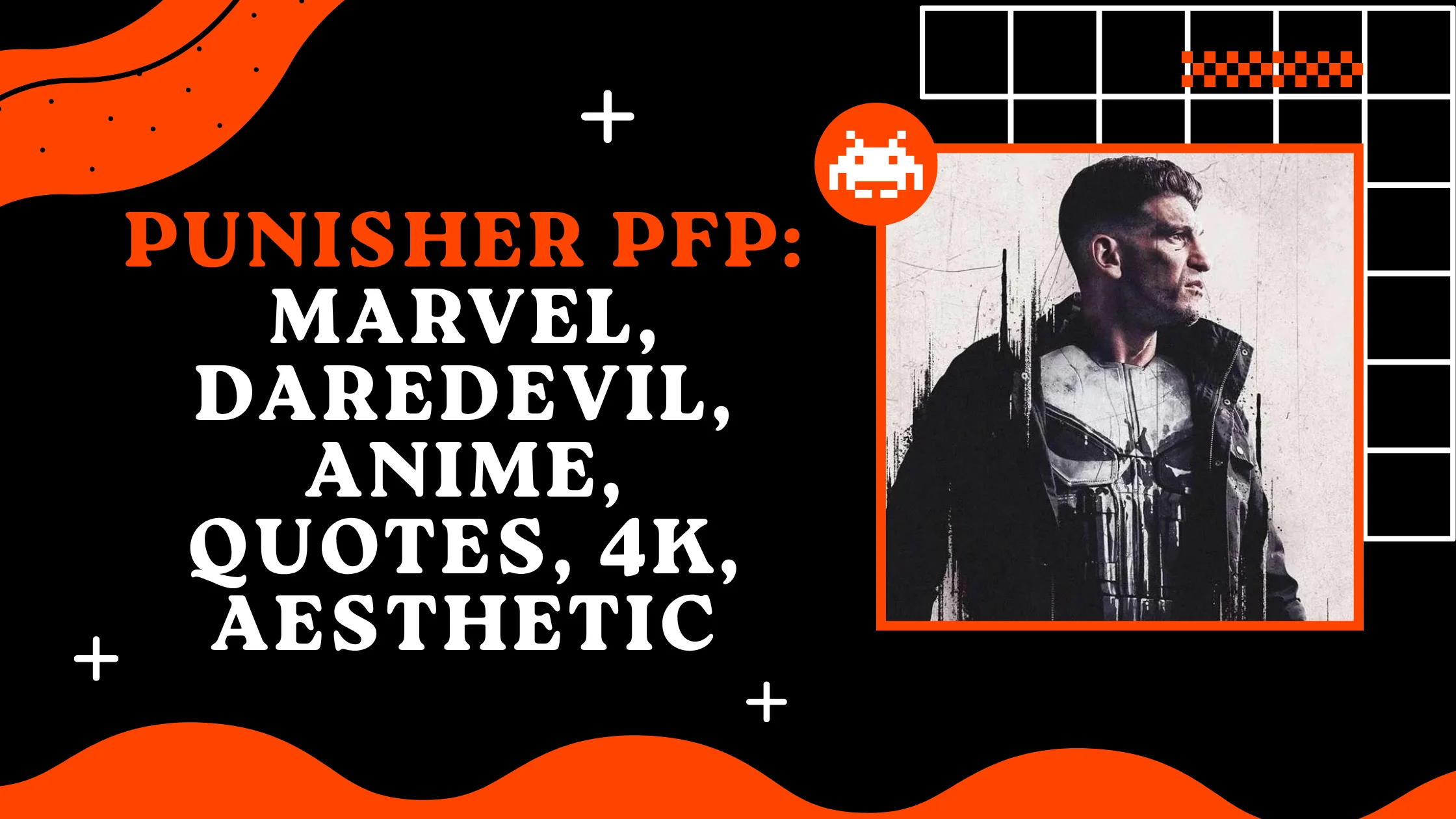
695+ Punisher PFP: Marvel, Daredevil, Anime, Quotes, 4k, Aesthetic
Punisher PFPs carry a different weight than most comic-book avatars because the character himself was never built to be likable he was built to be unmistakable. Frank Castle debuted in The Amazing Spider-Man #129 in 1974, created by Gerry Conway, John Romita Sr., and Ross Andru, and from that first appearance his identity has hinged on one thing: a stark white skull painted across black tactical gear. That’s a rare kind of branding in comics, and it’s exactly why the character translates so cleanly into a profile picture.
Online identity runs on instant signals, and Punisher’s skull does more communicating in a two-inch circle than most character designs manage in a full-page splash. There’s no cape, no mask covering the face, no bright primary colors just a former Marine turned one-man war on crime, marked by a symbol that reads as a warning. Picking him as a PFP says something specific about tone: no-nonsense, unapologetic, done with pretending things are fine. That’s a different lane than most superhero avatars occupy, and it’s a big part of why this character keeps circulating years after his original run.
Aesthetic Punisher PFPs
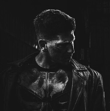
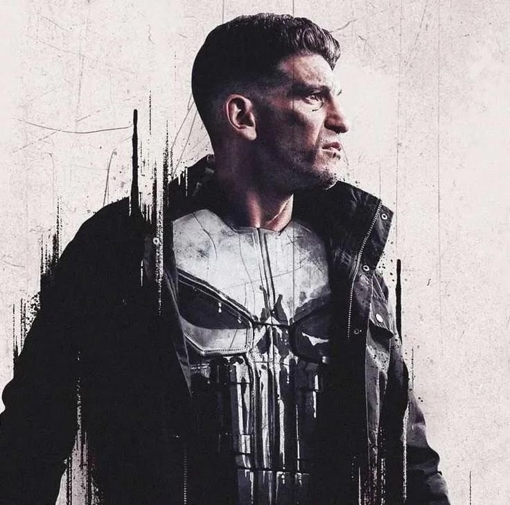
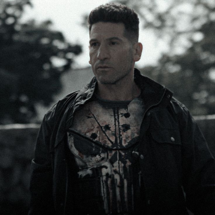
The aesthetic pull of Punisher art starts with restraint. There’s no costume flourish to exaggerate, so artists lean on texture instead worn leather, scuffed black fabric, a skull graphic that’s slightly cracked or faded rather than pristine. That imperfection does a lot of narrative work without needing a single word of context.
Palettes stay narrow on purpose: matte black, bone white, and the occasional streak of blood-red or gunmetal gray. Nothing competes with the skull for attention, and most aesthetic edits actively desaturate the background so the eye has nowhere else to land.
Expression rarely matters here since Frank Castle’s face is often shadowed or turned away entirely. The mood is less about a specific look on his face and more about atmosphere rain-slicked streets, dim alley lighting, the sense of someone who operates entirely outside daylight hours.
Cool Punisher PFPs
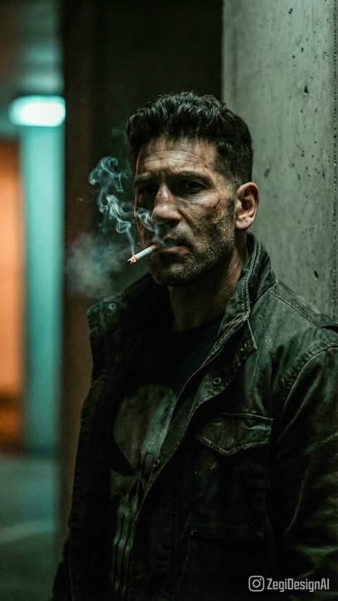
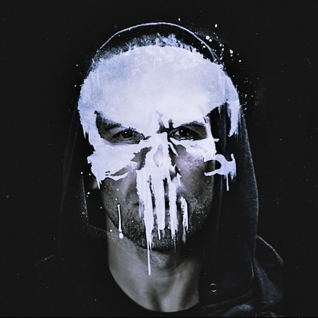
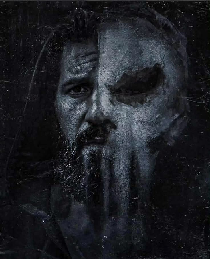
“Cool” Punisher edits tend to center on scale and silhouette rather than fine detail a wide shot with Frank standing in a doorway backlit by headlights, or a close crop on the skull catching a single hard light source. Both versions read as intimidating even shrunk down to avatar size, which is the entire point of this category.
Weapon-forward compositions are common too, since Castle’s identity is built on being an ordinary man with an extraordinary arsenal rather than any superpower. Dual pistols, a combat knife, or a rifle slung across the chest all reinforce that grounded, tactical edge that separates him from the rest of the Marvel roster.
Lighting does most of the heavy lifting here: hard rim light along the jaw, deep shadow across the eyes, minimal ambient glow. It’s a noir sensibility more than a superhero one, and that’s precisely why fans searching for “cool” edits gravitate toward this character over flashier costumed heroes.
“For more grounded, gritty Marvel picks, see our Captain America PFP collection.”
HD & 4K Punisher PFPs
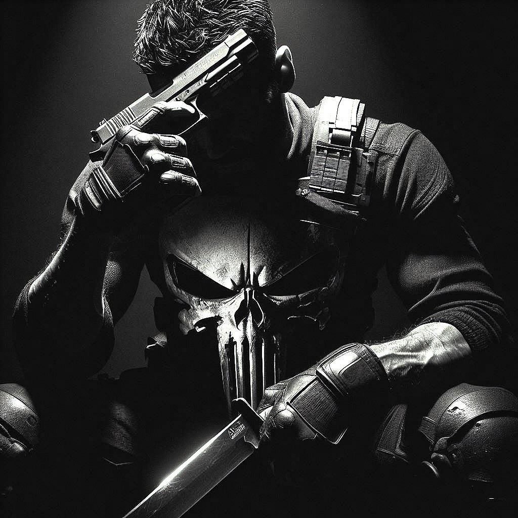
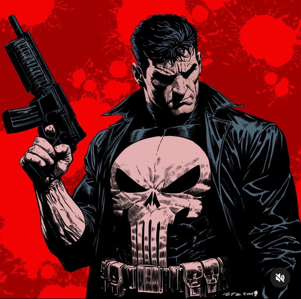
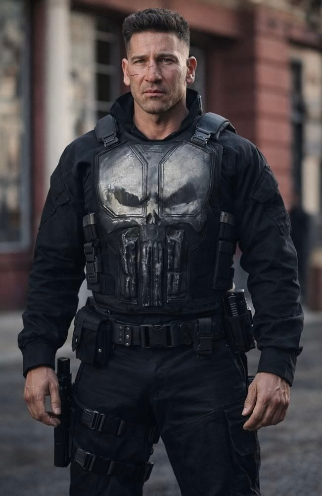
High-resolution Punisher images matter for a specific reason: the skull emblem is unforgiving of compression artifacts. Blur or pixelation softens its edges into something closer to a smudge than a symbol, which defeats the entire visual purpose. Fans hunting HD or 4K sources are usually after clean panel scans or sharp fan renders where the emblem’s jagged teeth stay crisp.
At full resolution, the appeal shifts toward material detail the weave of tactical vests, stitched patches, the subtle grime built into weathered gear. These textures vanish at low resolution but hold up well in a properly sized crop, giving 4K Punisher art a grittier, more tactile feel than most superhero avatars.
Because the palette here is already so limited, resolution does more work than color variety ever could. A sharp black-and-white skull against gunmetal gear reads as more striking at 4K than a busier, brighter image ever would at the same size.
Wallpaper-Style Punisher PFPs
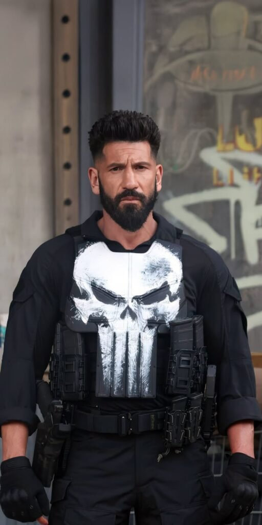
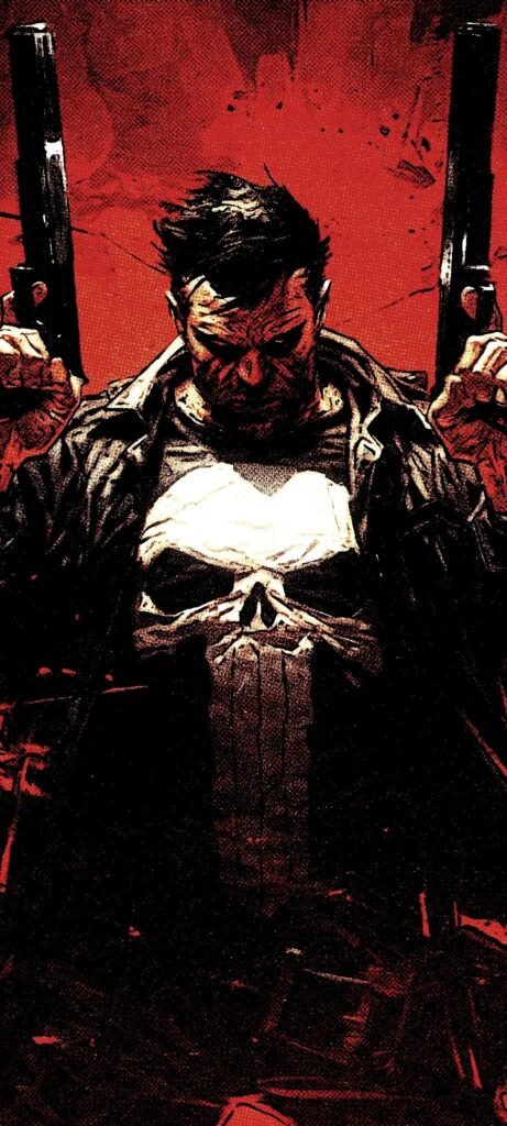
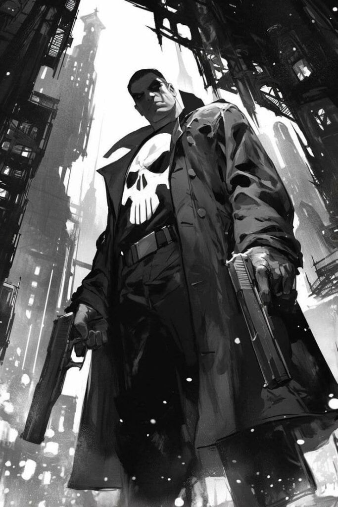
Wallpaper-oriented Punisher art keeps the full figure or environment in frame rather than isolating the emblem, often placing Frank against a rain-soaked New York skyline or a dim warehouse interior. That wider framing works because his silhouette — coat, weapons, stance — is recognizable even without a close-up on the skull.
These compositions frequently lean into the character’s Vietnam-veteran-turned-vigilante backstory through setting rather than costume: urban decay, chain-link fences, flickering streetlights. It’s environmental storytelling more than character detail, and it separates Punisher wallpapers from the cleaner studio-style crops used for tighter avatars.
Fans often pair a wallpaper with a matching cropped PFP pulled from the same source image, creating a cohesive desktop-and-profile combo rather than two unrelated pictures of the same character.
Discord Punisher PFPs
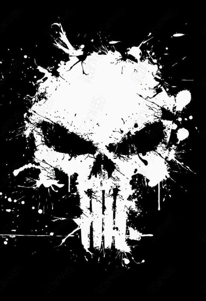
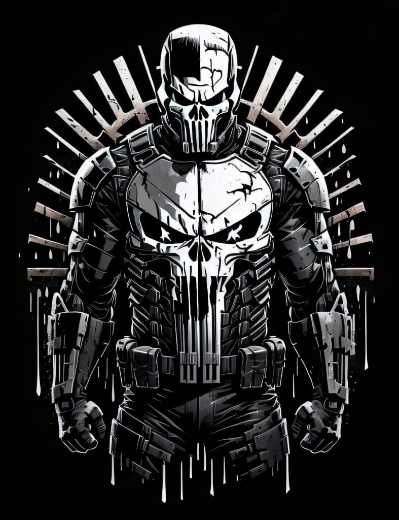
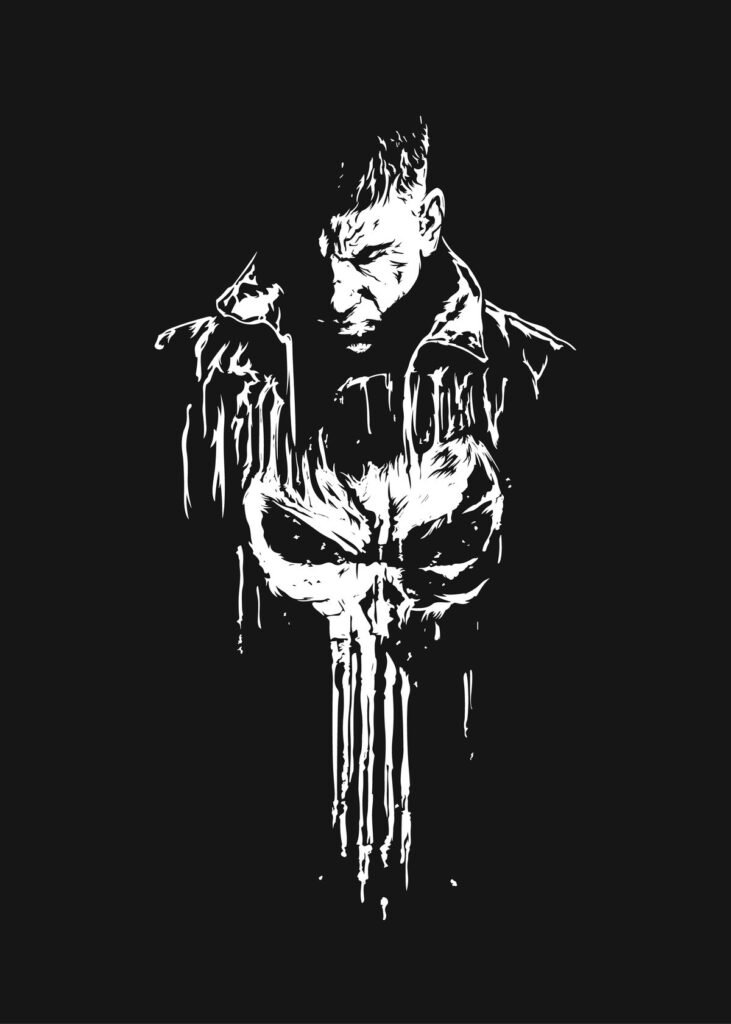
Discord shrinks every avatar into a small circle sitting right beside your status dot and role color, so busy Punisher compositions lose detail fast. The images that hold up best keep the skull dead-center with strong contrast against a dark background, since anything too intricate gets swallowed by the circular crop.
Server banner pairing plays a bigger role here than people expect. Because Discord displays a banner above your username in the member list, fans often choose Punisher art that echoes the banner’s palette — black-and-white banner behind a black-and-white skull crop — so the whole profile card reads as one deliberate design rather than two mismatched pieces.
Role colors interact with the image too. A deep red or stark white role tag sits cleanly against Punisher’s palette, which is part of why he’s a recurring pick in tactical, military-themed, or anti-hero-focused servers.
TikTok Punisher PFPs
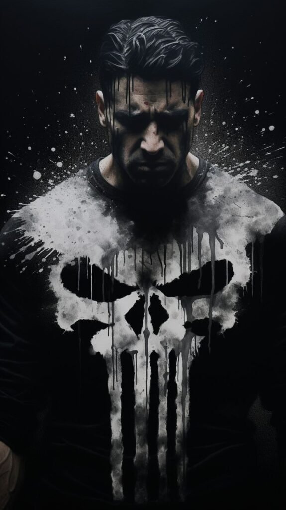
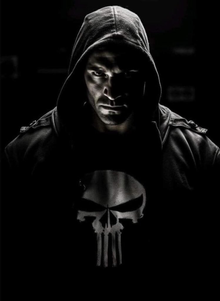
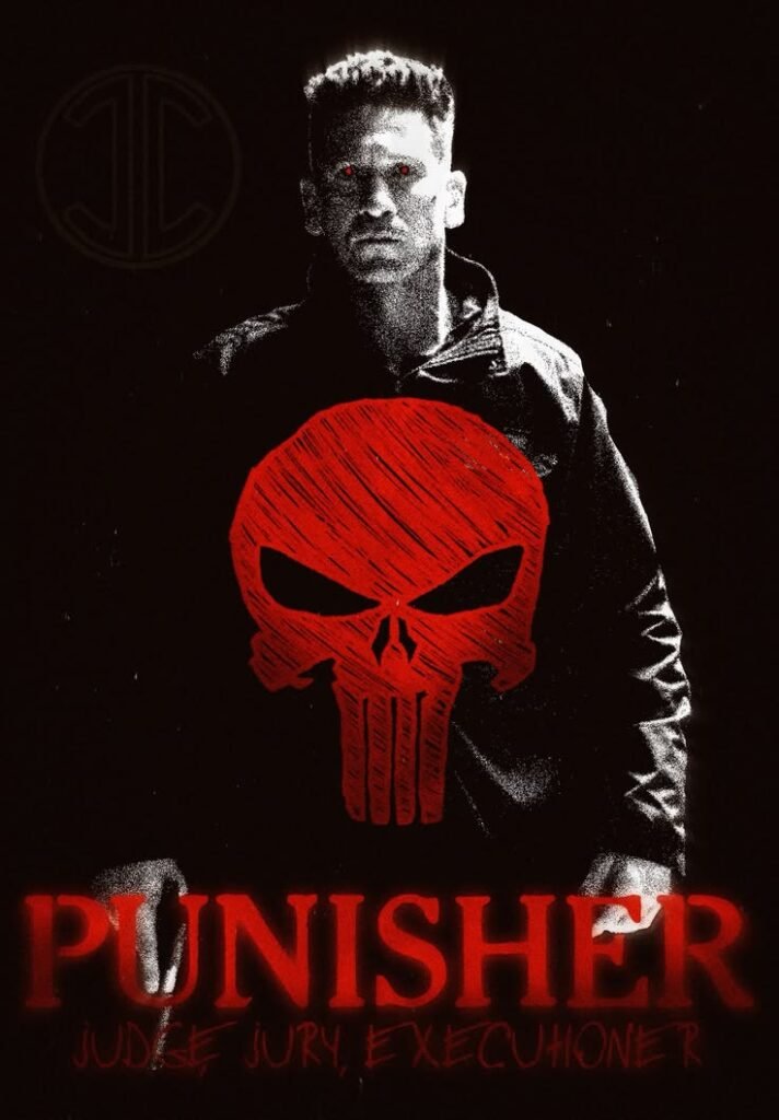
TikTok forces every avatar into a tiny circle competing against a fast-scrolling wall of comments and a duet grid packed with other creators. Punisher’s skull actually performs well under those conditions because there’s so little visual noise in the design to begin with — it reads instantly even at a fraction of its normal size.
Edits built for this platform tend to go bold and poster-like: skull filling nearly the entire circle, background cropped down to almost nothing. Anything finer than that gets lost while a viewer is mid-scroll, which is why subtlety tends to underperform here compared to platforms where people actually pause on a profile.
Because military and true-crime-adjacent communities overlap heavily with Punisher fandom on TikTok, his PFP shows up often alongside tactical-gear content and veteran-support pages, giving the image a slightly different cultural context than it carries in general comic fandom spaces.
Instagram Punisher PFPs
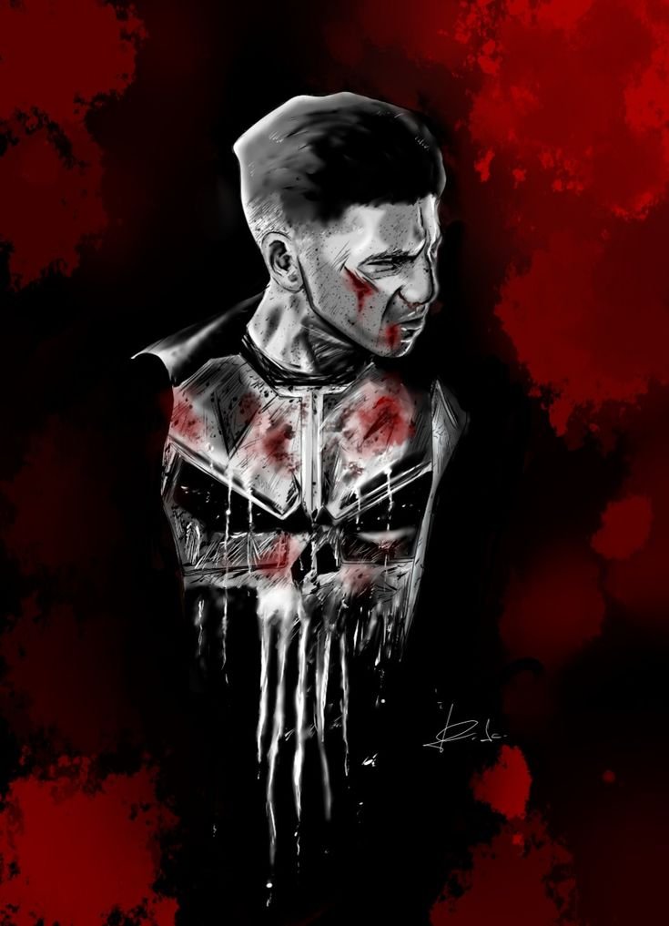
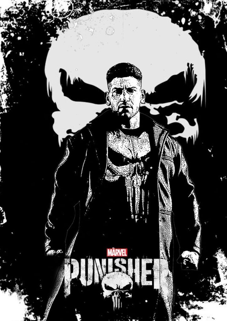
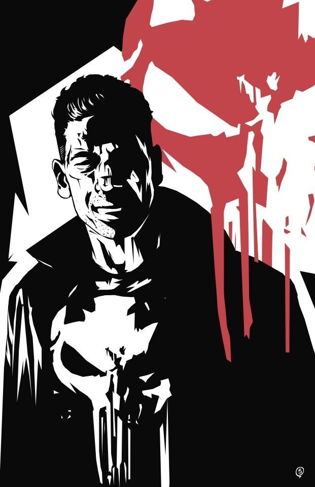
Instagram’s circular story-ring crop tends to clip the outer edges of wider compositions, so Punisher PFPs built for this platform usually keep the skull and shoulders centered well inside that boundary. Coats, weapons, or background detail near the frame’s edge risk disappearing under the ring entirely.
Grid coordination matters more on Instagram than almost anywhere else. Fans running tactical, fitness, or dark-aesthetic feeds often pull Punisher’s black-and-white palette directly into their post grid, so the PFP feels like an extension of the feed rather than an unrelated avatar sitting above it.
The story ring’s bright gradient border also affects how the image reads underneath it — high-contrast black-and-white Punisher edits tend to hold up better against that colorful ring than muted or desaturated grays, which can wash out next to it.
Pinterest Punisher PFPs
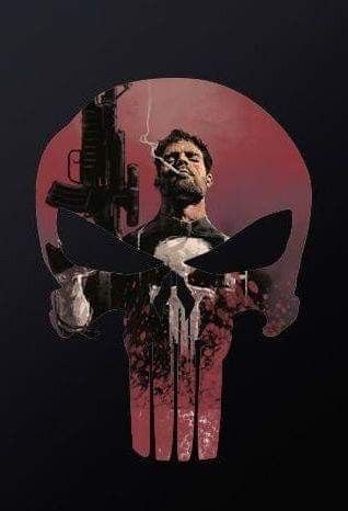
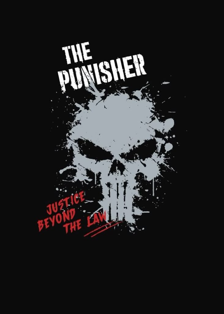
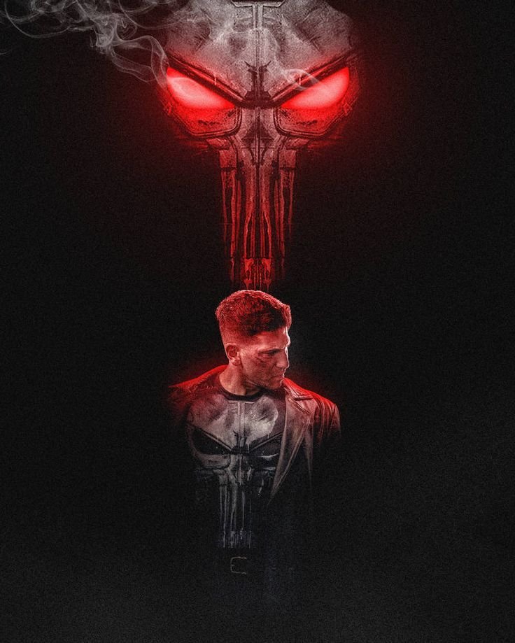
Pinterest runs on board-based discovery rather than a single profile image, so Punisher content performs differently here than on avatar-first platforms. Fans build boards around specific angles tactical gear reference, noir-style comic panels, skull-logo variations and save full, uncropped images rather than pre-cut avatar circles.
Because Pinterest doesn’t force a tight crop, wallpaper-style compositions with full environmental detail actually outperform close-up skull crops in this space. People are collecting inspiration and reference material, not just hunting for a single profile picture.
This is also where fans frequently stumble onto lesser-known Punisher art specific storyline covers, painted variant art, alternate costume takes since Pinterest’s discovery algorithm tends to surface related pins from artists reinterpreting the character across different eras.
Twitter/X Punisher PFPs
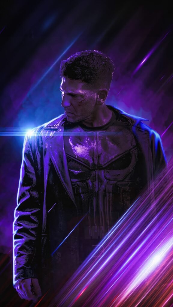
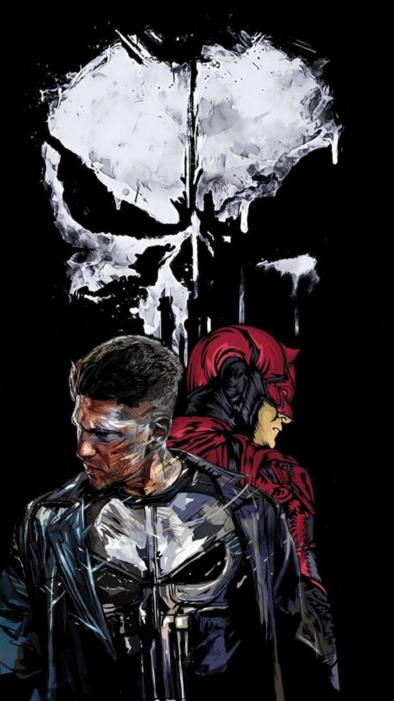
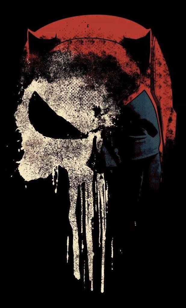
On X, avatars sit directly beside dense walls of reply text, so a Punisher PFP has to stay legible at a genuinely small size while competing against dozens of other tiny avatars in the same thread. The skull’s stark geometry handles that better than most character art because it doesn’t rely on fine detail to be recognized.
Military, law-enforcement-adjacent, and political accounts have long used Punisher’s skull as a kind of shorthand statement, which means the symbol carries more real-world baggage on X than it does on more purely fandom-driven platforms — something worth knowing before picking it purely for aesthetics.
Because X timelines are almost entirely text, PFPs with heavy background detail tend to disappear at a glance. The strongest choices crop tight to the emblem or face, letting the skull carry the full weight of the image without supporting scenery.
Black and White Punisher PFPs
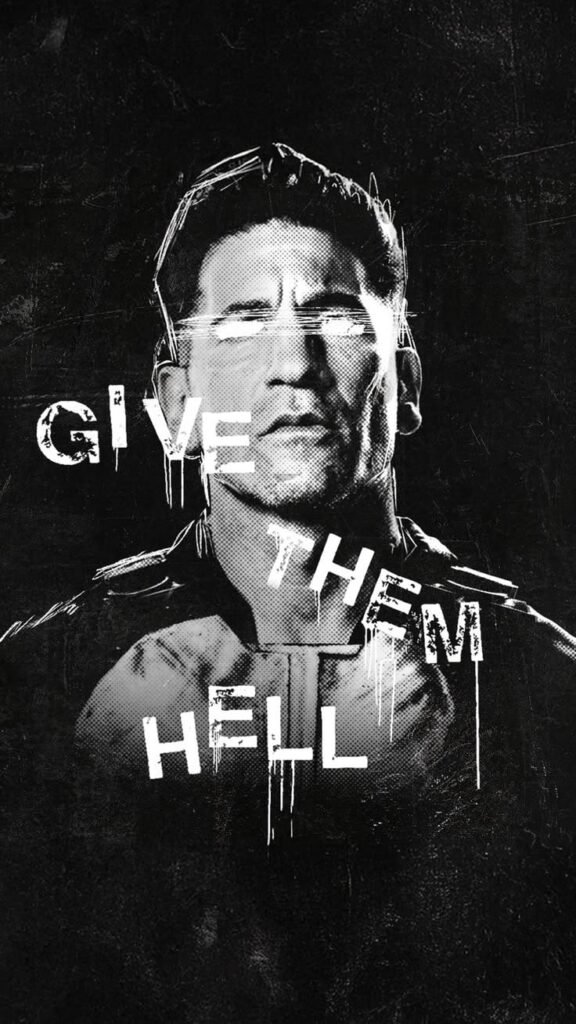
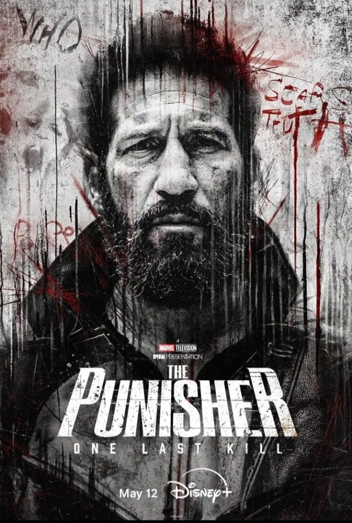
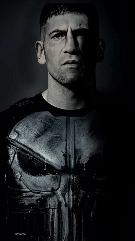
Stripped of color, Punisher’s design barely changes at all the character was practically monochrome to begin with, built around bone-white and matte black rather than a wide palette. That makes black-and-white edits feel less like a stylistic choice and more like the character’s default state finally rendered honestly.
This treatment also connects directly to the tone Garth Ennis and artist Steve Dillon established during the Punisher MAX run starting in 2004, which leaned into a stripped-down, grim realism far removed from typical superhero brightness. Monochrome PFPs tap into that same mood less costume, more consequence.
Nothing about the expression changes here since Frank’s face is rarely the focus to begin with. What shifts is the overall register: black-and-white versions read as harder-edged and more grounded, distancing the character from any lingering comic-book gloss.
“Fans of vengeance-driven characters may also enjoy our Ghost Rider PFP collection.”
For Boys — Punisher PFPs
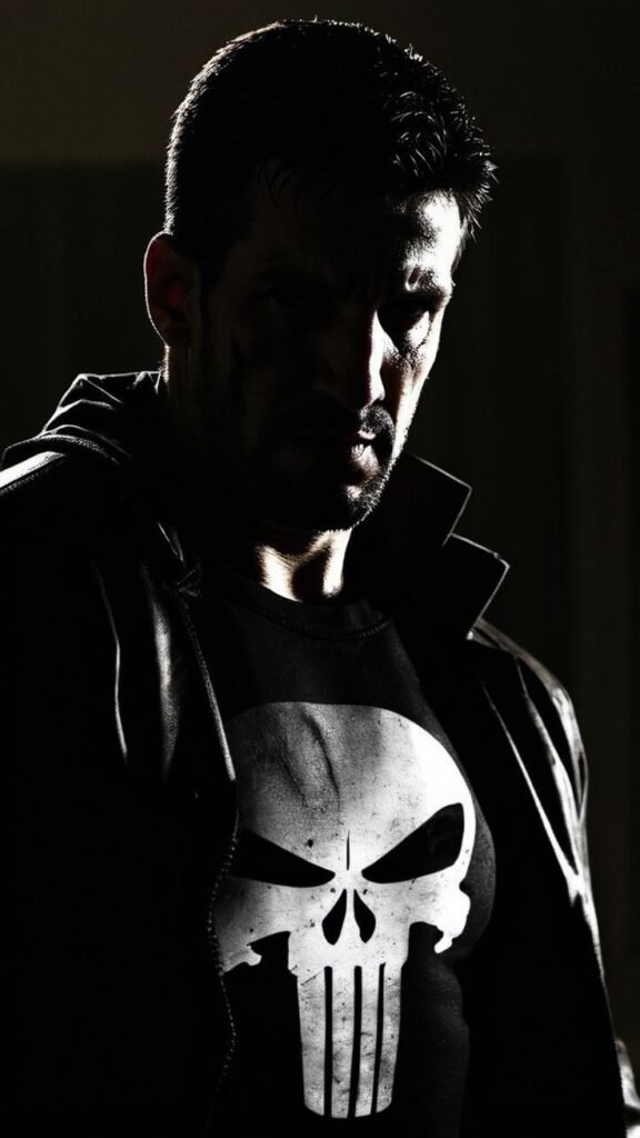
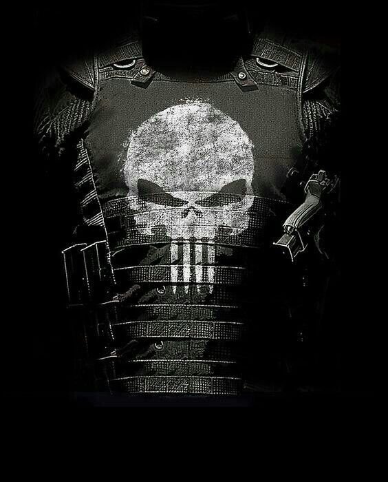
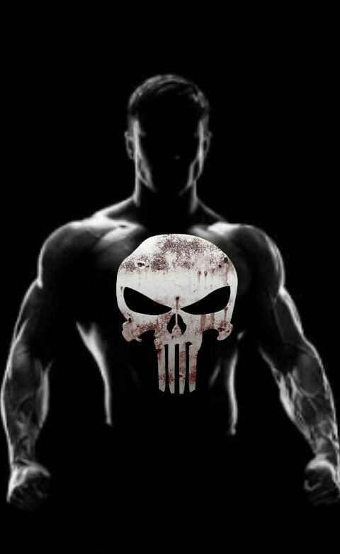
Punisher shows up constantly in “for boys” PFP searches because nothing about the design softens the character — no bright colors, no expressive face, just a skull, black gear, and an implied body count. That bluntness is exactly what this search category tends to want.
Weapon-forward crops dominate here, often edited with heavy shadow and minimal color to push the intimidation factor further. Low-angle shots that make Frank loom over the frame, or tight crops isolating just the emblem against total black, are common choices that reinforce a sense of controlled aggression.
This category also draws on Castle’s backstory as a Marine and Vietnam veteran rather than a costumed hero with powers, giving it a grounded, real-world edge that separates it from the typical cape-and-mask PFP trend most other Marvel characters fall into.
“Check out our Kamen Rider PFP collection for another action-hero aesthetic.”
Punisher MAX — The Iconic Form
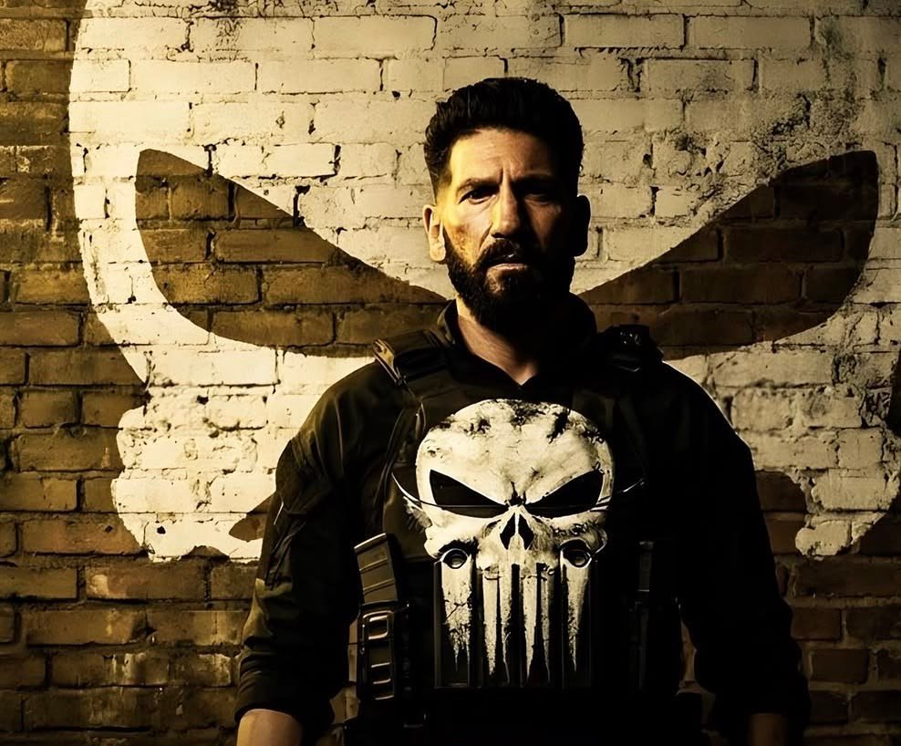
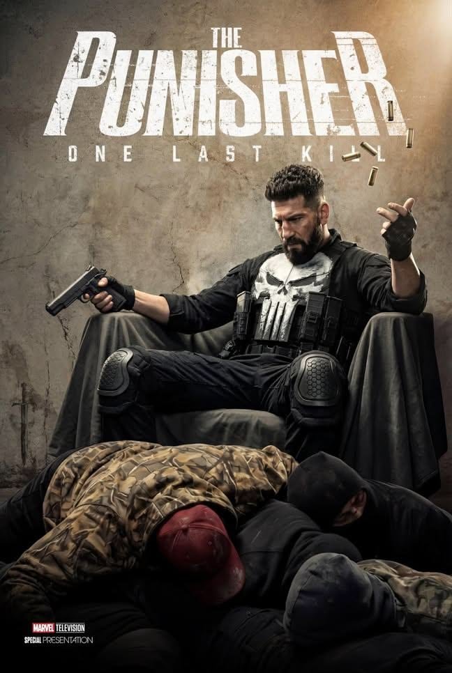
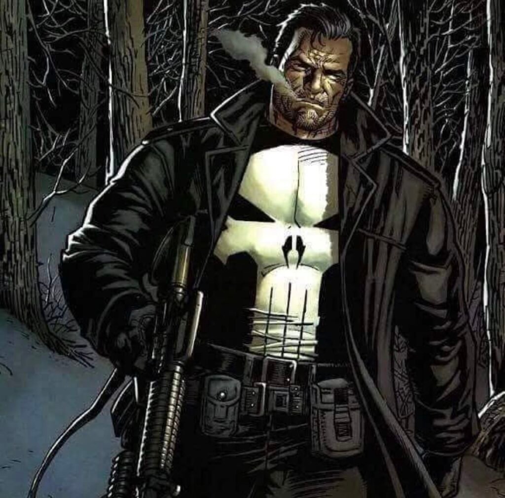
If one version of Punisher dominates “definitive look” searches beyond his standard tactical gear, it’s the take established in Punisher MAX, the mature-readers imprint written by Garth Ennis with art by Steve Dillon that ran through the mid-2000s. This version strips away lingering superhero polish entirely, presenting Frank Castle as a grim, aging soldier rather than a stylized vigilante.
PFP artists return to this era because it answers a specific question fans keep asking: what does Punisher look like when the story takes him seriously as a person instead of a symbol? The palette stays dark and restrained, lighting turns harsh and unflattering by design, and the skull itself often appears cracked or stitched onto worn gear rather than printed clean.
It’s a favorite among fans who know the character’s roots as a grounded, non-powered vigilante rather than a cosmic or mystical figure — this version leans entirely into realism, and that commitment is exactly why it still defines so much modern Punisher fan art today.
How to Choose the Right Punisher PFP
- Keep the skull emblem fully visible cropping through it undercuts the single most recognizable part of the design.
- Test contrast at small sizes before committing; Discord, X, and TikTok all shrink avatars down aggressively.
- Match the image’s black-and-white or muted palette to your banner or grid for a coordinated profile.
- Choose tight, centered crops for text-heavy platforms like Discord and X, and fuller compositions for Pinterest.
- Pick a genuinely high-resolution source; blur destroys the sharp geometry the skull design depends on.
- Decide between classic tactical-gear Punisher and the grittier MAX-era look based on the tone you want to project.
- Avoid cluttered backgrounds the character’s strength is minimalism, not scenery.
- Stay consistent with your existing profile’s color scheme rather than picking an image in isolation.
Read: Spider Man PFP
Read: Spider-Man vs Daredevil
Read: Captain America PFP
Read: Aesthetic Red PFP
Read: Batman PFP
Frequently Asked Questions
Conclusion
Punisher endures as a PFP choice precisely because his design refuses to compromise one symbol, one narrow palette, and zero reliance on flashy costuming to be recognized. Whether it’s the classic tactical-gear look, a stripped-down black-and-white edit, or the harder-edged realism of the Punisher MAX era, every version stays anchored to the same core idea: a grounded, weaponized response to violence rather than a superhero fantasy.
That consistency is what makes him work across such different platforms. A PFP needs to survive a tiny Discord circle, a clipped Instagram ring, and a crowded X reply thread all at once, and Punisher’s minimalist branding was practically made for that kind of stress test. For fans who want an avatar that signals intensity, discipline, and zero patience for nonsense, few Marvel characters communicate it as efficiently as the skull on Frank Castle’s chest.

5 Comments