960+ Spider Man PFP: Aesthetic, Couple, 4k, Comic, Sad, Black
Spider Man PFPs have become one of the most reliable ways to signal a specific kind of fandom online, and that traces directly back to a design choice Steve Ditko made when he co-created the character with Stan Lee for Amazing Fantasy #15 in 1962: hide the entire face behind a mask, then let two oversized white eye lenses carry every emotion instead. That’s an unusual amount of expressive weight to load onto a shape most artists would treat as a minor detail, and it’s exactly why the character keeps resurfacing as an avatar choice more than sixty years later.

What makes Spider Man specifically work as a PFP, rather than superheroes in general, is how much visual range that one costume has absorbed without ever losing recognizability a red-and-blue suit that’s been redrawn by dozens of artists, reduced to solid black for the symbiote costume, and flattened into halftone dots for Into the Spider Verse and still reads as unmistakably Spider-Man in a tiny circle next to a Discord username.
Aesthetic Spider Man PFPs
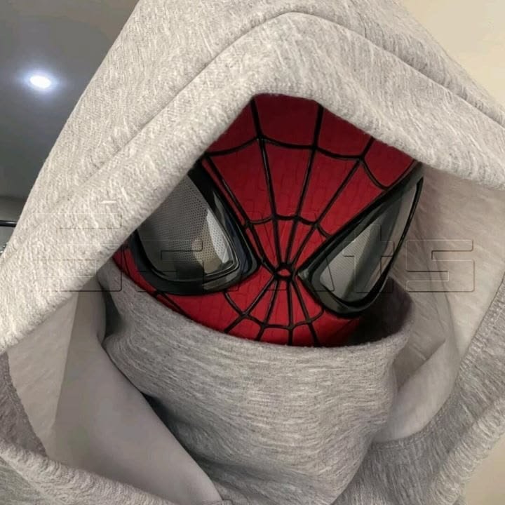
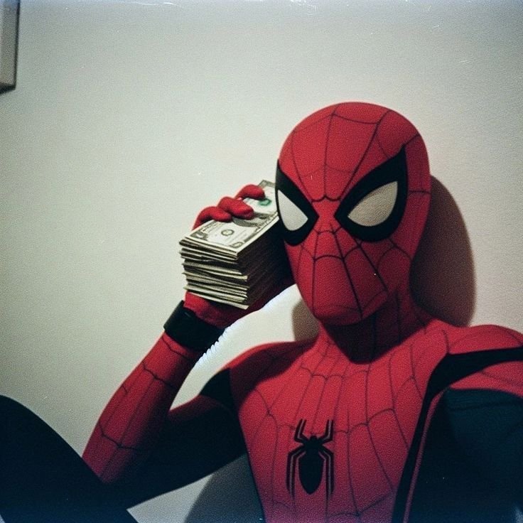
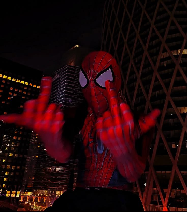
Aesthetic edits of Spider-Man tend to slow the character down deliberately, trading the swing for stillness — a figure seated on a fire escape railing, or framed in a doorway with rain streaking the mask. The palette shifts too, pulling the reds toward rust and the blues toward a near-navy, so the suit reads as mood rather than costume.
Because the mask removes any actual facial expression, these edits lean entirely on posture to do emotional work. A dropped head and slack shoulders against a dim window reads as exhaustion; a straight spine against open sky reads as resolve — the lens shape never has to change for either.
Backgrounds stay sparse on purpose. A single window frame, a stretch of brick, or blurred string lights does more for this style than a detailed skyline would, since aesthetic PFP culture generally favors quiet composition over spectacle.
Cool Spider Man PFPs
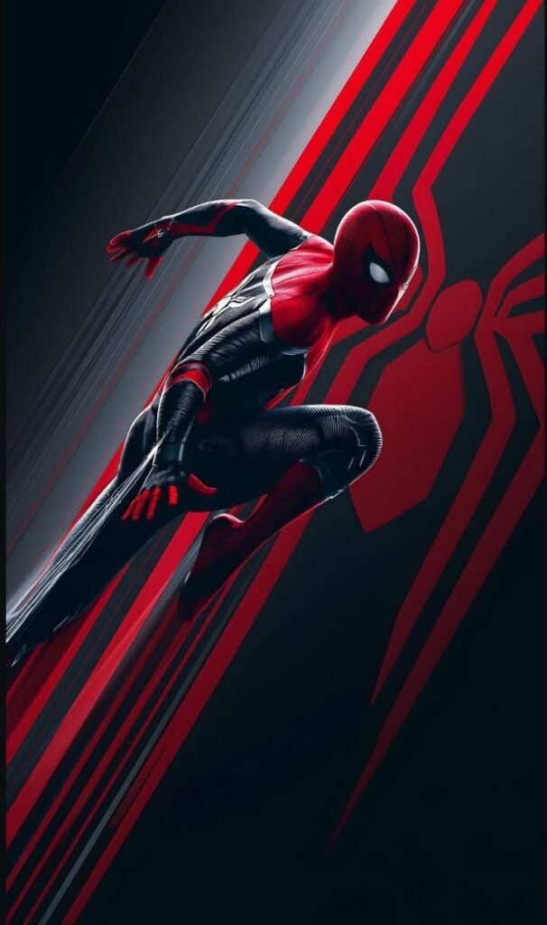
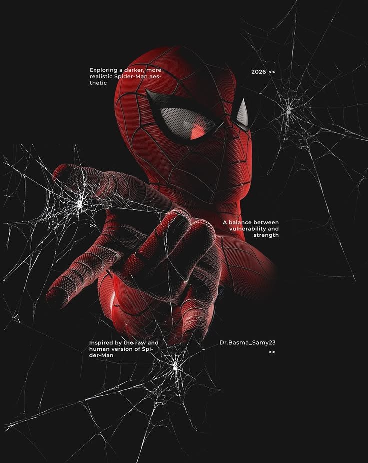
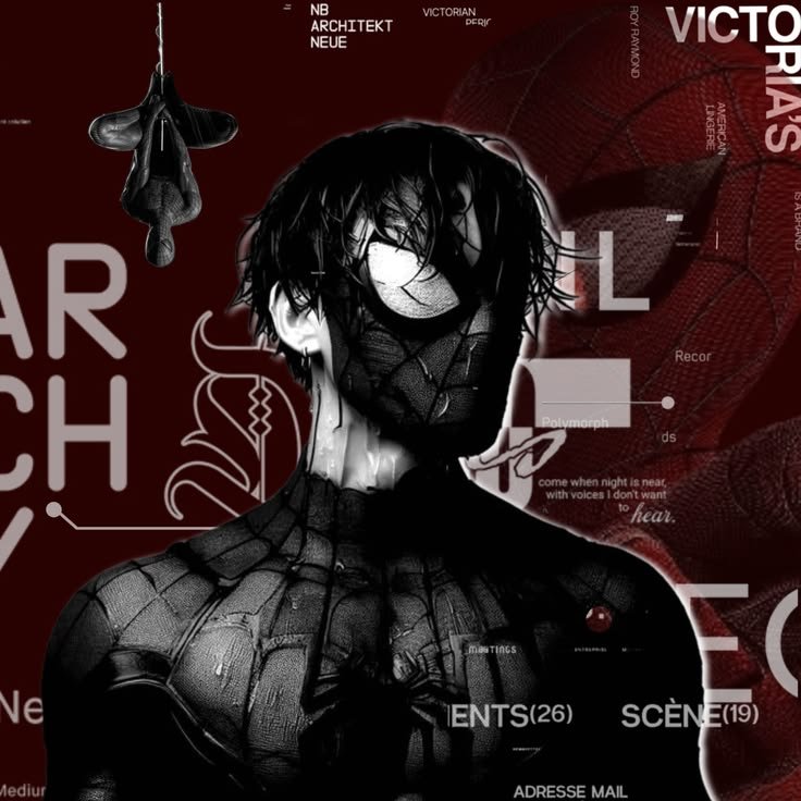
“Cool” Spider Man edits go the opposite direction, chasing motion and angle instead of stillness. This is where Ditko’s original layouts still matter his 1960s panels put Spider-Man in contorted, off-balance poses that most other superhero artists of that era avoided, and modern edits mining that archive still look sharper for it.
Lighting turns hard and directional here: a rim light tracing the suit’s edge against a near-black backdrop, letting the red isolate itself instead of blending into a busy scene. Some fan edits pull specifically from Todd McFarlane’s late-1980s run, known for thickening the webbing into a dense, almost overgrown pattern across the whole suit.
The tone skips playful entirely. This category treats Spider-Man closer to a predator crouched on a ledge than a wisecracking neighborhood hero, which is a deliberate reversal of how most casual fans picture him.
“For another wall-crawler take, our Miles Morales PFP collection explores a fresher, modern style.”
Funny-Meme Spider Man PFPs
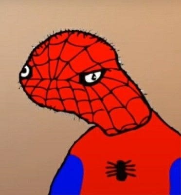
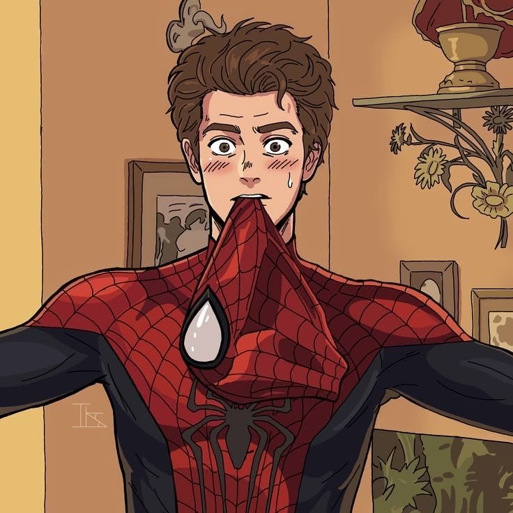
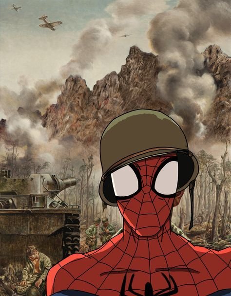
No Spider-Man PFP category carries more built-in recognition than the pointing meme, sourced from “Double Identity,” the nineteenth episode of the 1967 animated series, where the real Spider-Man and a costumed impostor accuse each other by pointing in unison. Crops built around that single freeze-frame lean entirely on comedic timing rather than atmosphere.
The joke got an unexpected canon upgrade in 2018, when Spider-Man: Into the Spider-Verse restaged the pose as an actual mid-movie gag between alternate-universe Spider-people — giving meme-style PFPs a legitimate in-story source alongside the original cartoon still.
This is the one Spider-Man PFP style built entirely around self-aware humor instead of mood. It thrives specifically in group chats and Discord servers, where an ironic avatar says more about personality than fandom depth.
HD & 4K Spider Man PFPs
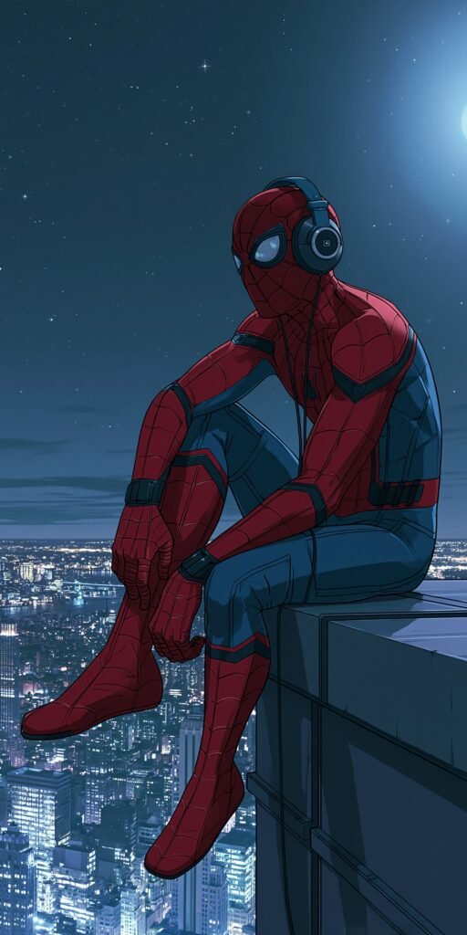
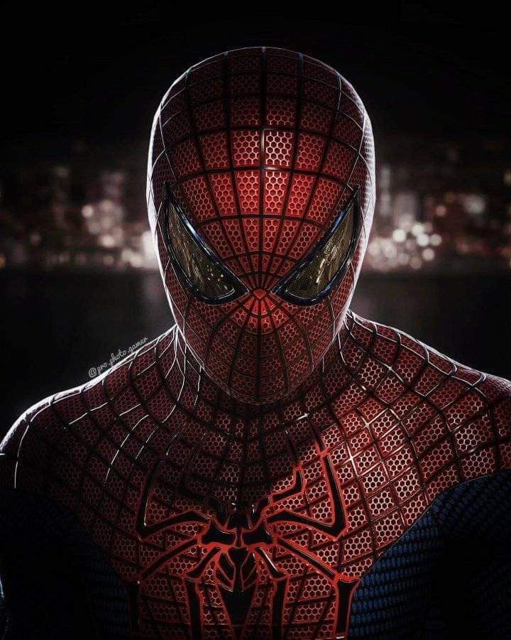
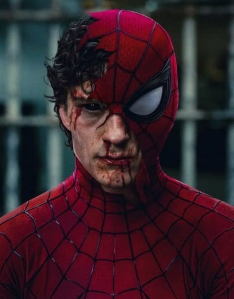
High-resolution Spider-Man art matters because the webbing pattern is one of the first things compression destroys — what should read as a fine, deliberate grid collapses into gray static once an image gets pushed through enough re-uploads. Fans chasing 4K sources are usually after clean digital renders or uncompressed comic scans specifically to preserve that grid.
At full resolution, the eye lenses reward close inspection in a way low-quality images can’t. Ditko originally drew them oversized specifically so Peter Parker’s face would stay completely hidden, unlike heroes such as Batman whose jawline still shows — a design decision that only pays off visually when the shape stays crisp enough to read subtle narrowing or widening.
Because the classic suit runs on just three core colors, sharpness alone does most of the work at high resolution. There’s no need for added texture or noise; clean edges on red, blue, and black carry the whole image.
Black and White Spider Man PFPs
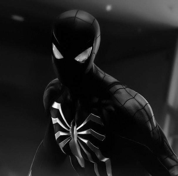
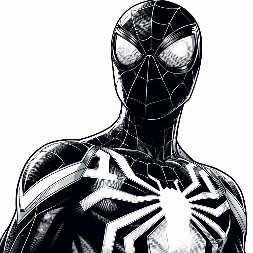
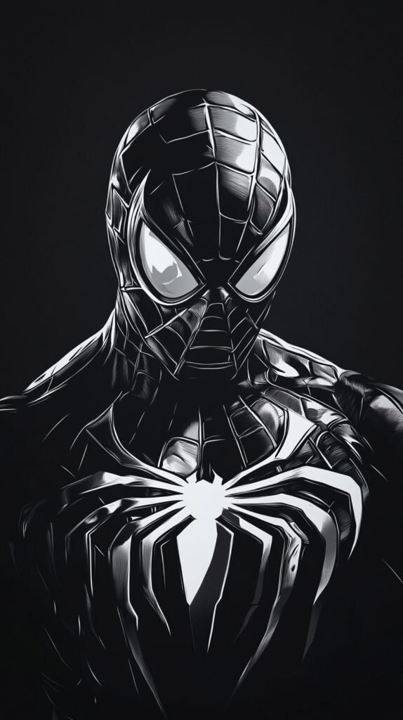
Stripped of color entirely, Spider-Man still holds together because the eye-lens shape alone is enough to identify him — no other Marvel character shares that exact silhouette. That’s a useful stress test for how strong the base design actually is.
Monochrome edits also connect back to the character’s original medium more directly than colorized versions do: Ditko’s 1962 pages were inked in black and white before Marvel’s four-color separation process ever touched them, so stripped-down PFPs echo that print-era linework rather than imitating it from scratch.
Tone shifts noticeably here. Without red and blue softening the image, black-and-white Spider-Man reads closer to a street-level vigilante than the quippy hero most adaptations lean into a serious register the character rarely gets outside symbiote-suit storylines.
“If you like Spider-Man’s dark symbiote side, Venom PFP leans further into that aesthetic.”
Symbiote Suit — The Iconic Alternate Form
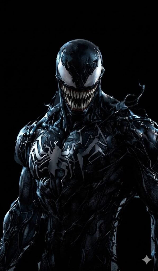
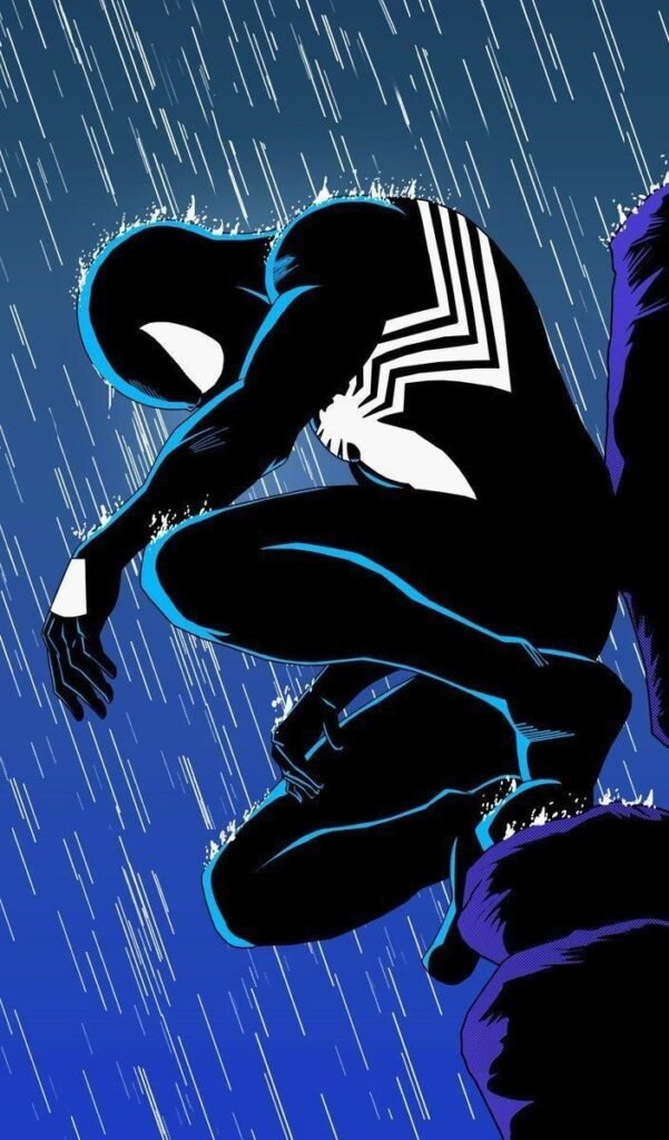
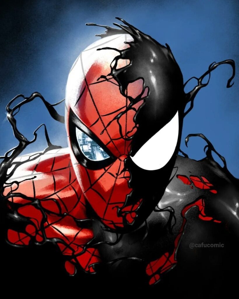
If one non-classic Spider-Man look dominates searches beyond red-and-blue, it’s the black symbiote suit, introduced in Secret Wars #8 in 1984 before later plotlines revealed the costume was actually a living alien organism the same creature that would eventually become Venom. The white eye shapes stay identical to the classic mask; everything else goes liquid black.
PFP artists return to this version specifically because it lets them darken the character’s tone without switching to a different hero entirely. Lighting turns harsher, the palette narrows to pure black and white, and the mood shifts from friendly hero to something closer to a horror figure stalking a rooftop.
This one draws a slightly different fan base than the classic suit people who know the symbiote’s specific comic backstory, not just its silhouette, since the slow corruption of its host is part of why the look feels so tonally different from every other Spider-Man PFP style.
Discord Spider Man PFPs
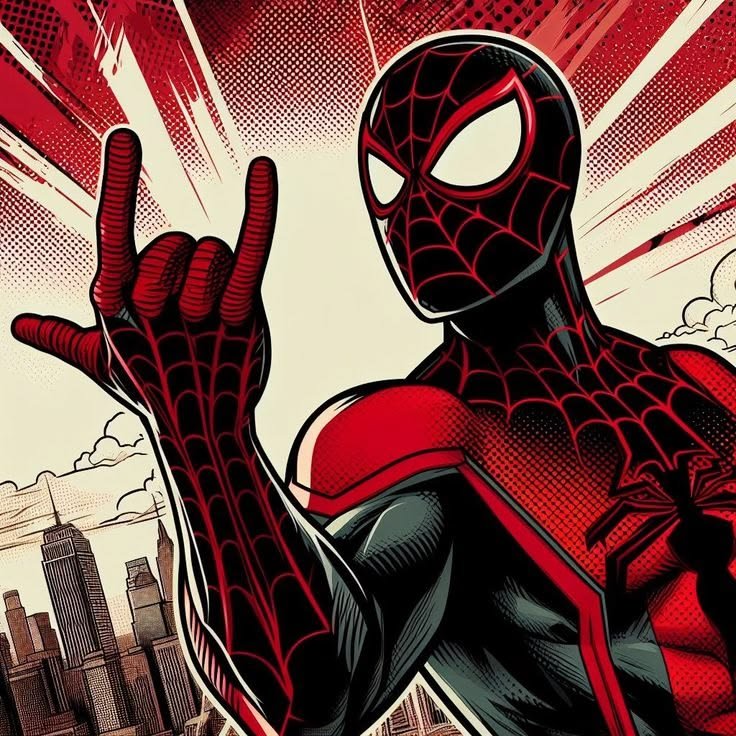
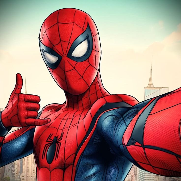
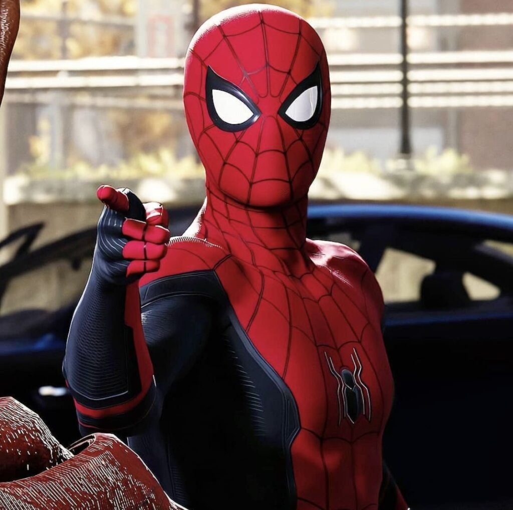
Discord shrinks every avatar into a small circle sitting directly beside a status dot and a role-color tag, which is a layout no other platform on this list replicates. Busy, detailed webbing tends to disappear at that size, so the strongest Discord picks keep the mask centered with strong red-blue separation.
Server banner pairing matters more here than people expect, since Discord displays a banner directly above the username in the member list. A red-leaning banner behind a red-heavy crop reads as a coordinated profile rather than two unrelated images stacked together.
Role-color tags interact with the suit differently depending on server setup — a blue-tagged server blends into the suit’s base tone, while a red-tagged one creates sharper contrast, giving fans a genuine reason to pick different crops for different servers.
TikTok Spider Man PFPs
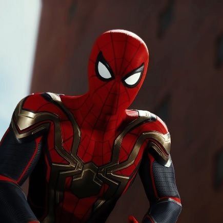
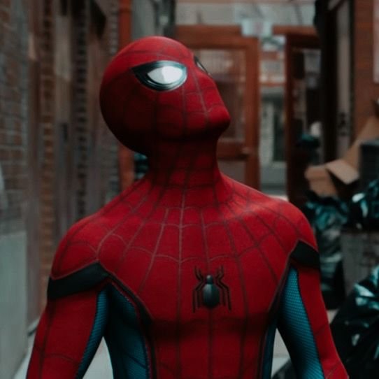
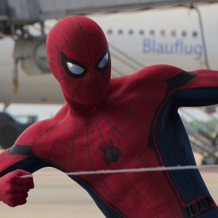
TikTok’s avatar sits beside a fast-scrolling comment column and a duet grid packed with other creators’ faces, a very different competition problem than a static feed. Fan-made frame edits pulled from Into the Spider-Verse have become especially popular here, since Sony Pictures Animation built that film around visible Ben-Day dot halftone shading — a print-comic texture that reads as intentional rather than blurry even when TikTok’s compression flattens everything else.
Because the app skews younger and meme-literate, Spider-Man PFPs built for it tend to favor bold, simplified crops over slow, cinematic ones a tight shot on the mask with almost no background detail.
Motion-adjacent stills, freeze-framed mid-swing, also do well here specifically because TikTok’s format already trains viewers to expect quick, snappy visuals rather than posed portraits.
Instagram Spider Man PFPs
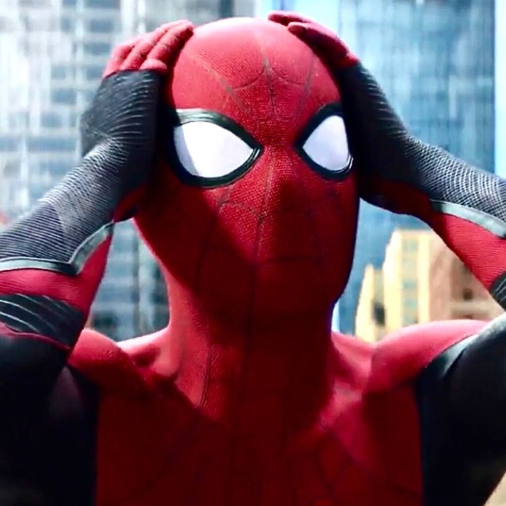
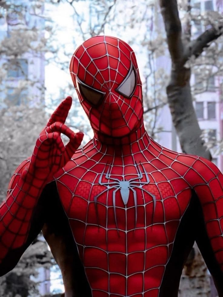
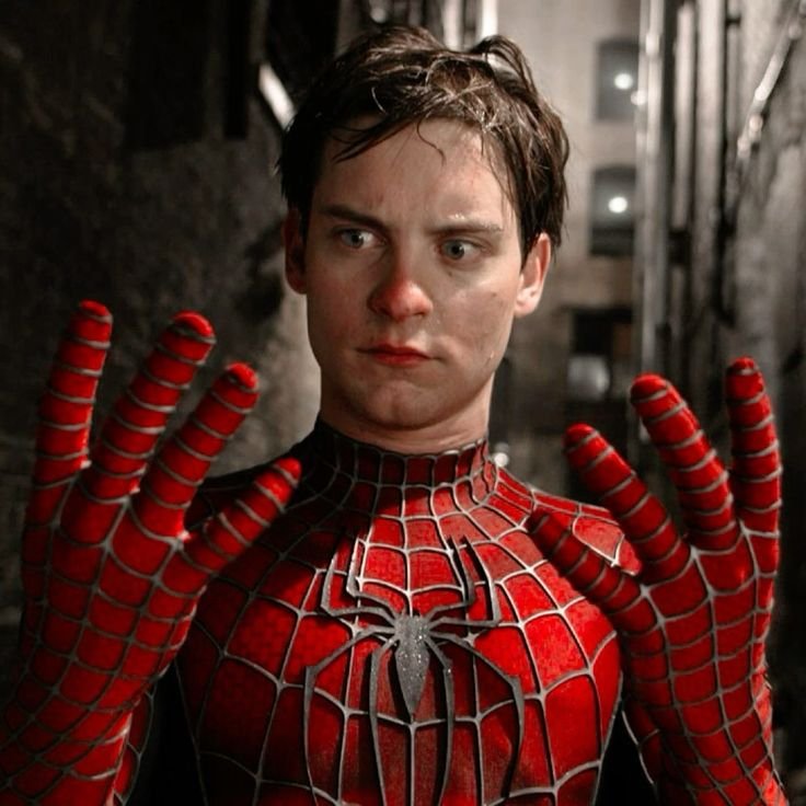
Instagram’s story ring clips the outer edge of a circular crop, so PFPs built for the app usually keep the mask and shoulders well inside that boundary, letting web-lines or skyline detail bleed off past the visible circle rather than getting cut mid-image.
Feed coordination plays a bigger role on Instagram than almost anywhere else on this list, since the platform displays a full grid beneath the avatar. Fans running comic or streetwear-adjacent accounts often pull the suit’s red-and-blue tones directly into their post grid so the PFP feels like part of a designed feed rather than a standalone image.
The story ring’s bright gradient border also reacts differently depending on the crop — high-contrast red tends to stand out sharply against it, while duller, desaturated edits can end up visually fighting the ring instead of sitting inside it.
Pinterest Spider Man PFPs
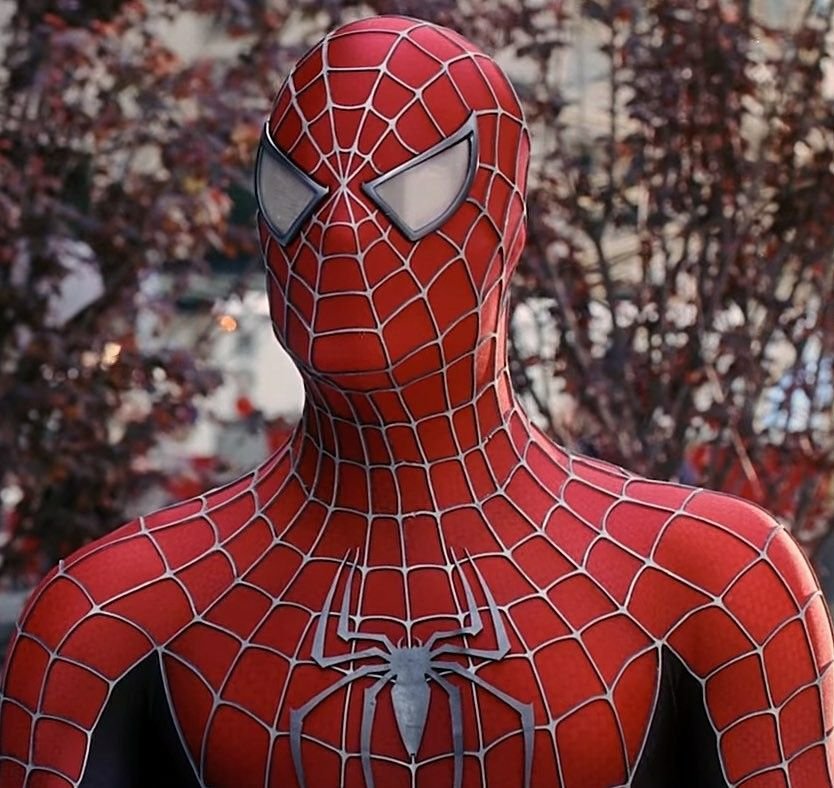
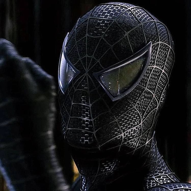
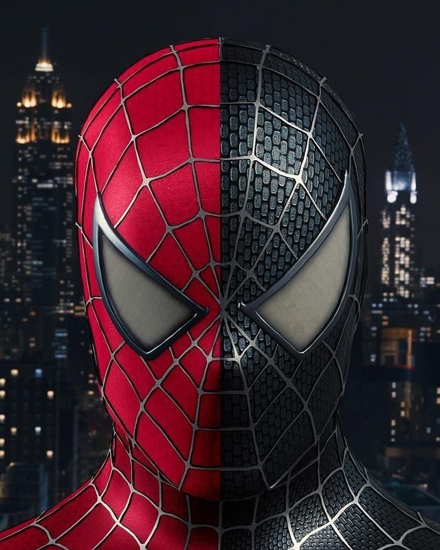
Pinterest runs on board-based discovery rather than a single profile image, which changes what kind of Spider-Man content actually performs there. Classic comic covers, animated stills, symbiote-suit variant art, and cosplay photography can all coexist as separate boards under one search term, something a single-avatar platform can’t support.
Because Pinterest doesn’t force a tight crop, full-figure and wallpaper-style Spider-Man images consistently outperform close mask crops. Users are building inspiration boards, not selecting one profile picture, so environmental detail and full costume shots get more saves than a tight eye-lens close-up would.
This is also where fans are most likely to stumble onto obscure art specific variant covers, individual animator stills, alternate costume takes — since Pinterest’s recommendation system tends to surface pins from very different creative eras side by side.
Twitter/X Spider Man PFPs
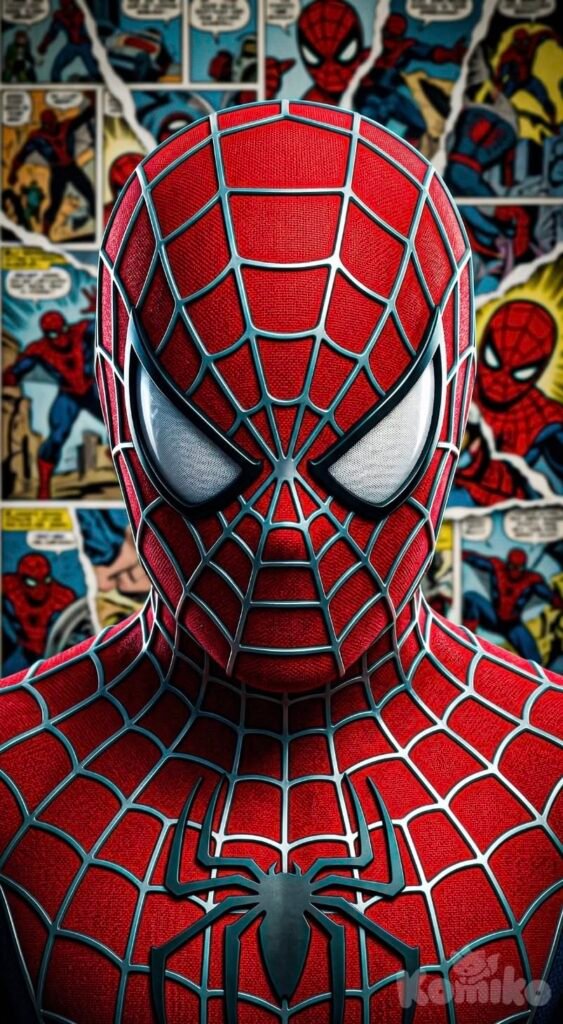
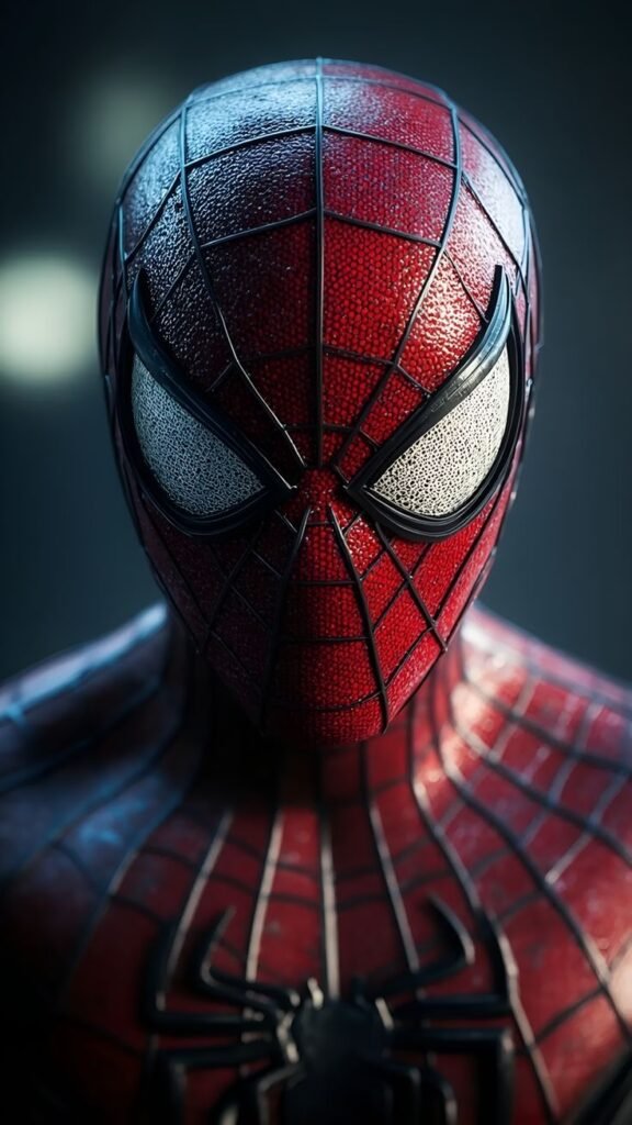
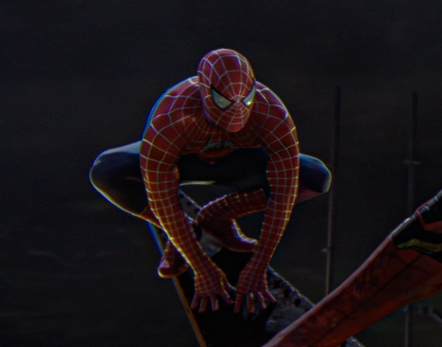
On X, an avatar sits beside dense reply chains rather than a comment column or a duet grid, so recognition has to happen instantly among dozens of other small circles stacked in a thread. Spider-Man’s sharply defined white eye shapes against a solid-colored mask hold up unusually well at that size compared to costumes with finer detail.
Fan-art and animation accounts on X circulate Into the Spider-Verse frame grabs almost as often as TikTok does, but for a different reason the print-style dot shading reads as a deliberate artistic choice in a text-heavy timeline, rather than getting mistaken for a low-quality upload.
Because X is overwhelmingly text, avatars with cluttered backgrounds tend to disappear at a glance. Crops that isolate the mask against a flat or dark backdrop hold attention longer in a scrolling thread than busier compositions do.
How to Choose the Right Spider Man PFP
- Keep the eye lenses fully visible they carry the character’s entire expression, so avoid crops that slice through the mask.
- Test the image at actual thumbnail size before picking it; Discord, X, and TikTok all shrink avatars significantly.
- Match the suit’s red-and-blue tones to your banner or feed grid if you’re building a coordinated profile.
- Choose tighter, mask-focused crops for text-dense platforms like Discord and X, and fuller poses for Pinterest boards.
- Source genuinely high-resolution art the fine webbing detail is the first thing lost to compression.
- Decide between the classic suit and the black symbiote costume based on whether you want a friendly or darker tone.
- Avoid heavily cluttered skylines behind the character; the suit’s contrast works best without competing scenery.
- Stay consistent with whatever color palette your profile already uses rather than choosing an image in isolation.
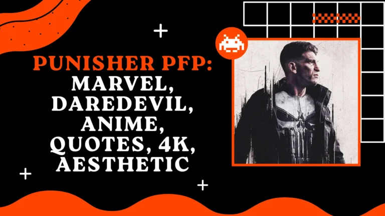
Read: Punisher PFP
Read: Loki PFP
Read:
Read: Spider-Man vs Batman
Read: Yujiro Hanma PFP
Frequently Asked Questions
Conclusion
Spider-Man holds up as a PFP choice because almost none of his identity depends on an actual face Ditko’s decision to bury Peter Parker’s expressions under two lens shapes turned out to be a design built for exactly this use case decades before profile pictures existed. Whether it’s the classic red-and-blue suit, a black-and-white ink-style edit tracing back to the character’s original print run, or the symbiote costume born out of Secret Wars, every version stays instantly recognizable at a glance.
That’s the real advantage over most other characters in this space: the same design has to survive a clipped Instagram ring, a tiny Discord circle beside a role tag, and a crowded X reply thread, and it manages all three without changing anything structural about the mask. For anyone who wants an avatar with real range playful, serious, or meme-ready depending on the day few characters offer as much built-in flexibility as the one still swinging between New York rooftops.

7 Comments